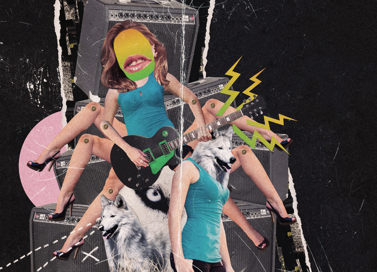
Make a Cut and Paste Rock Club Flyer
Step 1
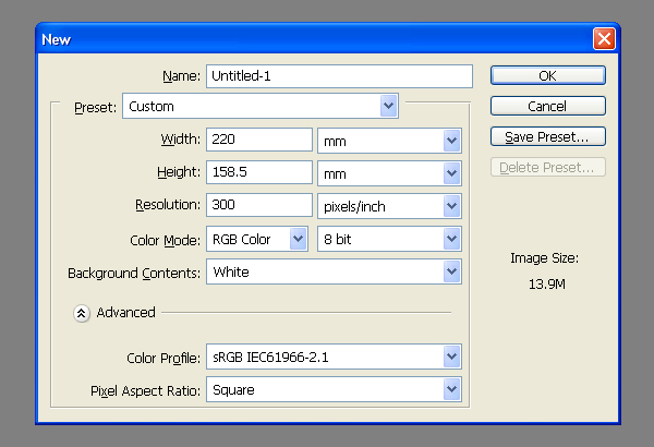
Set up a document. A5 is a pretty standard flyer size but it's best to add a 5 mm bleed to the document size unless you're after a white border. Final size 220mm x 158.5mm at 300 dpi. It's best to work in RGB at this stage as this will give you a decent representation of your print colors on-screen. I'll refer to this as the Working document.
Step 2
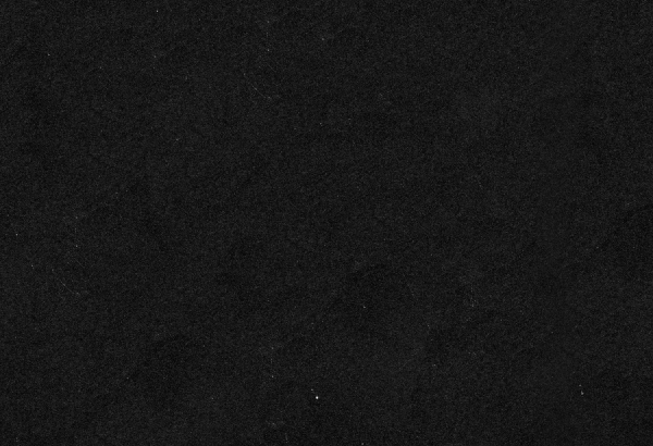
I wanted a fairly rough starting point so I scanned in a black square that was printed on recycled paper (from a washing machine instruction booklet). For our needs it's best to use print on uncoated paper or you can just download "UNSCUFFED.jpg" from the assets folder here. Cut and paste this into the working document.
Step 3
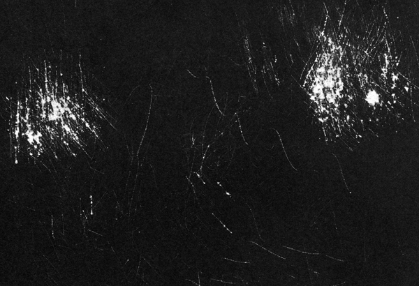
Next I used some sandpaper to scuff the printed side so you can see the white paper showing through the black ink. Alternatively you can use "SCUFFED.jpg" from the Assets folder. Don't import this into the working document yet.
Step 4
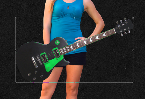
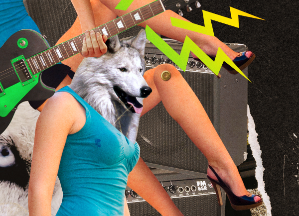
The design is centred around a girl playing a guitar. I got this girl from www.sxc.hu and crudely cut around it using the Pen Tool (P) set to Paths. Cut and Paste it into the working document.
Step 5
Next add a Guitar, again this is from www.sxc.hu. Cut out crudely with the Pen Tool, it is OK to have little flashes of the white background showing through as this will enhance the idea that it's been cut-out by hand. I also tend to alternate between dragging the Path Anchor Points to create curves and just clicking them to get straight lines.
Step 6
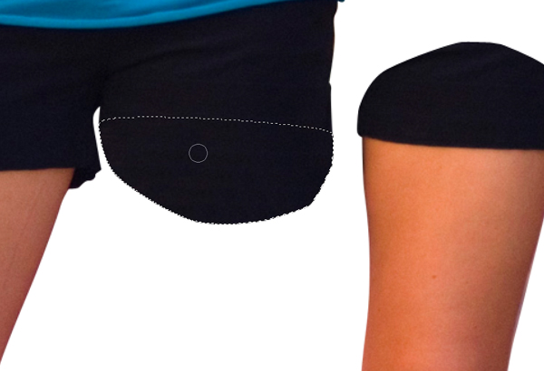
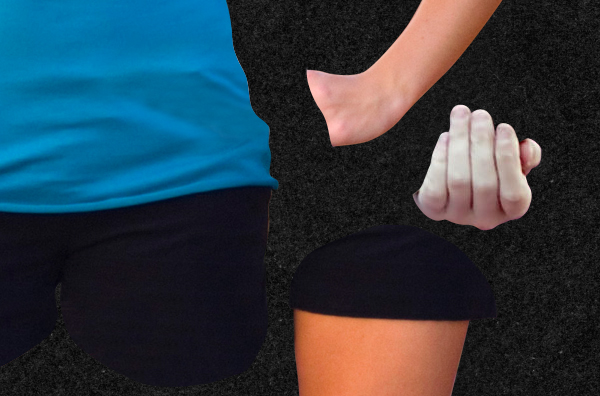
Now we need to start severing limbs. Start with a leg and cut out using the Pen Tool. Round off the point at which you separate the limb from the torso. Round off the opposing point also, this is to allow for rotation.
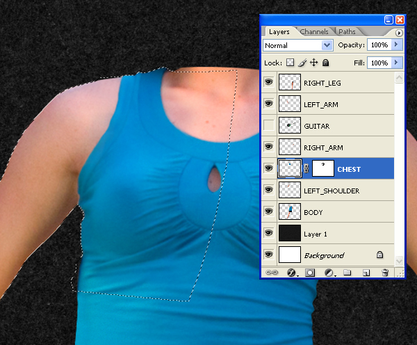
Step 7
Next cut the rest of the limbs and paste them onto their own layers. For the arms, make the cut at the elbow. The areas in which the arms overlap the body will require some cloning to reconstruct the gaps left from deleting the limbs.
Ctrl-Click the "BODY" layer thumbnail to make a selection of all the pixels on that layer. Then use the Clone Tool to clone out the hand that's left.
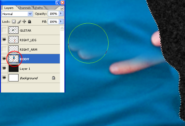
Reconstructive surgery on the left-hand-side shoulder is a bit difficult. The easiest thing to do is Select part of the right-hand side shoulder, copy, paste and flip. Then press Command + T and rotate to fit.
Step 8
We need another hand for the Guitarist, which I got here. Cut it out using the Pen Tool and paste it into the working document. The color doesn't match so select the "Hand" layer and go to Image > Adjustments > Color Balance (Command + B) and set-up as in the image below. It doesn't have to be exactly right at this stage.
Step 9
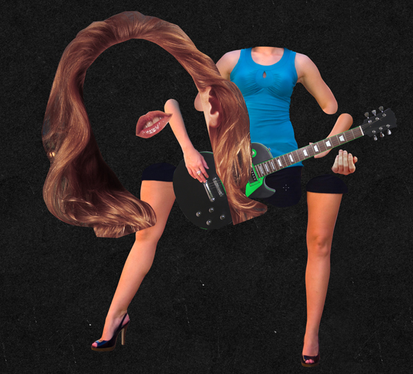
Open "MIA.jpg" from the zipped Assets folder. Next, use the Pen Tool to cut the hair and the lips from the image. Paste them onto their own layers into the working document. When working with a lot of layers it is a good idea to name them all, this will save you time in the long run.
Step 10
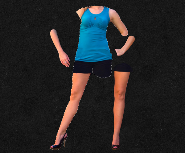
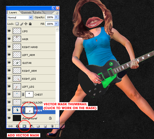
Arrange all the elements to create the guitar playing girl. Rotate and re-size each element as you see fit. Some areas may need masking off (this is better than simply erasing parts of the layer) by adding a vector mask and then painting directly on to the mask.
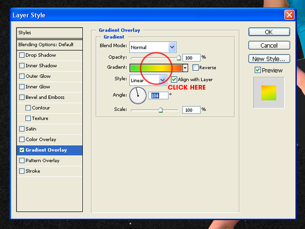
Step 11
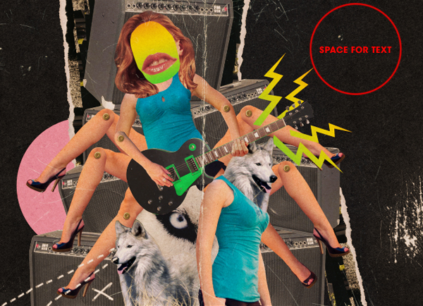
Create a new layer and move it just below the "Hair" and "Lips" layers in the Layer Palette. Use the Elliptical Marque Tool (Located behind the Rectangular Marquee Tool - Hold the mouse button down to access) to draw a circle where the head should be and fill with any color. Then go to Layer > Layer Style > Gradient Overlay and apply a gradient as shown.
Step 12
Next we need a rivet to act as a pivot point for the limbs as if constructed out of card. Thanks to Kriss Szkurlatowski for this one from his image here. Cut the rivet out using the Elliptical Marquee Tool and copy and paste into the working document. When using the Marquee Tool in this way, I click in the centre of the rivet, then hold down the Alt key, and drag from the middle outwards.
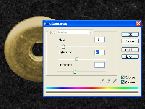
Step 13
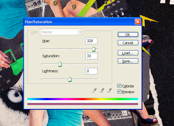
Use the Elliptical Marquee Tool to select the hole in the rivet and delete it. Then go to Image > Adjustments > Hue/Saturation (Command + U) and set-up as in the screen grab.
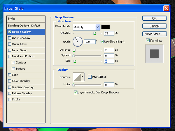
Step 14
Move the rivet into position (over a joint in the limbs), and go to Layer > Layer Style > Drop shadow, then set up as shown below. Next using the Move Tool, press and hold the Alt key, and use the mouse to drag a copy of the rivet into a new position. Repeat this to drag rivets to each of the limb joints.
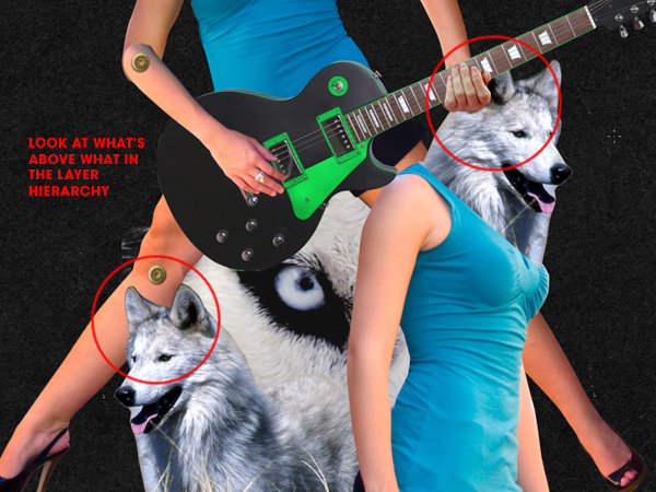
Step 15
Now to start building up the image. I grabbed another shot of the same girl, two wolves (1, 2) and a guitar amp from www.sxc.hu. Always make sure you check the copyright info before using images in commercial projects. Start cutting and pasting into the working document, paying attention to where on the layer hierarchy the layers are going. Remember to rotate and re-size (Command + T). Also, remember to mask off areas rather than deleting them. This allows for further tweaks down the line.
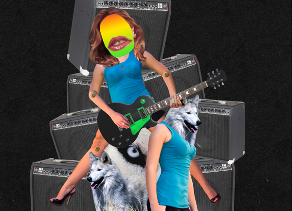
Step 16
Add the guitar amps to the bottom of the layer hierarchy and stack them up. The composition is beginning to take shape now.
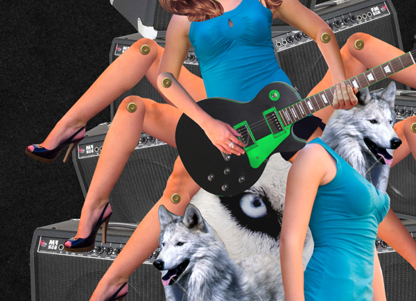
Step 17
Next up add some more legs. Group the leg elements by selecting the "LEFT_LEG," "LEFT_THIGH," and "RIVET_LEFTLEG" layers, then press Commmand + G. Next drag copies of the group and reposition them. Don't rotate the rivet though as it has a light source which is best to maintain.
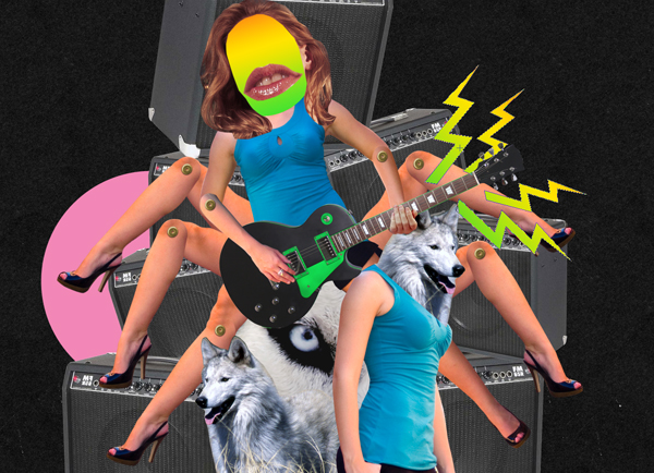
Step 18
Draw in some more color shapes to break up the photos. Use the Pen Tool set to Shape layers to draw the lightning. Select Add to Shape Area to draw them all on the same layer. Next go to Layer > Layer Style > Gradient Overlay and add a similar gradient as before. Then use the Ellipse Tool (U) to draw a circle, and place the circle beneath the guitar amps.
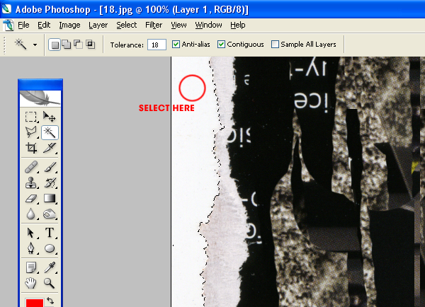
Step 19
Open "TORN_LONG.jpg" from the zipped Assets folder. This tear was achieved by simply scanning in a torn magazine cover. Then use the Magic Wand Tool to select the white space. I wouldn't usually recommend the Magic Wand, but it's fine for this purpose. Press Command + Shift + I to invert the selection and copy it into the working document.
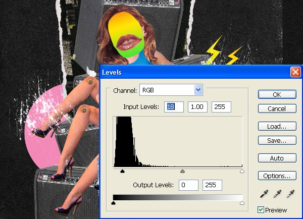
Step 20
Open "SCUFFED.jpg"from the zipped Assets folder. Next, copy it into the working document. Place it at the top of the layer hierarchy. Set the layer Blending Mode to Screen (this will knock out the black pixels), then go to Image > Adjustments > Levels (Command + L) and set up as in the screen grab.
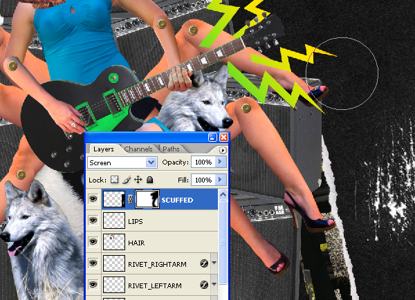
Step 21
Position it and mask off the areas you don't need. Use a big soft-edged brush to paint on to the layer mask when doing this.
Step 22
Next I scanned in some card (which you can get from the zipped Assets folder - see "card.jpg") and pasted it into the working document. Re-size so it covers the entire canvas and then set the Layer Blending Mode to Overlay. Reduce the layer opacity down to 40%. Duplicate the "Card" layer and set the layer Blending Mode to Darken and the Layer Opacity to 30%. The Darken layer should be above the Overlay layer.
With 40% Overlay.
With both 40% Overlay and 30% Darken.
Step 23
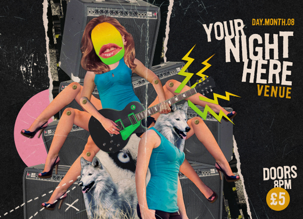
I added a couple more bits of stuff I scanned in (again see the Assets download) including some "briodoodles.jpg" and a "FOLDED.jpg." The biro doodles on white paper were Inverted (I) and set to Screen. The folded book cover was black and set to Screen. Then shift everything to the left to create a better composition. Incidentally, this is where the text for the flyer would go.
Step 24
Some of the scuffing and dirt marks are too much so I've removed them to balance it out. Add some text and then you're ready to put the finishing touches on this...
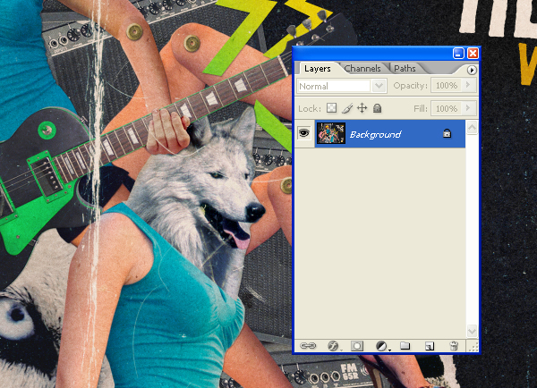
Step 25
For the finishing touches, select the lower "Card" layer (Overlay 40%) and press Shift+ Command + U to desaturate. Then go to Layer > Flatten Image.
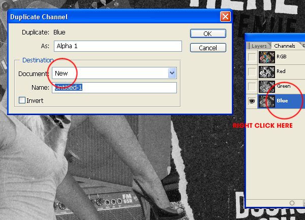
Step 26
Open the Channels palette and right click on the Blue Channel. Select Duplicate Channel and duplicate it to it's own document.
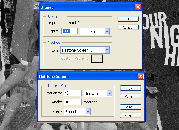
Step 27
Go to Mode > Bitmap and set up as shown below. OK this and go back to Mode and select Grayscale.
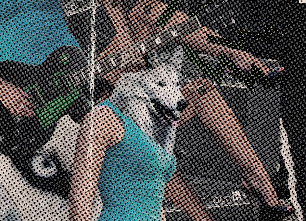
Step 28
Select the Magic Wand Tool and uncheck the box marked Contiguous. The standard 32 Tolerance is fine, then select any black pixel from the canvas. Press Command + C to copy the selection and then paste it into the working document.
Step 29
Press Command + U to bring up the Hue/Saturation dialogue and set up as in the screen grab. Then set the layer Blending Mode to Soft Light and the layer Opacity to 70%. Duplicate this layer and set it to Screen at 30%.
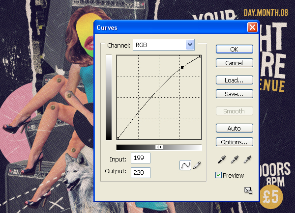
Step 30
Go to Layer > Adjustment Layer > Curves and boost the lighter pixels.
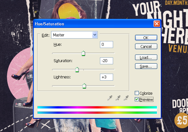
Step 31
Finally tweak the Hue/Saturation levels and print...
Conclusion
You can view the final image below or view a larger version here. Notice the space on the right open for placing your own text.
Labels: Design, photoshop tutorial