Sunday, March 29, 2009

A Simple Toggle with CSS & jQuery

I know that there are a lot of website is giving a toggle scripts (tutorials) but find that there are too hard to understand and edit.

After reading a few tutorials, I was able to achieve this effect, but i want to share with you.

Click here to view demo.

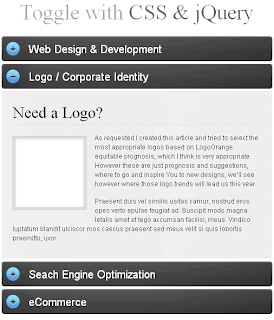
Step1. Style and wireframe

We start out with an h2 tag with a link as the “trigger” for our effect. Below our h2, we will have our container where we hold the content.
Note that we nest the container within another div. One of the main reasons I decided to do this was to prevent the padding from easing up and down during its action.

HTML


<h2 class="trigger"><a href="#">Toggle Header</a></h2>
<div class="toggle_container">
<div class="block">
<h3>Content Header</h3>
<!--Content--> </div>
</div>

CSS

h2.trigger { padding: 0 0 0 50px; margin: 0 0 5px 0;
background: url(h2_trigger_a.gif) no-repeat; height: 46px;
line-height: 46px; width: 450px; font-size: 2em;
font-weight: normal; float: left; }


h2.trigger a { color: #fff; text-decoration: none;
display: block; } h2.trigger a:hover { color: #ccc; }


h2.active {background-position: left bottom;}
/*--When toggle is triggered, it will shift the image to the bottom to show its "opened" state--*/

.toggle_container { margin: 0 0 5px; padding: 0;
border-top: 1px solid #d6d6d6;
background: #f0f0f0 url(toggle_block_stretch.gif) repeat-y left top;
overflow: hidden; font-size: 1.2em; width: 500px; clear: both; }

.toggle_container .block { padding: 20px; /*--Padding of Container--*/
background: url(toggle_block_btm.gif) no-repeat left bottom; /*--Bottom rounded corners--*/ }

Step2. Activating the Toggle with jQuery

jQuery
We will now activate this toggle effect with some simple jQuery.

$(document).ready(function()
{ //Hide (Collapse) the toggle containers on load
$(".toggle_container").hide(); //Switch the "Open" and "Close" state per click
$("h2.trigger").toggle(function(){
$(this).addClass("active");
},

function () {
$(this).removeClass("active"); }); //Slide up and down on click
$("h2.trigger").click(function(){
$(this).next(".toggle_container").slideToggle("slow"); });
});


Labels: , ,


CSS hacks (IE8 standard mode)

Currently tested:

IE 5.01, 5.5, 6, 7, 8 PC (IE8 standard mode)

Firefox 1.07, 1.5, 2 PC

Opera 8, 8.5, 9 PC

Click here to see demo.

Color should be as follows :

class="testclass": IE5-5.5: red (IE5: black), IE6: blue, IE7: pink, Firefox, Opera, Safari(?), IE8: green


.testclass {
color: red; /* IE 5-5.5 */
c\olor: blue; /* IE 6 */
}
*+html>body .testclass {
color: black; /* IE5 only if different CSS than for IE5.5. needed */
}
*+html>body .testclass[class] {
color: pink; /* IE 7 */
}
html>body .testclass {
color: green; /* Firefox, Opera, Safari, IE8 */
}

if you found any error in this, please give feedback and suggestion. Thanks...

Labels: ,


Thursday, March 26, 2009

Top 57 Points to Check your website for Maximum Usability

Do you know your website is usable or not? The answer to this question can make the difference between a successful site and one that’s just ignored. Go through below points to make sure your site is up to snuff.

  1. Do you answer your user’s questions?: Users visit a site because they want answers, so it’s vitally important that your site gives them what they are looking for.
  2. Is your navigation clear and simple?: Make sure that your navigation lets the user know where they have been and where they can go in a clear, consistent manner.
  3. Do you provide anchor text?: Ensure that your visitor always knows where links are headed by discussing the site before you ask them to "click here."
  4. Does your design guide the eye?: Use color, position, size, and more to create a specific flow for your site.
  5. Do you start link names with important keywords?: Use important keywords in your links so that users know when they’ve found the right information.
  6. Is your wording straightforward?: Take a look at your language to make sure it’s simple enough for all users to understand.
  7. Does your writing look like an inverted pyramid?: Give web users the instant gratification they want by offering the most important information early on.
  8. Do you have "white space?": By placing too many elements too close together, you may overwhelm users. Spread things out a little.
  9. Have you offered contact information?: If your site doesn’t answer all of a visitor’s questions, they will probably want to speak to you about it. Allow them an easy way to contact you.
  10. Do you change URLs?: Don’t. This creates linkrot, in which links to your site are broken, and discourages other sites from linking to you in the future.
  11. Do you have a site map?: A site map is very important for a large site, because it helps lost users find their way and also makes it easy for search engines to spider your site.
  12. Does your information look like an ad?: Users will ignore information if it resembles a promotion, so avoid using large red text and other design elements found in advertisements.
  13. Does your site require unnecessary plugins?: Be aware that not everyone’s browser is fully checked out. Use a plugin only if it adds value and is absolutely necessary.
  14. Have you enabled graceful degradation?: Be sure that even if your site can’t display certain elements, the rest will still function properly.
  15. Does your logo link home?: Users expect that your site’s main logo will always link to your homepage, so make sure you’ve done this.
  16. Have you grouped information?: Make it easy for users to find what they’re looking for by arranging related information together, such as your corporate history alongside your career offerings.
  17. Do you provide visual clues for links?: Make sure that you’ve made your links obvious with colored, underlined text.
  18. Have you used color properly?: Avoid placing light-colored text on a light-colored background, or it will be hard for visitors to read your content. The same goes for dark-on-dark.
  19. Do you support deep-link users?: Check all of your site’s pages to make sure a user could orient themselves if they arrived on that page before any other place on your site.
  20. Is your site organized with a consistent structure?: Be sure to include headings, lists, and a unifying structure from page to page.
  21. Do you show users where they’ve been?: Differentiate between visited and unvisited links so that visitors can navigate with ease.
  22. Is your text annoying?: Use bold, italic, and upper-caps text sparingly.
  23. Do your graphics mean anything?: If your graphics seem irrelevant or frivilous, users won’t be impressed, so make sure that any images you use are directly related to the content.
  24. Do you date your content?: Don’t make users guess about which content is current and which is obsolete. Add dates to articles, press releases, and other content.
  25. Is your site full of animation?: Cut down on unnecessary animations to avoid overwhelming the user.
  26. Have you optimized your writing for the web?: Ensure that your text is short, scannable, and to the point, offering answers and common language.
  27. Do your links work?: Always double check your site for broken links, as they’re one of the worst user annoyances out there.
  28. Do you have a tagline?: Use a tagline to give visitors an extremely quick summary of what you do and what the site’s about.
  29. Do you offer prices?: If you’re using your website as a sales tool, it is vitally important that you answer what is almost certainly your customer’s biggest question-how much is it?
  30. Do your error messages help?: Take a look at your error messages, and consider whether they just tell the user they’re wrong, or if they actually provide suggestions for how to remedy the problem.
  31. Have you tested alternative browsers?: Although the majority of the Internet is still on Internet Explorer, it’s vital that you make sure your page renders correctly in browsers like Firefox, Safari, Opera, and more.
  32. Does your content require horizontal scrolling?: Cut down on user annoyance by ensuring that your page’s width does not exceed your visitor’s browser.
  33. Have you added descriptions to images?: Let your users know what purpose an image serves by placing information in the ALT and TITLE attributes.
  34. Do you link within a page?: If so, cut it out. Linking to a different position on the same page will confuse visitors and undermine their understanding of the browser.
  35. Is your design consistent?: Don’t leave users guessing whether they’ve stumbled upon a different site. Use similar colors and typefaces throughout your entire site.
  36. Is your name and logo on every page?: Don’t assume that just because a user is on your site, they know who you are. Place your name and logo prominently on your site.
  37. Have you identified the next step?: Make it painstakingly easy for users to see where they’re supposed to go next.
  38. Does your FAQ answer real questions?: If your FAQ is full of questions that you only wish your visitors would ask, you need to reassess. Make sure that you’re actually featuring frequently asked questions so that the FAQ is actually useful.
  39. Can users find information quickly?: Follow the 3-click-rule, which states that users will stop using a site if they can’t find the information they want within 3 mouse clicks.
  40. Is your information cluttered?: If so, you need to break pages down into different sections.
  41. Are your forms too much trouble?: Cast a critical eye on your forms to make sure you’re allowing flexible inputs and not asking for unnecessary information.
  42. Is your site accessible for users with disabilities?: Check to make sure your site is readable by those with disabilities, especially the blind.
  43. Are your fonts readable?: Make your text readable by avoiding small font sizes and allowing font resizing.
  44. Is your site broken down into digestable chunks?: Follow the 7, plus or minus 2 principle, which states that users can retain only about 5-9 things at one time.
  45. Does your page load quickly?: Make sure your pages load quickly so that your website is friendly to those on slow Internet connections, or who have to pay per minute of Internet access.
  46. Is your title descriptive?: Make sure that your page title makes sense for the content you offer.
  47. Does your site render correctly in different screen resolutions?: If you’re only optimized for 1024×767, you’re rendering your site incorrectly to a lot of visitors.
  48. Offer a search function: Make it incredibly easy for users to find information by providing a search box.
  49. Have you outlined a privacy policy?: It drives users crazy to give away their contact information without knowing what will be done with it. Make it explicitly clear whether you’ll sell their email address, and how often they’ll get email from you.
  50. Do you have a liquid layout?: Frozen layouts and fixed page widths make it difficult for large browsers to render your page, and this design poses problems with printing.
  51. Does your content have spelling errors?: Check your content for errors in spelling or grammar, and don’t rely solely on a spell-check function.
  52. Use tabs responsibly: Use tabs to change views while still in the same context, and make them incredibly readable and logically broken up.
  53. Is your splash page absolutely necessary?: Most users prefer to get right to the content instead of watching and waiting for a splash page to complete.
  54. Do you have a brandable URL?: Use a short URL so that it can be easily relayed from one user to the next, and you’ll make viral marketing easier to come by.
  55. Have you filled out TITLE and META tags?: Make sure you’ve filled out this information to let users and search engines know what your site’s all about.
  56. Do you emphasize high-priority tasks?: Make sure that your homepage highlights the important actions you’d like visitors to make.
  57. Do users know when they’re clicking an email link?: Ensure that users know when to expect their email program to pop up.

Labels:


Wednesday, March 25, 2009

60 amazing business card (part1)


Click here to See more business card design part 2.......

Labels: ,


Monday, March 23, 2009

25 Ways To Improve Your Site In 15 Minutes

Usability/Accessibility

  1. Use your logo: Link it to your homepage. Sounds simple enough but it will save time for your users.
  2. Make links obvious: It’s a quick job to style them so they contrast against regular body copy.
  3. Make text readable: Don’t worry about cramming text so small so it stays ‘above the fold’ - let your text breathe by adding line height and space. And don’t be shy about increasing your font size.
  4. Make a useful 404 page: Maybe put a few words to explain what a 404 error is and point people to your site map, homepage or search facility.
  5. Offer a way to contact: Sounds simple, but if there is no way to contact you, people may not be able to tell you of issues on the site.

SEO

  1. Add title attributes: Add relevant title attributes to your main navigation. It will strengthen on-page SEO with very little effort.
  2. Create a Google site map: There are many generators and it only takes minutes. You can increase your website’s saturation almost instantly.
  3. Optimise title tags: Check title tags are relevant on your key pages and improve them where necessary.
  4. Check headers: Check that pages make use of H1, H2 and H3 tags. Check that these contain your main keywords (and still make perfect sense to the reader. No spammy tactics, else a kitten will tread on broken glass remember.)
  5. Link from your copy: Often forgotten about, why not interlink from key pages deeper into the site?

Design/Development

  1. Feedback: Get a few people to make one suggestion each about your site. It’s easy to be blind to mistakes on your own website.
  2. Browsers: Check your main website’s functionality in (e-commerce/gallery etc) in as many browsers as possible. Note any issues to fix later.
  3. Give direction: Your homepage isn’t an ‘about’ page. Give visitors a reason to click around. (Log in / Sign up / Request brochure etc.)
  4. Let the user be in control: Avoid popups, resizers and all those nasty things. It’s the users browser, not yours. Most popups can simply be placed on a new page.
  5. Animation: I’m not against a bit of useful animation, but don’t let images animate continually whilst the user is trying to read the content or look at a product. It’s like trying to sell a car to someone whilst dancing around distractingly in the background in a giant banana suit. Almost.

Content

  1. Rewrite: Read your opening paragraph. If it doesn’t engage you then rewrite it.
  2. Simplify: If you use too much jargon, replace as many instances as you can with clear wording. Jargon doesn’t help anyone.
  3. RSS: Let your RSS feed be auto-discovered. It’s easier for the user to locate that way.
  4. Don’t overdo it: People don’t have all day. Put key information in succinct paragraphs on the page. Waffling (except for around here!) is not for the web.
  5. Accessible: Check that you can access all the key pages of your site as a first time user. You may need a volunteer or two to test this theory.

Off Site

  1. Visibility: Check that you’re high in Google for your company name. If not, add a few links to your site with the company name in the link.
  2. Be nice: Answer a question on a forum about your speciality. You’ll gain a friend and some respect. Authority = traffic.
  3. Get involved: If you’re not on (by on I mean even a basic profile/listing) all of the cool places to hang out (Facebook for instance) then sign up. People may be looking for your services via these channels.
  4. Read: Read stuff on the internet? But it’s all fake? I kid. Read a news story about your industry - it may come in handy as a reference.
  5. Stay Ahead: Similar to the above, except this time keep an eye on new web technology. If you can use a new technology to your advantage and you get in there first then you may have just carved out a niche.

Labels:


Saturday, March 21, 2009

Logo Design Trends 2009

Street Art

dug-logo-showcaseslang-bangers-logo-showcase
keating-logo-showcaseround-5-logo-showcase
massive-logo-showcaseaz-smoothe-logo-showcase

Puzzle Patterns

transformation-logo-showcasewebdesignerwall-logo-showcase
pattern-stone-logo-showcasenatuur-2000-logo-showcase
wild-heart-logo-showcasedeath-logo-showcase

Classic Modernism

pixellove-logo-showcasepixelmatrix-logo-showcase

Pictograms

typeface-logo-showcasepixskull-logo-showcase

Typographic Logos

brand-logo-showcasetime-watch-logo-showcase
winery-logo-showcasebe-thirteen-logo-showcase
castroller-logo-showcasetwins-logo-showcase
talkmore-logo-showcaseupside-down-logo-showcase

Origami

This trend goes a little bit further to folding or fold over until complete origami style :

keen-alt-logo-showcasegarbo-logo-showcase
frogami-logo-showcasepage-fold-logo-showcase
access-church-logo-showcasemaven-logo-showcase
fold-it-logo-showcasekite-string-studio-logo-showcase
redfox-logo-showcaseorigama-logo-showcase

Tactile Logos

disco-logo-showcasedog-house-brewing-company
bite-size-standards-logo-showcasekaimere-logo-showcase

Labels: ,