The Simple CSS Grid
Narrow Gutter Space
I did a quick Photoshop mockup to show how 20px gutter space would look like on 960gs. The gutter is a bit too narrow for modern design.
To solve this small gutter problem, a lot of people add padding to either the content area or sidebar containers, making that subsequent content area smaller.
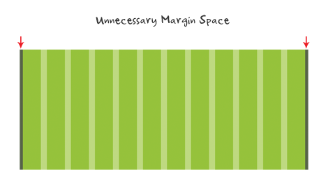
Unnecessary Left and Right Margin
To those who don’t know, the content width in 960gs is actually 940px, not 960px. It is 960px because of the added margin space on the left and right. Some people argue that this margin space helps visibility on mobile devices such as the iPhone and iPad. Technically, if there is a margin required, it should be applied on the container, not the columns.
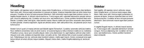
Too Many Classes
Visual aesthetic might be a personal biased but, even so, there seems to be some fundamental CSS issues as well. Below is a sample case. To achieve the layout result I’ve designed here, with 960gs, you will be required to add extra CSS classes: alpha, omega, and clear. The alpha & omega class is required to get rid of the margin space on the left and right hand sides of the columns. A clear class is also required to clear the floats after each row of columns.

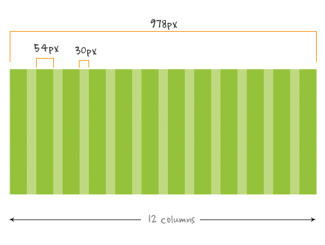
The Simpler 978px Grid (demo)
The 978px grid that I mentioned in my previous article got rid of the unnecessary left and right margin. As a result, the content width is increased by 38px. The gutter space has incresed from 20px to 30px. It still fits in the 1024 default display and the columns can be divided in any number of ways: 1/11, 3/3/3/3, 4/4/4, 3/9, etc.
978px HTML & CSS (demo)
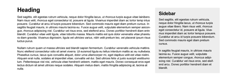
The following is a simpler CSS grid that Darcy and I came up with and deals with scenarios, like the "Too Many Classes", in an elegant way. There is only a left margin on the grids which creates the gutter space. Grid12 is not required because grid12 is the width of the container. There is no .alpha or .omega class, but a single.first class required for the first column in every new row. The purpose of the .first class is to clear the floats and get rid of the left margin space. Since the .first class clears the float, a.clear class is not required after each row.
.container { width: 978px; margin: 0 auto; } .grid1, .grid2, .grid3, .grid4, .grid5, .grid6, .grid7, .grid8, .grid9, .grid10,
.grid11 {float: left; margin-left: 30px; } .grid1 {width: 54px;} .grid2 {width: 138px;} .grid3 {width: 222px;} .grid4 {width: 306px;} .grid5 {width: 390px;} .grid6 {width: 474px;} .grid7 {width: 558px;} .grid8 {width: 642px;} .grid9 {width: 726px;} .grid10 {width: 810px;} .grid11 {width: 894px;} .first {margin-left: 0; clear: left; }
The Simpler 940px Grid (demo)
If you really want to keep the golden ratio, you can achieve the same result with this simpler grid. For those that argue the left and right margin is required to prevent the content from being trimed off in the mobile devices should think about appling that space to the container, not the columns themselves.
Labels: CSS


1 Comments:
Great Post... Thank you..
Post a Comment
Subscribe to Post Comments [Atom]
<< Home