Friday, November 28, 2008

How To Make a jQuery Calendar

Whether you’re an airline, task manager, or just have a birthdate field on your registration form, a popup date picker makes selecting dates considerably easier for users, and overall enhances the functionality and feel of the site. jQuery UI provides a datepicker widget that can easily be incorporated into your site.

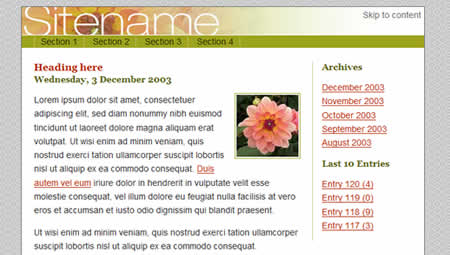
The Finished Datepicker Example

Getting Started

In order to use the datepicker, we need to download it from the jQuery UI download page and link it into our page as we do with the jQuery library. Applying the datepicker requires no HTML changes, and instead simply attaches itself to existing input fields. This is done with a single line of code:


$('#trip input#leavedate').datepicker();

The standard date picker that is shown is admittedly fairly ugly and impractical in both size and look.

Standard date picker

Customization

The real power of jQuery’s datepicker is the level of customization. We’ll go through three quick steps toward creating a datepicker that’s right for our example situation. This should give you enough examples and variations for you to choose the right parameters for your situation, too.

Styling

First up, we’re going to make the calendar popup itself a little more appealing for the sake of making more practical decisions around the actual placement of the calendar. jQuery provides a handful of CSS stylesheets to chose from, but you can of course always write your own or modify them if you don’t like them. With the first theme, the calendar looks like this:

Date picker with default style

Date Format

Specifying the date format is just a matter of passing a parameter to the .datepicker() initialization function. Here are some common formats:


$('#trip input#leavedate').datepicker({ dateFormat: $.datepicker.W3C }); // 2008-01-31
$('#trip input#leavedate').datepicker({ dateFormat: 'mm/dd/y' }); // 01/31/08
$('#trip input#leavedate').datepicker({ dateFormat: 'm/d/yy' }); // 1/31/2008
$('#trip input#leavedate').datepicker({ dateFormat: 'M d, yy' }); // Jan 31, 2008
$('#trip input#leavedate').datepicker({ dateFormat: 'MM d, yy' }); // January 31, 2008
$('#trip input#leavedate').datepicker({ dateFormat: 'D, M d, yy' }); // Thurs, Jan 31, 2008

This leaves you with control over the order, separaters (slash, dash, or space), whether or not you want leading zeros on your days or months, whether you want numbers or words, and what you include or omit (year, day name, etc.).

These affect the format that the date shows up in the field after you select it:

Date picker with an alternate date format

Behavior

The last customization that we’re going to look at here is the popup behavior. By default, the event is attached to the focus of the input field that the datepicker widget is attached to. This can easily be changed so that the event is attached to either a button or an image next to the field instead.


$('#trip input#leavedate').datepicker({ showOn: 'button', buttonImage: 'calendar.gif',
buttonImageOnly: true });

This makes the calendar popup look like this:

Date picker with icon for behavior

Wrapping Everything Up

These customizations are what make the jQuery datepicker UI widget so powerful, as the widget is practical in a variety of situations. The following is the completed example using the customizations discussed above.

...
...

via :designreviver

Labels: , ,


Wednesday, November 26, 2008

7 CSS Hacks that we should use+

If you are trying to do pixel-perfect cross-browser CSS layout, then you have probably ran into problems with IE . I am going to highlight the top 7 CSS hacks that we often use to have pixel perfect design.

1)Box Model Hack

The box model hack is used to fix a rendering problem in pre-IE 6 browsers, where the border and padding are included in the width of an element, as opposed to added on

 padding: 4em; border: 1em solid red; width: 30em; width/**/:/**/ 25em;
2) Conditional Comments

These conditional comments are for IE-only and they’re not supported by any other browser. For other browsers they are just an ordinary comments and therefor, they are safe to use.

The typical usage is as follows:

<!--[if IE]>    Some CssCode<![endif]-->

The above code applies to all versions of Internet Explorer, i.e. 5.01, 5.5 and 6.0, but now we want to apply it to versions of Internet Explorer, i.e. 5.01, 5.5 and 6.0, so we will apply the following condition:

<!--[if lte IE 6]>    Some Css Code<![endif]-->

After we finish testing, we remove all hacks to separate file(s), so the main CSS is clean and tidy. This separate file is then called in the header section of a file within conditional comments.

<!--[if lte IE 6]>    <link rel="stylesheet" type="text/css" href="ie_hacks.css">
<![endif]--> <!--/code-->

Condition is one of the following:

  • IE (Any version of IE)
  • lt IE version (Versions less than version)
  • lte IE version(Versions less than or equal to version)
  • IE version (Only version)
  • gte IE version (Versions greater than or equal to version)
  • gt IE version (Versions greater than version)

Version is the version of Internet Explorer, typically 5, 5.5, 6, or 7, you can read more info about this at Quirksmode.

3) Min-width and Max-width of an element

IE doesn’t understand this command, so we’ll need a new way of making this work in this browser. Let’s take a quick example, we need to apply this to a div with id="wrapper":

Next we create our CSS commands, so as to create a minimum width of 750px:

 #wrapper{min-width: 750px;width:expression(document.body.clientWidth <>

You might also want to combine this minimum width of 750px with a maximum width 1220px:

#wrapper{min-width: 750px;max-width: 1220px;
width:expression(document.body.clientWidth <> 1220? "1220px" : "auto");}

Another Alternative for for min-height without javascript is to use Dustin Diaz’ nice hack: :

#id{ min-height: 100px; height:auto !important; height:100px; } 

4) Easy Selectors

Most in-CSS hacks deal with selector bugs. Below is a list of different IE versions and the beginnings of selectors that are known to select elements in them. All of these selectors use valid CSS.

  • IE 6 and below
    * html {}
  • IE 7 and below
    *:first-child+html {} * html {}
  • IE 7 only
    *:first-child+html {}
  • IE 7 and modern browsers only
     html>body {}
  • Modern browsers only (not IE 7)
     html>/**/body {}
  • Recent Opera versions 9 and below
    html:first-child {} 
5)Whatever: hover

The :hover selector enables you to have cool effect for html elements like and in tables.Most browsers have no problem with this, except IE which look at the stylesheets and each individual rule with javascript.
If :hover rules can be tracked, and .htc can be used to change an elements behavior, then it should be possible to create a behavior that enables :hover for any element.

You can read more about this here

6)Transparent PNGs

IE dosn’t handle transparent PNG too well. You’ll get an ugly grayish type background wherever it’s supposed to be transparent. And we cann’t just use GIFs because aren’t good for higher resolution images. So we need a CSS hack to fix this. Follow the following steps and you will be set:

  • A HTC script and a transparent GIF will be used to solve this issue. You can download both files here
  • Now just upload these 2 files to wherever you store your IE.css file.
  • Add one simple line of CSS code to your ie.css file:
     img.pngfix {  behavior: url(pngHack.htc); }

Another solution can be found at Komodomedia

7) Stylegala- No More CSS Hacks

Stylegala’s method is to detect browser version and serve different CSS rules to different user agents, without using hacks or conditional comments. At the same time the end user or validator will never see the CSS rules specified for other browsers than the one they are using. He used some simple PHP code to detect browser type exactly as any CSS hack.

via :noupe

Labels: ,


40+ CSS Layouts Tutorials, Tips, Demos and Best Practices

The main idea behind CSS-based layouts is offering more flexibility and enhancing the visual experience of visitors. Some important tips and related key-factors can help to learn basics and keep essential techniques in mind. And this is what this article is all about. Finding the perfect Layout that have Total Flexibility, Equal Height Columns and just works fine.

So we’ve decided to take a deep look at articles about CSS-based layouts and the result was a list of 40 tutorials, resources and best practices offering gorgeous and valid CSS-based Layouts.

CSS Layout Tutorials

1-Three column fixed layout structure using CSS- This post explains how to realize an HTML/CSS basic structure to design a simple three column fixed page layout with standard elements (logo top bar, navigation bar, text stage, center column for post categories and right column to insert Google AdSense 120X600 ads), to use in your projects.

css layouts


2-Design page layout using CSS- How to design page’s layout for your site using a css file.

css layouts


3-How To Create a Horizontally Scrolling Site- Different techniques for creating horizontally scrolling layouts.

css layouts


4-Super Simple Two Column Layout- Different techniques for creating horizontally scrolling layouts.

css layouts


5-Simple 2 column CSS layout- This is a tutorial on how to use CSS to create a simple two column layout. The layout consists of a header, a horizontal navigation bar, a main content column, a sidebar, and a footer. It is also horizontally centered in the browser window.

css layouts


6-The holy grail layout - 3 columns and a lot less problems - This is a article discuss the three columns – two fixed-width sidebars and a fluid center column, all while keeping the markup clean and semantic, and most importantly well structured.

css layouts


7-CSS Centering 101- How to center a fixed-width layout using CSS

8-Creating a CSS layout from scratch- This guide will attempt to take you step by step, through the process of creating a fully functioning CSS layout.

css layouts


9-Multi-Column Layouts Climb Out of the Box- Multiple columns, equal column heights, fixed or liquid center column, clean markup, and CSS.

css layouts


10- In search of the One True Layout- Total Layout Flexibility, Equal Height Columns, Vertical placement of elements across grids/columns. This article shows how to achieve each of these goals, and then how to combine them, creating what could be called the One True Layout

css layouts


11-From PSD to HTML, Building a Set of Website Designs Step by Step-The entire process of getting from Photoshop to completed HTML.

css layouts


12- 5 Tips for coding xhtml/css layouts- These are few tips that could help you out in the transition from table-based web design to standards compliant css based layouts.


13-Designing a CSS based template- This is the start of a step-by-step based tutorial about how to create a CSS based template page. This will be a tutorial consisting of several parts: part 1 covers the creation of the navigation buttons in Photoshop CS*, the 2nd part will be the creation of the background, next on the list is the header and layout of the page and the final part will be the implementation in CSS and XHTML.

css layouts


14-Breaking Out of the Box With CSS Layouts- If you understand how the grid works, you can fracture or abstract that grid to make your layout more dynamic and interesting. In achieving this goal (while supporting flexibility and maintainability), CSS designs have so much more to offer than table-based layouts. Jina Bolton explains how to acheive this goal.

css layouts


15-Advanced CSS Layouts: Step by Step- The ultimate goal of this tutorial is to create a CSS layout that exactly resembles the WebReference.com layout made with tables and also behaves well with small window sizes and large fonts.

css layouts


16-6 Keys to Understanding Modern CSS-based Layouts-
These are the six things that will help people understand CSS-based layouts: Box Model, Floated Columns, Sizing Using Ems, Image Replacement, Floated Navigation and Sprites.


17-Are you making these common blog layout mistakes?-
Discussing 4 mistakes in basic blog layout are all too common and all too easy to fix.


18-Page Layout-
A practical guide for positioing and floating elements in a CSS page layout.


19-Site in an Hour- Making Simple Work of Complex CSS Layouts

css layouts


The best Layouts Resources

Most of these demonstrations can be used without asking for permission. However, some will require email approval first. Just check each site for the copyright requirements before use.

20-Sample CSS Page Layouts- Here are a range of CSS page layouts, including 2 column and 3 column layouts.

css layouts


21-The Perfect 3 Column Liquid Layout (Percentage widths)- No CSS hacks. SEO friendly. No Images. No JavaScript. Cross-browser & iPhone compatible.

css layouts


22-CSS TEMPLATES AND SAMPLES

css layouts


23-IM Layouts- IM Layouts is a simple CSS layout system. IM Layouts offer full Grade-A browser support.

css layouts


24-CSSplay - CSS Layout Listing

css layouts


25-Layoutgala - Getting the maximum number of layouts based on the same markup, each with valid CSS and HTML, without hacks nor workaround and a good cross-browser compatibility. The result is a set of 40 layouts.

css layouts


26-Glish- Many useful cross-browser CSS layout techniques

css layouts


27-Thenoodleincident- CSS Boxes going from a simple single box, through 3 columns with a full width top box, all with variations.

css layouts


28-The Layout Reservoir- Many useful CSS layout techniques

css layouts


29-The only CSS layout you need- In this article you are presented to ten different layouts with example pages, all based on the same HTML.

css layouts


30-Yet Another Multicolumn Layout- is an (X)HTML/CSS framework for creating modern and flexible floated layouts. The structure is extremely versatile in its programming and absolutely accessible for end users.

  • Download YAML here.

31-Liquid Designs- Liquid Designs is a gallery of websites designed with liquid layouts using XHTML and CSS


Best Practices

Also if you are looking for inspiration for CSS-based layout designs, you will find a nice collection of websites below. These sites show how css layouts can be applied on various type of sites. Check out how the layout can be divided into 2 columns, 3 columns, a mixture of narrow and wide columns.

32-Helldesign

css layouts


33-Silverbackapp

css layouts


34-OS communications informatiques

css layouts


35-Rockatee

css layouts


136-Darrenhoyt

css layouts


37-Makebetterwebsites

css layouts


38-Elitetheme

css layouts


39-Studio7designs

css layouts


40-Brightcreative

css layouts

via :noupe

Labels: ,


Tuesday, November 25, 2008

CSS2 - Cascading Style Sheets Level 2

Introduction to CSS2

This article is not meant to teach you Cascading Style Sheets. If you are looking for a CSS tutorial, you should start with the previous link or try the Free CSS Class. In this article you will learn the basics of CSS2 and how it differs from Cascading Style Sheets, level 1.

Cascading Style Sheets, level 2, supports all of the functionality of CSS1. This means that if you create a CSS1 style sheet, it will work in a user agent that understands CSS2. Plus, the way that CSS1 is written, if you write a CSS2 style sheet, and load it in a CSS1-only user agent, that agent will simply ignore the elements and properties that it doesn't recognize.

Differences Between CSS1 and CSS2

There are some really interesting differences between Cascading Style Sheets level 1 and level 2. CSS2 offers many new options for accessibility and use across various user agents. Positioning in CSS2 is more flexible and offers more options to the designer. Automated content allows developers to force the user agent to display specific content elements as well as the layout, look, and feel. Also there is support for special cursors in CSS2 as well as dynamic outlining.

Accessibility and CSS2

  • Aural style sheets
    With CSS2, there are now style properties to define an aural style sheet for your documents. This means, that if a customer comes to your Web page with a screen reader that is CSS2 enabled, you can define how your page will sound. And this isn't just useful for blind customers, with aural CSS your documents can be listened to in automobiles, as auditory documentation for training, entertainment, and even for people who simply can't read.
  • Paging
    CSS1 dealt almost solely with "continuous media" - that is, media like Web pages that would run continuously until the end. Paged media, such as paper, slide shows, or transparencies were not handled. But with CSS2, it is possible to define how pages should be displayed or printed. This means that you can specify the size of the page to be printed, add things like crop marks and register marks, or how the page should layout on double- and single-sided printings.
  • Media Types
    CSS2 media types allow you to specify different style rules depending upon how your document is going to be displayed. There are many different types you can specify, including: aural, braille, handheld, screen, print, and tv (plus others).
  • International Accessibility Features
    CSS2 now offers features such as more list styles for international documents, support for bidirectional text, and language-sensitive quotation marks.

Improved Features over CSS1

  • Font selection
    When choosing which font to use, CSS2 offers both the standard "name matching" system that CSS1 uses, plus three other methods for defining fonts. These are: intelligent font matching, where the user agent uses a font that is the closest match to the requested font. Font synthesis, where the user agent creates a font that matches the metrics of the requested font. And font download, where the user agent retrieves a font over the Web.
  • Tables
    CSS2 recognizes that there might not be a table element (and related elements) in an XML document - but to display tabular data, it is important to have this as a style. So CSS2 allows you to define any element as a table element (and all the related table elements).
  • Positioning
    While CSS1 had some aspects of positioning, CSS2 takes it to the next level. Relative and absolute positioning determine their location based on their placement within the document or based on the user agent. But along with absolute positioning is the concept of fixed positioning. This acts as a sort of "watermark" in continuous media. In paged media, an element with fixed position is repeated on every page. This allows you to create frame-like documents or place a signature on every page of a document.
  • Cursors
    Now you can define how you want your cursor to respond to various actions. For example, you might want the default behavior over a link to be changed over some of the links in your document. With CSS2 you can define how the cursor should look over any element.

There are many other features that are new with CSS2, but these are some of the most exciting ones. There are also elements like text-shadows, new pseudo-classes, the use of system colors, and dynamic outlines. You can find out more about the differences between CSS1 and CSS2 on the W3C Web site.

Labels: ,


50 Free Photoshop Brush Sets for Modern Design Trends

Janet Jackson and Luther Vandross were right when they sang, “the best things in life are free”. There are many talented designers out there who choose to help the community by providing free and useful Photoshop brush sets that you can download and use on your artwork.

In this collection, you’ll find over 50 free Photoshop brush sets for current design trends and styles such as vintage, retro, grunge, hand-drawn, swirls, and nature-inspired.

Note: It’s important to read the fine-print - some designers require attribution or have special requirements for commercial use. Even if they don’t require any credit, it’s always highly-appreciated to give them some anyways.

Vintage and Retro

Darger-esque

Darger-esque screen shot.
Download (Volume 1) | Download (Volume 2)

Girls in Trouble & Rebel Teens

Girls in Trouble & Rebel Teens screen shot.
Download

Transportation Part 1

Transportation Part 1 screen shot
Download

Vintage Stamps

Vintage Stamps screen shot.
Download

Old Photo Frame Brushes

Old Photo Frame Brushes screen shot.
Download

Vienna Brushes

Vienna Brushes screen shot.
Download

Alex Dukal Photoshop Stamp Brushes

Alex Dukal Photoshop Stamp Brushes screen shot.
Download

Newspaper Ads From The 60’s

Newspaper Ads From The 60s - screen shot.
Download

Rusty 80’s Arcades

Rusty 80's Arcades screen shot.
Download

Dot Splatter

Dot Splatter - screen shot.
Download

36 Vector Brushes

36 Vector Brushes - screen shot.
Download

240 Retro Dynamic Brushes

240 Retro Dynamic Brushes - screen shot.
Download

Grunge

Grunge Typo

Grunge Typo - screen shot.
Download

Grunge Photoshop Brushes Set

Grunge Photoshop Brushes Set - screen shot.
Download

Urban Decay Photoshop Brushes

Urban Decay Photoshop Brushes - screen shot.
Download

QuadGrunged

QuadGrunged - screen shot.
Download

Typographic Grunge Brushes

Typographic Grunge Brushes - screen shot.
Download

Grungy Texture

Grungy Texture - screen shot.
Download (CS 3) | Download (CS 1) | Download (PNG)

Grungy Watercolor

Grungy Watercolor - screen shot.
Download CS 3 | Download CS 1 | Download (PNG)

Grungy Wings

Grungy Wings - screen shot.
Download (CS3) | Download (CS1) | Download (PNG)

Grunge-Rust Brush

Grunge-Rust Brush - screen shot.
Download

Hi-Res messy photoshop brushes

Hi-Res messy photoshop brushes - screen shot.
Download

Sidewalk Series Vol. 1 Cracks

Sidewalk Series Vol. 1 Cracks - screen shot.
Download

Sidewalk Series Vol. 2 Oil Stains

Sidewalk Series Vol. 2 Oil Stains - screen shot.
Download

Sidewalk Series Vol. 3 Concrete Rust

Sidewalk Series Vol. 3 Concrete Rust - screen shot.
Download

Grunge Brushes 3

Grunge Brushes 3 - screen shot.
Download

Water Color and Paint

Hi-Res Watercolor Photoshop Brushes

Hi-Res Watercolor Photoshop Brushes - screen shot.
Download (Part 1 - CS 3) | Download (Part 1 - CS1) | Download (Part 2 - CS 3) | Download (Part 2 - CS 1) | Download Part 2 - PNG)

20 watercolor Brushes

20 watercolor Brushes - screen shot.
Download

WaterColor Reloaded

WaterColor Reloaded - screen shot.
Download

Messy Spraypaint

Messy Spraypaint - screen shot.
Download CS 3 | Download CS 1 | Download PNG

Go Media Spray Paint - Photoshop Brush Set

Go Media Spray Paint - Photoshop Brush Set - screen shot.
Download

Hi-Res Splatter Photoshop Brushes

Hi-Res Splatter Photoshop Brushes - screen shot.
Download (CS 3) | Download (CS 1) | Download (PNG)

Splatter Brushes

Splatter Brushes - screen shot.
Download

Hand Drawn

Doodles

Doodles - screen shot.
Download (Part 1) | Download (Part 2)

Pencil Traces (hand drawn)

Pencil Traces (hand drawn) - screen shot.
Download

stencil word brushes

stencil word brushes - screen shot.
Download

Hand Drawn Floral Pattern Brushes

Hand Drawn Floral Pattern Brushes - screen shot.
Download

Graffiti Photoshop Brushes

Graffiti Photoshop Brushes - screen shot.
Download

Urban Scrawl

Urban Scrawl - screen shot.
Download

Swirls

Swirls Brushes

Swirls Brushes - screen shot.
Download (Part 1) | Download (Part 2) | Download (Part 3)

Swirly Brushes

Swirly Brushes - screen shot.
Download

big swirl brushes

big swirl brushes - screen shot.
Download

Wavy Lines

Wavy Lines - screen shot.
Download

Fractal Brush Set

Fractal Brush Set - screen shot.
Download

Watercolor Swirls

Watercolor Swirls - screen shot.
Download

Floral, Nature, Plants

Floral

Floral - screen shot.
Download (CS 3) | Download (CS 1) | Download (PNG)

Wood Series Vol. 2 Tennessee Leaves

Wood Series Vol. 2 Tennessee Leaves - screen shot.
Download

Floral Brushes

Floral Brushes - screen shot.
Download

Leaves

Leaves - screen shot.
Download (CS 3) | Download (CS 1) | Download (PNG)

Suddenly Spring

Suddenly Spring - screen shot.
Download

via : sixrevisions

Labels: ,