Wednesday, September 29, 2010

The Simple CSS Grid

Narrow Gutter Space

I did a quick Photoshop mockup to show how 20px gutter space would look like on 960gs. The gutter is a bit too narrow for modern design.
narrow gutter

To solve this small gutter problem, a lot of people add padding to either the content area or sidebar containers, making that subsequent content area smaller.
narrow gutter solution


Unnecessary Left and Right Margin

To those who don’t know, the content width in 960gs is actually 940px, not 960px. It is 960px because of the added margin space on the left and right. Some people argue that this margin space helps visibility on mobile devices such as the iPhone and iPad. Technically, if there is a margin required, it should be applied on the container, not the columns.
unnecessary margin


Too Many Classes

Visual aesthetic might be a personal biased but, even so, there seems to be some fundamental CSS issues as well. Below is a sample case. To achieve the layout result I’ve designed here, with 960gs, you will be required to add extra CSS classes: alpha, omega, and clear. The alpha & omega class is required to get rid of the margin space on the left and right hand sides of the columns. A clear class is also required to clear the floats after each row of columns.
too many classes

The Simpler 978px Grid (demo)

The 978px grid that I mentioned in my previous article got rid of the unnecessary left and right margin. As a result, the content width is increased by 38px. The gutter space has incresed from 20px to 30px. It still fits in the 1024 default display and the columns can be divided in any number of ways: 1/11, 3/3/3/3, 4/4/4, 3/9, etc.
978 grid

978px HTML & CSS (demo)

The following is a simpler CSS grid that Darcy and I came up with and deals with scenarios, like the "Too Many Classes", in an elegant way. There is only a left margin on the grids which creates the gutter space. Grid12 is not required because grid12 is the width of the container. There is no .alpha or .omega class, but a single.first class required for the first column in every new row. The purpose of the .first class is to clear the floats and get rid of the left margin space. Since the .first class clears the float, a.clear class is not required after each row.

.container {   width: 978px;   margin: 0 auto;  } 
.grid1, .grid2, .grid3, .grid4, .grid5, .grid6, .grid7, .grid8, .grid9, .grid10, 
.grid11 {float: left;   margin-left: 30px;  } 
.grid1 {width: 54px;} 
.grid2 {width: 138px;} 
.grid3 {width: 222px;} 
.grid4 {width: 306px;} 
.grid5 {width: 390px;} 
.grid6 {width: 474px;} 
.grid7 {width: 558px;} 
.grid8 {width: 642px;} 
.grid9 {width: 726px;} 
.grid10 {width: 810px;} 
.grid11 {width: 894px;} 
.first {margin-left: 0; 
clear: left;  } 
 

The Simpler 940px Grid (demo)

If you really want to keep the golden ratio, you can achieve the same result with this simpler grid. For those that argue the left and right margin is required to prevent the content from being trimed off in the mobile devices should think about appling that space to the container, not the columns themselves.

Labels:


Friday, September 24, 2010

10 short tips on how to design for web

This post will help you through some of the greatest issues with design for web and hopefully give you something to think about when you start your next design for web.

1. Remember you have very little time on your hands

I read somewhere that average page visit throughout the entire internet is only 4 seconds. That doesn't give you enough time to make an impression on the user and get him engaged with your site. That means that you have to be as precise as possible in explaining what the site you are designing is all about. If it takes more than few seconds for user to figure out what the website is all about, he will loose interest and browse away.

2. Remember that user scan the web

When you walk into the room you don't see every single face there. First you only notice shapes of people and stuff that are inside. You scan the room. Then you move on to something that grabs the attention. Similar thing happens with first visit to the website. Users scan it first. This is the point where you need to guide user wherever you want him to go. It can be a login button, learn more button, conversion form, blog post.

3. Up-left corner of the web site is most visible

This is well known fact. The main reason for this is that people read books and articles that way (starting from up left corner) plus the early web sites and applications were designed that way. We often put logo in top left corner, and that is a good thing. But think about adding another element or two up there to make it more prominent (login link, search from, slogan...)

4. Learn about F pattern

Some eye-tracking case studies proves that users scan the web in a shape of a letter F. Top area gets scanned all the way, middle area half way through and lower area gets scanned only on the left side. Just something to think about when you're having doubts on where to put content blocks in your designs.

5. Learn what users ignore

Users are ad-blind. They learned to ignore banner ads or text ads. Avoid designing anything that looks like an ad. Also, users ignore large blocks of text. Nobody has the time (actually I would say patience!) to read great blocks of text just to get an idea of what the page is about.

6. Text vs graphics

One interesting fact. Text grabs more attention than any cool graphic! If you want to deliver a message to your reader I suggest using a large slogan instead of cool header image.

7. Grab attention with design elements

Good elements for grabbing attention are text slogans, call to action buttons (usually using bright colors), various 1-2-3 steps list or lists in general.
If you're writing a long article one of the most important things are headings. Headings grab attention like nothing else. Use the headings properly, explain the user what the article is about in just those few simple steps.

8. Text Formatting

Text has more chance of being read when it's formatted properly. Don't be afraid to use many paragraphs, bold and italic text blocks, blockquotes, underlined or upper-case text... Anything that makes your text block more visually attractive. Of course, you need to use formatting to emphasize important words or sentences and guide your reader through the article.

9. Use clean graphics

I already mentioned that users are ad blind. When you use graphics in your design make sure that they're not too busy, messy and non-understandable. Many people will find it hard to look at the image that is too busy or colorful. Graphics needs to be clean and non-confusing.
What you can use to grab attention with graphics are people faces, especially when eyes on the photo are looking at the user. Also you can use eyes on the photo to “point” users to a certain direction.

10. Use whitespace

Use whitespace to give some element more visibility. If a certain element is too close to margins or other elements the things will be confusing and messy. Give it some “air to breathe”. This especially applies to text blocks.

Labels:


Monday, September 20, 2010

Capture anything you see on your PC screen!


SnapIt Screen Capture 3.7

SnapIt is easy to use screen capture software which allows you to easily capture anything on the screen  including windows, menus, full screen, rectangular regions, web pages and take shots of moving images.

- Supports hotkeys, auto-saving, clipboard
- Automatically copies screenshots to the clipboard
- Tracks capture history, auto-saves captured images
- Saves files in BMP, GIF, JPEG, PNG and TIFF formats
- Auto-names captured images

Download and install SnapIt Screen Capture 3.7.109751:
http://digeus.com/downloads/snapit/files/3/snapit_3_7.exe

Learn more what is included in SnapIt Screen Capture 3.7.109751:
http://www.digeus.com/products/snapit/snapit_screen_capture_3_5.html

Labels:


Wednesday, September 15, 2010

Eight Rules for Effective Web Forms

If you're looking to collect information from your users, there isn't a much easier or more straightforward method than a Web form. If designed well, Web forms provide valuable information; if not, they may scare users away. With this in mind, here are a few key tenets of Web form design that every designer should know.

1. Build Conservatively and Design With a Purpose

Let's face it: No one likes spending a long time filling out a form. Keep it short and simple and eliminate elements that aren't absolutely necessary or that don't offer a tangible benefit. Make sure every part of your form is pulling its weight, and your users will thank you.

The structure of your form should serve just as much of a functional purpose as its elements. When laying out your form, keep in mind that, at least in the Western world, people read from top to bottom and left to right. They also often use the Tab key to move around the form. Your design should reflect this through intuitive labeling and natural placement of elements. And, of course, your form should never look scattered or haphazard — make sure everything is evenly spaced and neatly arranged.

Here are a few standard form layouts that you should use as a starting point for more creative designs:

Left-Aligned Labels With Vertically Stacked Fields
Form with left-aligned labels and vertically stacked input fields
This form features left-aligned labels with neatly ordered fields stacked on top of one another. This gives the eye an easy-to-follow path down the form, which is especially helpful if you're asking questions users may not be familiar with. Because they're able to read down the list of questions without the visual interruption of an input field, they'll be able to concentrate more on what you're asking. This layout does tend to make for longer form completion times because of the amount of time it takes for the eye to move from the label to the input field.

Right-Aligned Labels With Vertically Stacked Fields

Form with right-aligned labels and vertically stacked input fields
Right-aligning your labels can help make them easier to distinguish and quicker to read, and also eliminates awkward spaces between labels and input fields. However, this can be harder to read. It also looks jagged, which can be a bit unattractive.

Top-Aligned Labels

Form with top-aligned labels and input fields with variable stacking
Top-aligned labels like these make for a form that's quicker and easier to fill out because the eye doesn't have to move as far between the label and the input field. This type of layout also gives you the freedom to place related fields next to each other, which can save space.

2. Tailor Your Form to the Situation

Every form you make should be tailored to the specific situation it addresses. When you're planning the design of your form, ask yourself the following questions: What are you asking? Why? What does your Web design look like with and without the form? Is the form something users want to fill out, or is it something they're required to fill out? Your answers to these questions should help dictate the layout and content of your form.

3. Use What You Need

When deciding whether to add an element to your form, ask yourself if you could do without it. If the answer is "yes," don’t use it.

One element that's almost always unnecessary is the Reset button. These relics still make an appearance now and then, but they should be avoided. Think about it: When you want to change information on a form, it doesn't matter if the field is already filled out or not, so why would you even need to erase all the information? The only thing the Reset button is good for is accidentally clearing all the information your user just entered and aggravating them enough that they'll go somewhere else instead of taking the effort to fill out the form again.

4. Use Short, Clean Descriptions When Necessary

You may need to explain why you are collecting certain information on your form, especially when users are loathe to share it, like with phone numbers or e-mail addresses. This not only helps reduce user confusion, but also ensures that the data is accurate and correctly formatted.

Any descriptions and comments should be clean and concise. You may also want to format them with different colors, sizes, or styles to help set them apart. Just be sure not to overdo it — after all, you don’t want your descriptions to look tacky or drown out the rest of your form. This form, which asks for information in order to provide a quote for printing services, is a good example of a form that effectively uses descriptions:

A form requesting containing short but informative descriptions

5. Be the First to Communicate

Make sure the wording in your form is friendly and user oriented. Here's a simple trick for writing conversational copy: Pretend you're actually talking with your user.

If you want to know someone’s name, you aren’t going to stare them in the eyes with a rigid expression and demand, "Full name." That would just be creepy. If you were looking to garner a positive response from this person, you would instead open with a smile and say, "Hi, what’s your name?"

Keeping this in mind, instead of prompting your user with the label "Full Name," try something a little more personable, like, "What's your name?"

6. Divide the Form Into Bite-Sized Sections

Communication involves the exchange of ideas in small, manageable sections. You introduce yourself, and the other person does the same. You mention what you do for a living, and the other person has a comment or question. You remark back, or answer, and this prompts another response. In a good conversation, the information is a steady, back-and-forth flow.

A form, being another method of communication, should be the same way. You may be asking for quite a bit of information, but that doesn't mean you have to throw it all at the user in a huge block. Try using horizontal rules, colored bars, meaningful images, or headings that match the design of your site to separate the information into small, easily understood chunks. If all else fails, spread your form out across multiple pages and add a progress bar across the top so users know about how much they have left.

7. Include Meaningful Contextual Error Messages

Your error messages should be helpful and clear. Specify in the message which field caused the error, and highlight the label and/or the field itself. After all, no one likes hunting through a form for an elusive field they overlooked the first time around.

8. Release the User

When the user clicks the Submit button, they think they're done, and they're ready to move on. They’re basically saying, "Here's the info you wanted. Talk to you later!" 

In a real conversation, you'd give them a wave, say, "Bye," and walk off, or give them some other way of acknowledging that the communication is done. Your form should be no different. Have your form programmed so it sends the user to a custom page that tells them something like, "Thank you for your submission! You'll be hearing from us shortly." There should also be a link back to the main page of your Website.

And that's it! Keep these rules in mind when designing your next Web form, and you may be surprised at the quantity and quality of feedback you receive as a result.

Labels:


Wednesday, September 1, 2010

Designing By Numbers: Data Analysis for Web Designers


Designing By Numbers: Data Analysis for Web Designers

Judging what’s best for an audience is never far from the web designer’s mind. The ability to predict whether a web design will soar like an eagle or sink like the Titanic is among the most subjective and complex measurements you will encounter.

While resources that explain best practices exist, and your visitors contacting you about serious issues and offering you feedback relating to your site will occur if you have the proper mechanisms in place — it’s ultimately your responsibility to be proactive and research, investigate, and determine the what, why and how to ensure widespread usability.

Designing by Numbers

Before we examine the types of statistical information you should be looking at — and the relevance they have to your web design projects — we first need to go over the 3 single-word questions that relate directly to all the design decisions you will make.

These 3 questions are ultimately at the heart of your research, analytics and motivation behind designing by the numbers.

What, why, and how is a simple design process that:
  1. Defines what the issue is
  2. Proves why it is an issue
  3. Determines how to fix the issue with the optimal solution (if it is an issue)

What?

Of all the questions that may enter the mind of a web designer, "What?" is probably the word that relates to the task at hand. The process of understanding relevance and the usefulness of information explicitly relates to the decisions we undertake.
  • What do site users need?
  • What things frustrate site users?
  • What can I do in this design to accomplish the site’s objectives?
  • What’s wrong with the site?
  • What’s right about the site?
  • What can be made better?
  •  
Asking "What?" will yield to a lot of information that will help you make optimal design decisions.


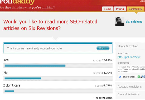
What your audience requires is a fundamental principle of designing by numbers. Get Satisfaction is a feedback tool you can use to help you design by the numbers.

Why?

Next on the list of list of determining factors is the question of "Why?"

Because making changes or implementations beyond what you initially set out to achieve may cost time, money or resources — the ability to back up your ideas with hard data and facts will be enough to even make the bean-counting bosses go weak at the knees and take your professional guidance and ideas more seriously.
  • Why are people not using the comments?
  • Why is the community participation on the site low?
  • Why are users having trouble finding what they need?
  • Why do we need to support Internet Explorer 6?
Knowing what needs to be done is one thing — knowing the justification to why it needs to be done is another.


Reasons for why cross-browser support should be implemented can easily be seen when you calculate the percentages of users that use certain browsers.

How?

The last single-word question is "How?" which makes sense in that once you know what needs doing and why it’s required, the method of actualizing the "What" is important.
  • How should I go about increasing user engagement?
  • How can this design improve community participation?
  • How can I fix the issue of users not finding the product they need?
  • How can I create a design that works in Internet Explorer 6?

Statistical/Gathering Methods

When determining the best course of action for your visitors, there are 3 essential statistic types that will come into play in helping to answer the "what" question. (We shall come to the "how" and the "why" later on, so don’t worry!)

Each of these data gathering techniques have their own benefits and pitfalls so there isn’t ultimately a perfect solution.

However, designers wanting a well-rounded experience would be better off using a mixture of all 3 as they not only give you a range of quantitative results (raw numbers) but also qualitative research (such as open-ended responses and feedback).

On-Site Data

On-site data are the kind of information you obtain from website analytics software and monitoring user activity on your website.

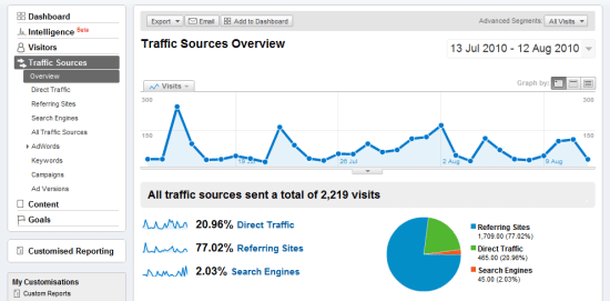
While this type of data is often ideal in that they relate directly to your visitors, it often takes a while for activity on a new website to build up — and as such, depending on these alone may leave you in the dark as to your visitor’s basic primary needs upon launching the service.

In sites with limited or no traffic, or sites that are still in development — analytics software fails because there is no (or limited) data sources; you’re pretty much in the dark.


Most websites have some kind of visitor tracking mechanism installed, such as Google Analytics.

Third-Party/Generalized Data

Independent data are often the most useful to new websites, usually produced by large firms who provide demographic services like Net Applications or W3Counter.

These third-party data-gathering sites offer a glimpse at the general population, and by that, it will include useful details such as the browsers and devices they use, their country of origin, and so forth.

On-Site data gathering methods is going to be more accurate and will reflect your particular situation much better — for example, a web development blog will have a different audience than a cooking blog) — but accounting for independent statistics can aid you by providing a baseline to work from, especially if you have no user base.


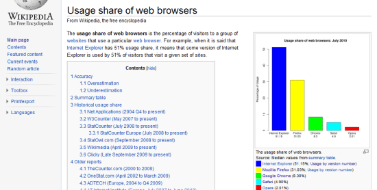
There are plenty of statistics on the web, you just need to look! The figure above shows statistics from A List Apart’s survey of web designers.

Social Data

Socially-sourced data are a relatively new concept that has come out of the rise of networking sites like Facebook or Twitter, where people can promote or discuss your creation through an external site.

While there are still a large number of people who aren’t interested in the "social" aspect of social networking, the importance of leveraging these statistics of what visitors like, dislike and their comments attributing to such information can actually be more useful (in different ways) to the conventional number-based statistics from analytics packages.


Social networking can provide you with useful feedback to work with.

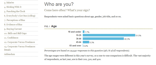
Designers Demographics

Now that we have covered the "what", we need to examine the "why" (and by association) the need to focus our attention on all the pretty percentages, pie charts and graphics that appear everywhere.

Ensuring your visitors can use and enjoy their experience with your web design is important and determining how we can provide that experience will all be down to using the statistics methods above and then narrowing the focus down onto what is most relevant for your audience.

While pretty numbers may seem impressive on their own, they’re not worth anything if they don’t speak to your niche, so successful sourcing of your data is critical.


Review websites are notorious for having subjective criteria of questionable validity.

If you’ve exhausted local statistics and have a general idea of the visitors you’re getting (and perhaps where they found you), and if you’ve gone further afield to seek out related demographics relating to research on an area which affects your niche, its worth going beyond the number crunching and seeking out "intelligent hits" that may help guide your decision making. Asking your community (or perhaps your competitions if you don’t have one!) what would enhance the experience can be great, just don’t try to please (or annoy) everyone and only implement what will benefit your users!


Getting to know your visitors can simply be a matter of knowing how to communicate.

With all of this information in regards to what you’re investigating the "why" (as in why changes need to be made) will become quite apparent. While it may seem natural, it’s quite easy to become so fixated on the number of visitors or re-tweets we get, that we actually ignore the most important thing a statistics package (or some solid research) can tell us – that our visitors will have their own specific set of needs and requirements that need addressing. As a final point on the matter of "why", if we don’t actively seek out ways to improve ourselves, we can’t hope to gain new customers.

Visitors may have JavaScript disabled which could leave them excluded from statistics.

A Quick Measurement

The next thing to take into account is how to filter the information once you’ve collected it (which meets the "how" element). Having lots of statistics and ideas may help, but filtering the stream of data will be critical to making sense of the best route to take in fixing a common problem or deciding the next step. The simplest way to prioritize your data is to follow the below, the higher up on the list the item is, the better and more potentially useful and reliable your research will be. Once the best information is extracted, you can refer to the numbers when making decisions for the design.


Determining the quality of your information is a mission critical part of the process.

Importance of Location:

  • Local
  • Independent
  • Social

Importance of Type:

  • Statistics
  • Research

Importance of Reliability:

  • Proven
  • Trends
  • Unproven

Importance of Margin:

  • Significant
  • Proportionate
  • Insignificant
Note: Using the above, a locally sourced bunch of statistics that are proven (by a significant margin) to be the best course of action would ultimately be the peak of what you can gather. Though as your research will lead to talking with customers, individual needs should be accounted for as well.

Variable Considerations

Before rounding up this article, it’s important that we consider the variables which may impact your statistics. While it’s great that there are plenty of studies that may assist you in decision making (like how to build a perfect font stack or what browsers you should support), it’s very important that we highlight the issues that will break down the cold harsh numbers and give you a little more to work with. Without making this article particularly heavy going (which isn’t the intention), the two types of variables you want to consider are mechanical and personal, and both relative to the visitor.

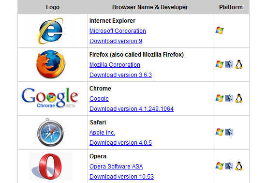
The first of these (mechanical) will directly affect the way in which your visitor interacts with your site, this isn’t as a result of their physical being, but more of their circumstances and equipment. In web design it’s obvious that the device used, the OS installed, the browser used, the scripting or plug-ins available or something else will affect their experience. While these are usually listed as independent statistics in packages, they are often related to each other in that a single user will contribute to a number of these breakdown listings, thereby it may directly affect the results.


Nothing forces greater demands on a website than the range of browsers that exist.

The second and probably one of the more important factors are the personal variables. The reason why these variables are so important is because they will often not appear in statistics packages and require you to undertake independent research to get the numbers or determine the viability of catering to their needs. Such factors include the accessibility level being required, the usability of a site (which won’t be a number) and the findability of information. While harder to pin down, it still makes sense to account for such variables as they directly and quite dramatically affect visitors.

Note: Error Margins also play a part in statistics, research made by a human rather than a computer can be subject to biases, errors and omissions – some of which may go unnoticed. The significance of information can also fluctuate depending on the audience who visit the site at any given time.

via: Six Revisions

Labels: