Friday, January 28, 2011

Top 10 Best Practices for HTML Email

Recently, I’ve found myself creating design, not for the web, but for HTML emails. It has been an experience reverting back to techniques used in the previous century, prior to the advent of CSS. I’ve also learned from mistakes made, and I’d like to share what I’ve learned with you.

Use a Email Management Service

Using one of the many services out there (i.e. ConstantContact, MailChimp, Lyris, etc.), you can send out effective and professionally designed HTML email communications without knowledge of HTML by using pre-established templates. These services also allow those marketers with the proper skills to create custom HTML emails. Most systems are designed to ensure the greatest compatibility with the greatest number of email clients. They also offer great reporting and metrics to provide information on open rate (for HTML emails only), clicked links, etc. Lastly, the systems handle all subscriber management tasks, such as subscribes, un-subscribes, etc.

Layout with Tables

After several years after migrating to using <divs> and CSS to layout web pages, it was awkward, but necessary to revert back to using tables for layout. This to ensure the greatest compatibility with the many email clients used. You should first use a “body” table at 100% width, especially if you plan to use a background color or image for email. This should be followed by a “container” table that will hold the content of your message. The width should be limited to around 600 pixels. You should think of your email message in terms of sections, with each section hosted within a table, with each table stacked on top of each other. A note on nested tables: you should limit the number of nested tables as much as possible. Some email clients have difficulties in rendering multiple levels of nested tables. In the example below, the green stacked tables are nested 2 levels down.

Use CSS Sparingly

Though some email clients can understand CSS instructions, you should limit CSS to simple text formatting. Also, CSS should be implemented in-line, not embedded (within the <head> tag) or from an external style sheet. In fact, at least one email system formats text using the <font> tag, and places in-line CSS as an attribute within the <font> tag. Example:

<font color=”#000000” face=”Verdana, Arial, Helvetica, sansserif” size=”4” style=”FONT-FAMILY: Verdana, Arial, Helvetica, sans-serif;FONT-SIZE: 14pt;COLOR: #000000;”>

Use Tables for Backgrounds Colors & Images

If your design includes background colors or images, consider using tables to implement. The <body> tag is frequently stripped on attributes by email clients. Also, make sure your design does not require (is only enhanced by) a background image. Many email clients do not support background images.

Place Your Key Message Prominently

Many people scan their inbox for messages to read or delete. Each email client handles HTML emails differently, even dependent on the platform. Email applications, such as Outlook, provide a preview pane that can be sized and laid out as the user sees fit. This can produce unwanted results, as the main message of your email is more than 200 pixels down the screen and not seen. To improve on this, place a textual statement that presents the key message of the email at the very top of the page.

Using this method also benefits users of email services such as GMail, that display the first few textual characters of each email next to the subject:

Use Alt Text in Images to Repeat Your Message

Most designed think graphically. Therefore, many designers may be horrified when they discover that most email applications and systems have images turned off by default. You can still get your message out, but you’ll have to leverage the image’s “alt” attribute to repeat the message. This way, the message is isplayed in text and not lost.

Target, Target, Target

Less of a design best practice, you must target your email communications to your audience. For instance, I have a client, a travel agency, who sends emails targeted to their audience based on destination. We wouldn’t send an email on Alaska cruise promotions to people who have communicated interest in Costa Rica. And constantly check your email metrics to make sure your communications are relevant. One sure sign of irrelevancy is an increase in opt-outs.

Test, Test, Test

Before sending out each and every email, you must test, both the HTML email and the text version. Test links, ensure that images appear, make sure the message appear effectively in the preview pane, the initial text in the subject line in Gmail and like web-based email systems. Send a test email to some friends who use different email clients and ask them to view/test.

Use a Web Analytics Tool to Track Conversions

If you’re using your email messages to drive conversions, you need a good way to see what happens from email through your website, to your conversion end state. That’s where a good web analytics program can help. For instance, with Google Analytics, you can tag the links in your email and be able to track conversions. (see this Google help doc for more information). This is vital to show the effectiveness of your email messages.

Labels: ,


Friday, September 24, 2010

10 short tips on how to design for web

This post will help you through some of the greatest issues with design for web and hopefully give you something to think about when you start your next design for web.

1. Remember you have very little time on your hands

I read somewhere that average page visit throughout the entire internet is only 4 seconds. That doesn't give you enough time to make an impression on the user and get him engaged with your site. That means that you have to be as precise as possible in explaining what the site you are designing is all about. If it takes more than few seconds for user to figure out what the website is all about, he will loose interest and browse away.

2. Remember that user scan the web

When you walk into the room you don't see every single face there. First you only notice shapes of people and stuff that are inside. You scan the room. Then you move on to something that grabs the attention. Similar thing happens with first visit to the website. Users scan it first. This is the point where you need to guide user wherever you want him to go. It can be a login button, learn more button, conversion form, blog post.

3. Up-left corner of the web site is most visible

This is well known fact. The main reason for this is that people read books and articles that way (starting from up left corner) plus the early web sites and applications were designed that way. We often put logo in top left corner, and that is a good thing. But think about adding another element or two up there to make it more prominent (login link, search from, slogan...)

4. Learn about F pattern

Some eye-tracking case studies proves that users scan the web in a shape of a letter F. Top area gets scanned all the way, middle area half way through and lower area gets scanned only on the left side. Just something to think about when you're having doubts on where to put content blocks in your designs.

5. Learn what users ignore

Users are ad-blind. They learned to ignore banner ads or text ads. Avoid designing anything that looks like an ad. Also, users ignore large blocks of text. Nobody has the time (actually I would say patience!) to read great blocks of text just to get an idea of what the page is about.

6. Text vs graphics

One interesting fact. Text grabs more attention than any cool graphic! If you want to deliver a message to your reader I suggest using a large slogan instead of cool header image.

7. Grab attention with design elements

Good elements for grabbing attention are text slogans, call to action buttons (usually using bright colors), various 1-2-3 steps list or lists in general.
If you're writing a long article one of the most important things are headings. Headings grab attention like nothing else. Use the headings properly, explain the user what the article is about in just those few simple steps.

8. Text Formatting

Text has more chance of being read when it's formatted properly. Don't be afraid to use many paragraphs, bold and italic text blocks, blockquotes, underlined or upper-case text... Anything that makes your text block more visually attractive. Of course, you need to use formatting to emphasize important words or sentences and guide your reader through the article.

9. Use clean graphics

I already mentioned that users are ad blind. When you use graphics in your design make sure that they're not too busy, messy and non-understandable. Many people will find it hard to look at the image that is too busy or colorful. Graphics needs to be clean and non-confusing.
What you can use to grab attention with graphics are people faces, especially when eyes on the photo are looking at the user. Also you can use eyes on the photo to “point” users to a certain direction.

10. Use whitespace

Use whitespace to give some element more visibility. If a certain element is too close to margins or other elements the things will be confusing and messy. Give it some “air to breathe”. This especially applies to text blocks.

Labels:


Wednesday, September 15, 2010

Eight Rules for Effective Web Forms

If you're looking to collect information from your users, there isn't a much easier or more straightforward method than a Web form. If designed well, Web forms provide valuable information; if not, they may scare users away. With this in mind, here are a few key tenets of Web form design that every designer should know.

1. Build Conservatively and Design With a Purpose

Let's face it: No one likes spending a long time filling out a form. Keep it short and simple and eliminate elements that aren't absolutely necessary or that don't offer a tangible benefit. Make sure every part of your form is pulling its weight, and your users will thank you.

The structure of your form should serve just as much of a functional purpose as its elements. When laying out your form, keep in mind that, at least in the Western world, people read from top to bottom and left to right. They also often use the Tab key to move around the form. Your design should reflect this through intuitive labeling and natural placement of elements. And, of course, your form should never look scattered or haphazard — make sure everything is evenly spaced and neatly arranged.

Here are a few standard form layouts that you should use as a starting point for more creative designs:

Left-Aligned Labels With Vertically Stacked Fields
Form with left-aligned labels and vertically stacked input fields
This form features left-aligned labels with neatly ordered fields stacked on top of one another. This gives the eye an easy-to-follow path down the form, which is especially helpful if you're asking questions users may not be familiar with. Because they're able to read down the list of questions without the visual interruption of an input field, they'll be able to concentrate more on what you're asking. This layout does tend to make for longer form completion times because of the amount of time it takes for the eye to move from the label to the input field.

Right-Aligned Labels With Vertically Stacked Fields

Form with right-aligned labels and vertically stacked input fields
Right-aligning your labels can help make them easier to distinguish and quicker to read, and also eliminates awkward spaces between labels and input fields. However, this can be harder to read. It also looks jagged, which can be a bit unattractive.

Top-Aligned Labels

Form with top-aligned labels and input fields with variable stacking
Top-aligned labels like these make for a form that's quicker and easier to fill out because the eye doesn't have to move as far between the label and the input field. This type of layout also gives you the freedom to place related fields next to each other, which can save space.

2. Tailor Your Form to the Situation

Every form you make should be tailored to the specific situation it addresses. When you're planning the design of your form, ask yourself the following questions: What are you asking? Why? What does your Web design look like with and without the form? Is the form something users want to fill out, or is it something they're required to fill out? Your answers to these questions should help dictate the layout and content of your form.

3. Use What You Need

When deciding whether to add an element to your form, ask yourself if you could do without it. If the answer is "yes," don’t use it.

One element that's almost always unnecessary is the Reset button. These relics still make an appearance now and then, but they should be avoided. Think about it: When you want to change information on a form, it doesn't matter if the field is already filled out or not, so why would you even need to erase all the information? The only thing the Reset button is good for is accidentally clearing all the information your user just entered and aggravating them enough that they'll go somewhere else instead of taking the effort to fill out the form again.

4. Use Short, Clean Descriptions When Necessary

You may need to explain why you are collecting certain information on your form, especially when users are loathe to share it, like with phone numbers or e-mail addresses. This not only helps reduce user confusion, but also ensures that the data is accurate and correctly formatted.

Any descriptions and comments should be clean and concise. You may also want to format them with different colors, sizes, or styles to help set them apart. Just be sure not to overdo it — after all, you don’t want your descriptions to look tacky or drown out the rest of your form. This form, which asks for information in order to provide a quote for printing services, is a good example of a form that effectively uses descriptions:

A form requesting containing short but informative descriptions

5. Be the First to Communicate

Make sure the wording in your form is friendly and user oriented. Here's a simple trick for writing conversational copy: Pretend you're actually talking with your user.

If you want to know someone’s name, you aren’t going to stare them in the eyes with a rigid expression and demand, "Full name." That would just be creepy. If you were looking to garner a positive response from this person, you would instead open with a smile and say, "Hi, what’s your name?"

Keeping this in mind, instead of prompting your user with the label "Full Name," try something a little more personable, like, "What's your name?"

6. Divide the Form Into Bite-Sized Sections

Communication involves the exchange of ideas in small, manageable sections. You introduce yourself, and the other person does the same. You mention what you do for a living, and the other person has a comment or question. You remark back, or answer, and this prompts another response. In a good conversation, the information is a steady, back-and-forth flow.

A form, being another method of communication, should be the same way. You may be asking for quite a bit of information, but that doesn't mean you have to throw it all at the user in a huge block. Try using horizontal rules, colored bars, meaningful images, or headings that match the design of your site to separate the information into small, easily understood chunks. If all else fails, spread your form out across multiple pages and add a progress bar across the top so users know about how much they have left.

7. Include Meaningful Contextual Error Messages

Your error messages should be helpful and clear. Specify in the message which field caused the error, and highlight the label and/or the field itself. After all, no one likes hunting through a form for an elusive field they overlooked the first time around.

8. Release the User

When the user clicks the Submit button, they think they're done, and they're ready to move on. They’re basically saying, "Here's the info you wanted. Talk to you later!" 

In a real conversation, you'd give them a wave, say, "Bye," and walk off, or give them some other way of acknowledging that the communication is done. Your form should be no different. Have your form programmed so it sends the user to a custom page that tells them something like, "Thank you for your submission! You'll be hearing from us shortly." There should also be a link back to the main page of your Website.

And that's it! Keep these rules in mind when designing your next Web form, and you may be surprised at the quantity and quality of feedback you receive as a result.

Labels:


Wednesday, September 1, 2010

Designing By Numbers: Data Analysis for Web Designers


Designing By Numbers: Data Analysis for Web Designers

Judging what’s best for an audience is never far from the web designer’s mind. The ability to predict whether a web design will soar like an eagle or sink like the Titanic is among the most subjective and complex measurements you will encounter.

While resources that explain best practices exist, and your visitors contacting you about serious issues and offering you feedback relating to your site will occur if you have the proper mechanisms in place — it’s ultimately your responsibility to be proactive and research, investigate, and determine the what, why and how to ensure widespread usability.

Designing by Numbers

Before we examine the types of statistical information you should be looking at — and the relevance they have to your web design projects — we first need to go over the 3 single-word questions that relate directly to all the design decisions you will make.

These 3 questions are ultimately at the heart of your research, analytics and motivation behind designing by the numbers.

What, why, and how is a simple design process that:
  1. Defines what the issue is
  2. Proves why it is an issue
  3. Determines how to fix the issue with the optimal solution (if it is an issue)

What?

Of all the questions that may enter the mind of a web designer, "What?" is probably the word that relates to the task at hand. The process of understanding relevance and the usefulness of information explicitly relates to the decisions we undertake.
  • What do site users need?
  • What things frustrate site users?
  • What can I do in this design to accomplish the site’s objectives?
  • What’s wrong with the site?
  • What’s right about the site?
  • What can be made better?
  •  
Asking "What?" will yield to a lot of information that will help you make optimal design decisions.


What your audience requires is a fundamental principle of designing by numbers. Get Satisfaction is a feedback tool you can use to help you design by the numbers.

Why?

Next on the list of list of determining factors is the question of "Why?"

Because making changes or implementations beyond what you initially set out to achieve may cost time, money or resources — the ability to back up your ideas with hard data and facts will be enough to even make the bean-counting bosses go weak at the knees and take your professional guidance and ideas more seriously.
  • Why are people not using the comments?
  • Why is the community participation on the site low?
  • Why are users having trouble finding what they need?
  • Why do we need to support Internet Explorer 6?
Knowing what needs to be done is one thing — knowing the justification to why it needs to be done is another.


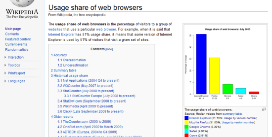
Reasons for why cross-browser support should be implemented can easily be seen when you calculate the percentages of users that use certain browsers.

How?

The last single-word question is "How?" which makes sense in that once you know what needs doing and why it’s required, the method of actualizing the "What" is important.
  • How should I go about increasing user engagement?
  • How can this design improve community participation?
  • How can I fix the issue of users not finding the product they need?
  • How can I create a design that works in Internet Explorer 6?

Statistical/Gathering Methods

When determining the best course of action for your visitors, there are 3 essential statistic types that will come into play in helping to answer the "what" question. (We shall come to the "how" and the "why" later on, so don’t worry!)

Each of these data gathering techniques have their own benefits and pitfalls so there isn’t ultimately a perfect solution.

However, designers wanting a well-rounded experience would be better off using a mixture of all 3 as they not only give you a range of quantitative results (raw numbers) but also qualitative research (such as open-ended responses and feedback).

On-Site Data

On-site data are the kind of information you obtain from website analytics software and monitoring user activity on your website.

While this type of data is often ideal in that they relate directly to your visitors, it often takes a while for activity on a new website to build up — and as such, depending on these alone may leave you in the dark as to your visitor’s basic primary needs upon launching the service.

In sites with limited or no traffic, or sites that are still in development — analytics software fails because there is no (or limited) data sources; you’re pretty much in the dark.


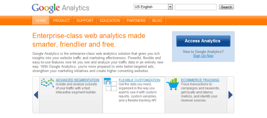
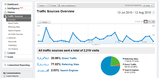
Most websites have some kind of visitor tracking mechanism installed, such as Google Analytics.

Third-Party/Generalized Data

Independent data are often the most useful to new websites, usually produced by large firms who provide demographic services like Net Applications or W3Counter.

These third-party data-gathering sites offer a glimpse at the general population, and by that, it will include useful details such as the browsers and devices they use, their country of origin, and so forth.

On-Site data gathering methods is going to be more accurate and will reflect your particular situation much better — for example, a web development blog will have a different audience than a cooking blog) — but accounting for independent statistics can aid you by providing a baseline to work from, especially if you have no user base.


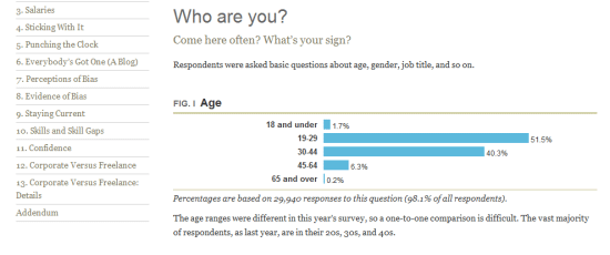
There are plenty of statistics on the web, you just need to look! The figure above shows statistics from A List Apart’s survey of web designers.

Social Data

Socially-sourced data are a relatively new concept that has come out of the rise of networking sites like Facebook or Twitter, where people can promote or discuss your creation through an external site.

While there are still a large number of people who aren’t interested in the "social" aspect of social networking, the importance of leveraging these statistics of what visitors like, dislike and their comments attributing to such information can actually be more useful (in different ways) to the conventional number-based statistics from analytics packages.


Social networking can provide you with useful feedback to work with.

Designers Demographics

Now that we have covered the "what", we need to examine the "why" (and by association) the need to focus our attention on all the pretty percentages, pie charts and graphics that appear everywhere.

Ensuring your visitors can use and enjoy their experience with your web design is important and determining how we can provide that experience will all be down to using the statistics methods above and then narrowing the focus down onto what is most relevant for your audience.

While pretty numbers may seem impressive on their own, they’re not worth anything if they don’t speak to your niche, so successful sourcing of your data is critical.


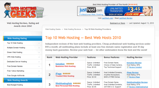
Review websites are notorious for having subjective criteria of questionable validity.

If you’ve exhausted local statistics and have a general idea of the visitors you’re getting (and perhaps where they found you), and if you’ve gone further afield to seek out related demographics relating to research on an area which affects your niche, its worth going beyond the number crunching and seeking out "intelligent hits" that may help guide your decision making. Asking your community (or perhaps your competitions if you don’t have one!) what would enhance the experience can be great, just don’t try to please (or annoy) everyone and only implement what will benefit your users!


Getting to know your visitors can simply be a matter of knowing how to communicate.

With all of this information in regards to what you’re investigating the "why" (as in why changes need to be made) will become quite apparent. While it may seem natural, it’s quite easy to become so fixated on the number of visitors or re-tweets we get, that we actually ignore the most important thing a statistics package (or some solid research) can tell us – that our visitors will have their own specific set of needs and requirements that need addressing. As a final point on the matter of "why", if we don’t actively seek out ways to improve ourselves, we can’t hope to gain new customers.

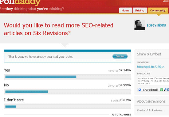
Visitors may have JavaScript disabled which could leave them excluded from statistics.

A Quick Measurement

The next thing to take into account is how to filter the information once you’ve collected it (which meets the "how" element). Having lots of statistics and ideas may help, but filtering the stream of data will be critical to making sense of the best route to take in fixing a common problem or deciding the next step. The simplest way to prioritize your data is to follow the below, the higher up on the list the item is, the better and more potentially useful and reliable your research will be. Once the best information is extracted, you can refer to the numbers when making decisions for the design.


Determining the quality of your information is a mission critical part of the process.

Importance of Location:

  • Local
  • Independent
  • Social

Importance of Type:

  • Statistics
  • Research

Importance of Reliability:

  • Proven
  • Trends
  • Unproven

Importance of Margin:

  • Significant
  • Proportionate
  • Insignificant
Note: Using the above, a locally sourced bunch of statistics that are proven (by a significant margin) to be the best course of action would ultimately be the peak of what you can gather. Though as your research will lead to talking with customers, individual needs should be accounted for as well.

Variable Considerations

Before rounding up this article, it’s important that we consider the variables which may impact your statistics. While it’s great that there are plenty of studies that may assist you in decision making (like how to build a perfect font stack or what browsers you should support), it’s very important that we highlight the issues that will break down the cold harsh numbers and give you a little more to work with. Without making this article particularly heavy going (which isn’t the intention), the two types of variables you want to consider are mechanical and personal, and both relative to the visitor.

The first of these (mechanical) will directly affect the way in which your visitor interacts with your site, this isn’t as a result of their physical being, but more of their circumstances and equipment. In web design it’s obvious that the device used, the OS installed, the browser used, the scripting or plug-ins available or something else will affect their experience. While these are usually listed as independent statistics in packages, they are often related to each other in that a single user will contribute to a number of these breakdown listings, thereby it may directly affect the results.


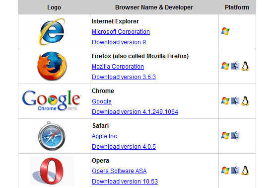
Nothing forces greater demands on a website than the range of browsers that exist.

The second and probably one of the more important factors are the personal variables. The reason why these variables are so important is because they will often not appear in statistics packages and require you to undertake independent research to get the numbers or determine the viability of catering to their needs. Such factors include the accessibility level being required, the usability of a site (which won’t be a number) and the findability of information. While harder to pin down, it still makes sense to account for such variables as they directly and quite dramatically affect visitors.

Note: Error Margins also play a part in statistics, research made by a human rather than a computer can be subject to biases, errors and omissions – some of which may go unnoticed. The significance of information can also fluctuate depending on the audience who visit the site at any given time.

via: Six Revisions

Labels:


Saturday, August 21, 2010

The Importance of Social Media Marketing: Why You Should Learn and Master it

Social media marketing is the process of promoting your site or business through social media channels and it is a powerful strategy that will get you links, attention and massive amounts of traffic.

There is no other low-cost promotional method out there that will easily give you large numbers of visitors, some of whom may come back to your website again and again.

If you are selling products/services or just publishing content for ad revenue, social media marketing is a potent method that will make your site profitable over time.

Those who ignore the efficacy of social media usually fall into three categories; the ones who don’t know much or anything about social media, the ones who are interested but don’t know how to use it and those who don’t believe in the value that a social media strategy can bring to any site or business.

The Value of Marketing Through Social News Websites
Web 2.0 poster
Image Credit: Poster Web 2.0

For those who don’t understand or see the value of social media websites, let’s take a look at the benefits of creating viral content and effectively promoting them through social media channels.

Developing link baits and successfully getting it popular on various social media websites like Digg and StumbleUpon will lead to multiple benefits for any website:
  • Primary and Secondary Traffic. Primary traffic is the large amount of visitors who come directly from social media websites. Secondary traffic is referral traffic from websites which link to and send you visitors, after they come across your content through the social sites.
  • High Quality Links. Becoming popular on social news websites like Digg or Reddit will get you a large number of links, some of which may be topically relevant, some not. A good story can realistically acquire a large number of high quality editorial links, most of which cannot be easily bought.
Now let’s translate this into tangible benefits for your website:

1. Links = Better Search Engine Rankings.
When a website receives a large number of natural, permanent links from trusted domains, it develops authority. Search engines trust it. If you optimize your linkbait and website structure properly, you can easily start ranking for competitive keywords, which will in turn bring in search engine visitors.

Do this often enough and your search traffic will undoubtedly increase. In a sense, you are obtaining these quality links through borrowed trust. Many bloggers and webmaster still think that if an article is on the Digg or del.icio.us homepage, then it’s probably worth checking out and referencing through a citation link.

A new website may find it difficult to gain links from a critical mass that is not familiar with it but a trusted social news resource makes it easier for links to come in, because the community and buzz has somewhat ‘certified‘ the value of the site. Note that the actual strength of the article is still of utmost importance for all.

2. Primary + Secondary Traffic = Community/Supporters.
Some people claim that social news websites only send useless traffic, visitors that will often just view a specific webpage and click away. Yes, that’s usually the case. Sites like Digg are notorious for their poor bounce rates: many visitors drop in for the article and then leave after reading it. StumbleUpon is much better in this aspect.

But don’t mistake this with a lack of interest. Your subscriber figures will often take big jump up and then stabilize after a few days. If your entire site is relevant to the general interests of the social media website, there will always be a handful of social users who will start to track your site in order to submit future content.
Detractors also ignore the power of ultra targeted secondary traffic. General sites or blogs in the same niche will link to a story that’s popular on social sites, because it adds value for their readers or users. This is done naturally on a daily basis for many.

While primary traffic usually comes in a larger volume, I would argue that secondary traffic is more valuable. Why? Because links from other websites bring visitors who are very likely to be interested in your content. These citation links demonstrate recognition of your site in the eyes of others. It builds your brand.

Think of the social news site as a platform or a soapbox. As something that gives you a chance to be heard or read, even for a brief moment of a few hours. The people who are drawn to your message will visit your site and recommend it to others.

Four Reasons to Practice Social Media Marketing

Web 2.0 poster
Image Credit: Poster Web 2.0

Why bother exploring social media as a marketing channel for your website or business? After all, you could stick to link exchanges, search advertising or the purchase of banner and editorial ads on relevant sites.

Here are some reasons why you should consider using social media:
  1. It’s natural. Not only do you get natural links without any discernible pattern, your website is exposed to large groups of people in a spontaneous fashion. This differs from paid advertising which has overt commercial overtones.
  2. It’s defensible. Once successfully mastered, social communities can be a great source of web traffic on top of any traffic you are already receiving from search engines. While you can’t easily increase your search engine traffic, social media traffic can be very easily controlled through strategic marketing.
  3. It’s low-cost/high returns. If done by yourself, costs are limited to only time and perhaps the expenses involved in hiring a freelance programmer/designer. The benefits will often exceed the cost. It would take you thousands of dollars to buy many links; social media has the ability to give you that for free.
  4. It complements other efforts. Social media optimization and marketing is usually community-specific. It doesn’t interfere with any other methods of getting traffic to your website. It can and will fit perfectly with an advertising campaign targeting other websites or search engines.

So How Does Social Media Help Me to Make Money?

It doesn’t. At least not directly. Every site or business that wants to expand and become profitable, needs a core group of supporters who will be willing to make purchases or recommend the site to others. Your site needs to perpetuate itself.

The more supporters you have, the faster word spreads about your site. Social media marketing is an excellent way to get people to come into your site to take a look at at what you have to offer. You will grow when there are a group of loyal visitors ready to always act upon what you have to offer.

Because social media websites can be leveraged for links and better search rankings, they can greatly increase your site’s income potential. For example, you will be able to price ads higher or generate revenue from any paid business models.

Why Bloggers Should Learn How to Use Social Media

Bloggers and social media
Image Credit: Climate Change Protest

There are many ways to build a popular blog and many methods to promote your website. For example, you can start leaving comments regularly on many high traffic blogs in your niche or perhaps, consider guest posting on other bigger blogs.

My marketing strategy for blogs is very simple. I don’t comment actively, hold contests or write guest posts. I’ve never done any of that for any blog I’ve ever set up. Some people might enjoy doing it but its just a little too tedious for me.

What I do instead is strategic. I focus on creating just one excellent blog post, which I will then push through social media sites and email pitches to other bloggers. This is straightforward and I don’t have to run around many blogs putting up my URL and thinking of something insightful to say.

Think about it. Why write 50 guest posts for 50 different blogs when you can easily just write one article and get an equal amount of links and greater traffic through the use of social media? Guest posting builds relationships but I reckon there are many more powerful ways to network with others. 

It isn’t just about creating articles and then promoting them on social sites as an afterthought. It’s about putting social media in the center of your marketing strategy, optimizing your site or content and making it an attention magnet.

Social Media and It’s Potential for Your Site: An Example

I recently launched a new blog a months ago and took around 20 hours to create a feature article. I subsequently promoted it on various social websites through my own influencer profiles. I also sent out emails to large sites in the same niche.

The article eventually got to the Digg, del.icio.us and Reddit frontpage and received over 140+ reviews on StumbleUpon. It accumulated well over 800 unique links, including some from very heavily trafficked websites. Some of them alone sent more traffic than the frontpage of del.icio.us.

The article is more than a month old and it is still receiving incoming links. Subscribers are up by over 800% and I received around 12K pageviews everyday for the first month. Bear in mind this is only a one month old site.

While not every article in every niche will receive the same amount of attention or success, this illustrates the great potential of social media. I’ve become a firm believer in having a solid social media strategy for every website I develop. It is important for success on every level, even for sites that are already popular.

Fundamentals of Social Media Marketing: An Article Series

Digg
Image Credit: johnxlewis


Social media marketing is not difficult at all. It is something every one can do with some effort and knowledge. It isn’t some secret art form that only experts can master. Unlike other skills, social media has a remarkably low barrier of entry. Everyone is invited to the party. No one is excluded.

I know how social media works. I know what type of content/bait works for different websites. I know what type of marketing strategy to adopt for a high possibility of success. This knowledge is something you can acquire yourself too.

Now that I’ve illustrated the value of social media, a step by step introduction to social media websites and the appropriate marketing strategies to adopt is in order. I plan to start an article series on DIY social media marketing, to teach absolute beginners and bloggers/webmasters what they need to do for social media success.

Labels: ,


Tuesday, March 30, 2010

22 Ways To Find Advertisers For Your Website

Selling advertising deals is one of the most profitable ways to monetize your website. Some time ago I wrote an article titled How to Find Advertisers for Your Website, where I covered the pros and cons of using this method, what you need to have in place before getting started, how much you should charge and so on.


The most difficult part of the process, however, is to actually find the advertisers. I included some places where you can look for in that article, but I felt that it would be useful to have one post listing all the ways you can use to find advertisers for your website. That is what the list below is all about.

Leveraging Your Own Site

Your own website should be the first port when it comes to finding advertisers. Why? Because people who are familiar with your work will be more willing to discuss possible advertising deals.


1. Put an “Advertise” link on the menu bar
If you have a navigation menu bar, you could include an “Advertise” link there, making it point to a page where you describe the advertising options of your site. This link will help you in two different ways. First of all it will allow interested companies to quickly find the page where you display your advertising information. Secondly, it will also let all visitors know that you do accept advertising deals.


2. Use an “Advertise Here” banner as placeholder
If you have unsold ad spots, you could include an “Advertise Here” banner as a placeholder on one of them. This banner will act just like the “Advertise” link on the navigation menu, but it might be more effective because it will show potential advertisers exactly where their ads will be displayed. Just make sure to not use an “Advertise Here” placeholder on all of your unsold spots, as this would send a negative message to advertisers (i.e., no one is buying any ads on your site, so why should they?).


3. Write a post welcoming advertisers
If you have a blog, you could write a post inviting advertisers. This technique works pretty well because it allows you to elaborate your offer. On the post you’ll be able to explain what kind of audience your blog has, what kind of traffic it gets, what are the advertising options available and so on.


4. Email your list
Do you have an email list? Then send the same information that you posted on the blog to these subscribers. The only thing you should not include is the price. Why? Because if you don’t include it interested people will email you asking for that, and this will give you their email addresses and an invite for a conversation, where you’ll have better chances of convincing them.


5. Put a message at the bottom of blog posts
If you post often on your blog you could attach a message at the bottom of every post. Something like “Want to showcase your product to our audience? Then check our advertising options.” Obviously you should include a link to your “Advertise” page on that message. If you are using WordPress, you’ll just need to edit the single.php file to make this message appear on all your blog posts.


6. Put a message at the bottom of your feed
Similarly, you could also put a message at the bottom of your feed. This will make sure that both website visitors and RSS subscribers will see it. If you are using WordPress, you can create easily create a custom message to be displayed at the bottom of you feed with the RSS Footer plugin.


7. Examine who is leaving comments
It is a good idea to examine who is leaving comments on your blog. You are basically looking for people who work at companies that have relevant products to your audience. Once you identify someone who does (either by the link he will leave or by the domain on his email address), you’ll just need to contact him, asking if his company would be interested in becoming a sponsor. This technique works well because the person will already be a member of your community.


8. Examine who is linking to you
Apart from examining who is leaving comments on your blog you should also check the people linking to your blog posts. If you notice a link from a company blog, you could again contact the company asking if it would be interested in becoming a sponsor. If they liked your content enough to link to it, they will certainly consider an advertising deal.


9. Reply to all press releases and review requests
Once your website gets somewhat popular inside its niche you’ll certainly start receiving many press releases and review requests via the contact form. Instead of sending these to the trash bin, you should reply to all of them, stating that you found their product/service interesting, and that you believe they could benefit from advertising on your site because your audience would be a good match. Then give all the details about the advertising options, and wait to see if they are interested.


Exploring Ad Networks

If you can find companies that are already spending money on online advertising, your job will be halfway done. Advertising networks represent an excellent opportunity to do this.


Just by visiting the homepage of this ad network you’ll be able to see a list of “Sample Advertisers.” Most of those are big online spenders. After that you can also check the publishers listed on the directory. Just click to visit the homepage of each site, and check what companies bought banners there. You’ll be able to find hundreds of potential sponsors.


On the navigation menu of this ad network you’ll find a link titled “Site Directory.” It is basically a list of all the websites that accept ads through the network. You’ll just need to browse through them, checking what companies are buying banners there. The interesting thing is that you can also filter the websites by niche, making sure you’ll only contact relevant companies.


ClickBank is not an ad network per se, but rather an affiliate marketing one. That being said, you could still signup as an affiliate and browse its marketplace looking for sponsors. Just avoid contacting the top selling products, because those already have hundreds of affiliate promoting them. Focus on the middle range of the marketplace.


Once you signup as a “Blogger” on this ad network you’ll be able to browse its marketplace, which contains a list of companies who are willing to pay bloggers to review their products/services. Guess what? After that it will just be a matter of contacting them.


This network works pretty much like the previous one. You’ll find fewer offers here, but it is still worth a look once in a while. Additionally, if you setup a low review price for your blog you’ll be contacted by interested companies on a regular basis.


Vising other sites in your niche

A very effective way to find advertisers for your website is to visit other sites in your niche, looking for companies advertising there already.


15. Contact the banner advertisers
First of all you’ll want to contact the advertisers who purchased banner spots. Usually these are companies who contacted the site owner directly, so they will be more open to discussing new advertising opportunities with you.


16. Contact the AdSense advertisers
If the site you are visiting uses Google AdSense, you could check the companies that are putting ads there and then contact them . Mention on your email that your saw the company ad on the XYZ site, and that you believe your site would be a good match for their products/services, too.


17. Contact the site owner
If your website is larger than the one you are visiting, you could also contact the site owner to see if he is not interested in purchasing one of your banner spots. This could help him to get more brand awareness and new readers. Secondly, you could also try to establish a partnership, where you refer advertisers to each other.


Using Google

Whenever you need to find something online, Google can help.
18. Search for relevant products and contact the organic results
Companies that sell products or services relevant to your audience will certainly consider the opportunity to advertise on your site. If that is the case, all you need to do is visit Google and start searching for these companies. If you have a site about baseball, for example, go to Google and search for “baseball bats”, “baseball gloves” and so on.


19. Search for relevant keywords and contact the AdWords advertisers
Apart from finding companies on the organic results you can also look for the ones already spending money on Google AdWords. These are the “Sponsored Links” that will appear on top and to the right of the organic search results. Notice that you don’t need to search for products here. Searching any keyword that is related to your niche should already trigger the sponsored links.


20. Search for websites thanking their sponsors/advertisers
Many websites publish periodic posts thanking their sponsors. You could use Google to find these posts, as they will come with a list of companies you can contact. For example, you could search for “thanks sponsors” on Google. Alternatively you can also filter the search to specific websites that are related to your site. If you have a tech blog, for example, you could search for “site:techcrunch.com sponsors”, which will give you a list of all the posts on TechCrunch.com that talk about sponsors.


Using Social Networks

Social networks are among the most popular websites on the Internet these days. As such, companies are starting to direct their advertising efforts there, and you could use that to find sponsors for your site.


21. Sponsored Tweets
Twitter created one of the fastest growing online platforms, and many companies started to leverage the “sponsored tweet” idea. They basically pay a certain amount of money for people willing to send a message talking about their products or services. Most of these companies require people to disclose the ads with hashtags. Two popular ones are #ad and #sponsored. If you search for those hashtags on Twitter, you’ll be able to find a huge list of sponsored messages. After that you’ll just need to contact the companies who sponsored them.


22. Facebook Ads
Facebook is the largest social network on the web, and they also have a self-serving ad platform that works similar to Google AdSense. As a result many companies are purchasing ads there, and you could try to find some that are related to your own niche. You just need to browse around the site (while logged in), and the ads should appear on the right sidebar. On some pages you’ll also find a link titled “More Ads,” which will send you to a page with a list of advertisers relevant to your profile.


Bonus Tip

This tip helped me find dozens of advertisers over the years. It is a really simple but very effective one. The tip is: create a folder on the bookmarks of your browser named “Potential Advertisers” or “Potential Sponsors.” After that you’ll just need to pay attention while browsing the web to companies and/or websites that have something related to your website and that could be interested in advertising there. Whenever you come across one, bookmark it. If you use the Internet a lot you’ll find that this bookmark folder will grow very quickly, and it will just be a matter of getting in touch with the companies listed there.

Labels: ,


Friday, March 26, 2010

Eight Rules for Effective Web Forms

1. Build Conservatively and Design With a Purpose

Let's face it: No one likes spending a long time filling out a form. Keep it short and simple and eliminate elements that aren't absolutely necessary or that don't offer a tangible benefit. Make sure every part of your form is pulling its weight, and your users will thank you.

The structure of your form should serve just as much of a functional purpose as its elements. When laying out your form, keep in mind that, at least in the Western world, people read from top to bottom and left to right. They also often use the Tab key to move around the form. Your design should reflect this through intuitive labeling and natural placement of elements. And, of course, your form should never look scattered or haphazard — make sure everything is evenly spaced and neatly arranged.

Here are a few standard form layouts that you should use as a starting point for more creative designs:

Left-Aligned Labels With Vertically Stacked Fields
Form with left-aligned labels and vertically stacked input fields

This form features left-aligned labels with neatly ordered fields stacked on top of one another. This gives the eye an easy-to-follow path down the form, which is especially helpful if you're asking questions users may not be familiar with. Because they're able to read down the list of questions without the visual interruption of an input field, they'll be able to concentrate more on what you're asking. This layout does tend to make for longer form completion times because of the amount of time it takes for the eye to move from the label to the input field.

Right-Aligned Labels With Vertically Stacked Fields
Form with right-aligned labels and vertically stacked input fields

Right-aligning your labels can help make them easier to distinguish and quicker to read, and also eliminates awkward spaces between labels and input fields. However, this can be harder to read. It also looks jagged, which can be a bit unattractive.

Top-Aligned Labels
Form  with top-aligned labels and input fields with variable stacking

Top-aligned labels like these make for a form that's quicker and easier to fill out because the eye doesn't have to move as far between the label and the input field. This type of layout also gives you the freedom to place related fields next to each other, which can save space.

2. Tailor Your Form to the Situation

Every form you make should be tailored to the specific situation it addresses. When you're planning the design of your form, ask yourself the following questions: What are you asking? Why? What does your Web design look like with and without the form? Is the form something users want to fill out, or is it something they're required to fill out? Your answers to these questions should help dictate the layout and content of your form.

3. Use What You Need

When deciding whether to add an element to your form, ask yourself if you could do without it. If the answer is "yes," don’t use it.

One element that's almost always unnecessary is the Reset button. These relics still make an appearance now and then, but they should be avoided. Think about it: When you want to change information on a form, it doesn't matter if the field is already filled out or not, so why would you even need to erase all the information? The only thing the Reset button is good for is accidentally clearing all the information your user just entered and aggravating them enough that they'll go somewhere else instead of taking the effort to fill out the form again.

4. Use Short, Clean Descriptions When Necessary

You may need to explain why you are collecting certain information on your form, especially when users are loathe to share it, like with phone numbers or e-mail addresses. This not only helps reduce user confusion, but also ensures that the data is accurate and correctly formatted.

Any descriptions and comments should be clean and concise. You may also want to format them with different colors, sizes, or styles to help set them apart. Just be sure not to overdo it — after all, you don’t want your descriptions to look tacky or drown out the rest of your form. This form, which asks for information in order to provide a quote for printing services, is a good example of a form that effectively uses descriptions:

A form requesting containing short but informative descriptions

5. Be the First to Communicate

Make sure the wording in your form is friendly and user oriented. Here's a simple trick for writing conversational copy: Pretend you're actually talking with your user.

If you want to know someone’s name, you aren’t going to stare them in the eyes with a rigid expression and demand, "Full name." That would just be creepy. If you were looking to garner a positive response from this person, you would instead open with a smile and say, "Hi, what’s your name?"

Keeping this in mind, instead of prompting your user with the label "Full Name," try something a little more personable, like, "What's your name?"

6. Divide the Form Into Bite-Sized Sections

Communication involves the exchange of ideas in small, manageable sections. You introduce yourself, and the other person does the same. You mention what you do for a living, and the other person has a comment or question. You remark back, or answer, and this prompts another response. In a good conversation, the information is a steady, back-and-forth flow.

A form, being another method of communication, should be the same way. You may be asking for quite a bit of information, but that doesn't mean you have to throw it all at the user in a huge block. Try using horizontal rules, colored bars, meaningful images, or headings that match the design of your site to separate the information into small, easily understood chunks. If all else fails, spread your form out across multiple pages and add a progress bar across the top so users know about how much they have left.

7. Include Meaningful Contextual Error Messages

Your error messages should be helpful and clear. Specify in the message which field caused the error, and highlight the label and/or the field itself. After all, no one likes hunting through a form for an elusive field they overlooked the first time around.

8. Release the User

When the user clicks the Submit button, they think they're done, and they're ready to move on. They’re basically saying, "Here's the info you wanted. Talk to you later!"

In a real conversation, you'd give them a wave, say, "Bye," and walk off, or give them some other way of acknowledging that the communication is done. Your form should be no different. Have your form programmed so it sends the user to a custom page that tells them something like, "Thank you for your submission! You'll be hearing from us shortly." There should also be a link back to the main page of your Website.

And that's it! Keep these rules in mind when designing your next Web form, and you may be surprised at the quantity and quality of feedback you receive as a result.

For more information about Web Form Builder or to download the free trial, click here.

Labels: ,


Friday, February 5, 2010

Top Five Ways to Make Your Site More Popular

The Web has grown into a real jungle, and finding cool new sites nowadays isn't always the easiest thing in the world. If you have a Website yourself, you're dealing with the other end of this issue. How do you get noticed online, and is there anything you can do to increase your popularity?

There certainly is! Here are the top five ways you can strengthen your site and increase your online visibility.

1. Strong Hosting

This first point is mostly important for those who don’t have their own Website yet but eagerly want to create one. After you have selected your domain name, the next step is to choose a hosting plan. There are many good, affordable alternatives, but what professionals usually recommend is specialized blog hosting. This form of Web hosting allows you to set up a professional-looking Website in no time at all. Why is this important to mention when it comes to making your site more popular? Well, without strong hosting, you won’t be able to handle a traffic to your new Website, which means you’ll have no chance at all of becoming well liked.

Of course, finding strong hosting is often easier said than done. The hosting industry has grown very popular in recent years, and this has lead to large numbers of companies offering various hosting services. But don’t be fooled by their tricky ways of making it sound as if they are the best in the industry. We would recommend you partner up with a company that has a strong reputation and experience in the business. You might start at Web Hosting Search for reviews and other information to help you find the right fit.

When it comes to hosting, you should compare the different features included with the plan. Make sure you are guaranteed at least 99.9% uptime and that customer support is easy to get hold of. You never know when you could need them. Likewise, it is also good to know exactly what kind of numbers in terms of disc space and bandwidth will you be allowed to use and manage. Some providers also forbid their clients to upload music or video files to their servers even if it is for personal use. It's important to ask customer support to resolve such issues before purchasing a plan. Some other things you might consider asking are whether your domain name registry information will be protected and how many different e-mail accounts will you be allowed to use as part of the hosting agreement.

2. Optimize Your Website

A cute robot searches some binary code

In order to be truly successful online, you will have to get a high ranking in search engines. To succeed in this, you should learn as much as you possibly can about search engine optimization (SEO). The subject of SEO is vast and can be quite daunting at first, but once you get the hang of it, you'll be able to see the benefits immediately and will probably wonder why you didn’t get started with it earlier. A few things you can do to get started are to make sure you're using the proper keywords and to write for your visitors as well as for search engines. Writing for search engines is important, since you want to get high rankings, and writing for visitors is of the essence because you want them to stick around and return to your Website.

When you are satisfied with the keywords and content on your site, it is time to start working with link building. Search engines determine much of the value of a certain page/site by looking at the number of inbound links. Link exchange is one of the most popular and successful ways to get a good rank on search engines, and it’s really easy to do. Simply visit a Website that you like and ask the Webmaster if they are interested in a link exchange — it doesn’t have to be any more complicated than that.

Having something interesting and distinctive on your page is a great way to attract potential link partners. For example, if you are running a Website about domain names, why not add a domain name availability checker to your homepage? It will most likely attract links from other sites related to the niche, and people will tend to come back again if they want to know whether a domain is available or not. Try to be extra creative to set yourself apart from competitors.

3. Take Advantage of Social Media Optimization

Even though SEO should be a big part of your site optimization, it shouldn’t end there. Social Media Optimization is probably just as important, since it’s one of the strongest marketing tools available today. A social media optimization campaign should include a few different things. First, make sure the content on your site or blog is relevant to your topic and not out of date. Visit similar sites and join the discussion in leaving comments on posts/articles — don’t be afraid to say what's on your mind. Make yourself visible on Facebook and MySpace. Three other sites that can be useful for social media optimization are Twitter, Flickr, and YouTube. The two latter ones are not always applicable. Make sure you only take advantage of them when the time is right — you might do more harm than good if you don’t.

Obviously, don’t forget to include outbound links to your Website on any social media site you utilize. Even if your link has a "nofollow" attribute attached to it (e.g. like in Facebook), you will still attract new visitors and potential customers to the site. Lastly, your campaign should be built on friendly platforms, such as CoffeeCup Flash™ Blogger, which make it easy to create and edit content.

4. Get Your Visitors Involved

A crucial point to make your site grow in the number of visitors is by getting them involved. Try to write in a personal style, and don’t be afraid to leave an open question. If this shouldn’t do it, why not hold a contest? This will most likely get people talking about your site. The prize doesn’t have to cost a fortune, since people like to compete regardless of what the award is — it's human nature.

Other easy ways of getting your visitors involved is by including a forum on your site or the possibility to comment on your posts/articles. Everyone wants to express their own personal ideas and thoughts on topics, and by allowing them doing so, you also increase the chance of visitors returning to see how was their feedback appreciated. As an added bonus, if the topic is extra popular, the discussion could attract interest from other Websites as well!

5. Emphasize Usability in Your Design

Fingers on a keyboard

Investing in a good design is more important than some people seem to think. With a beautiful design, you will grow in trust among your readers/visitors. An important fact to remember is not over-designing the Website. It doesn’t matter how many hours you’ve put into designing the site if no one understands how to use it. Let some non-Internet-savvy friends navigate through your Website before launching it at a full scale. If they find it easy, so will the rest of your visitors.

It is difficult to say exactly what makes a beautiful and functional design. What looks good to one person might seem terrible for another. However, there are basic trends in Web design, and if you follow these, you can be sure to please most of your visitors. A few popular Web design trends for 2009 are multi-column layouts, large illustrations, and lots of white space.

If you wish to stay on the safe side, then it is a good call to make the layout and design features on the page easily accessible and simple to understand. Try to use standard coding and avoid over-the-top Flash animations. Some people may have browser settings that prevent them from viewing Flash, which means you might lose valuable visitors. Try to think how the visitor thinks, and your Website will grow more popular and respected day after day.

Labels: ,


Wednesday, January 13, 2010

Is Flash Banner Blocking Your Beautiful CSS Drop Down Menus?

If flash banner is blocking your beautifully crafted CSS drop down menu or your drop down menu is hiding behind your flash banner, here is a simple and quick tip to get it fixed.


With so many buttons to push (the so-called “flashvars”), getting flash content to behave nicely alongside other content types you may have on a web page can sometimes be a real pain.


Community member Eugene got caught up in one of these flash blues recently and wrote to me asking for help:


I’ve just added a flash banner on my page and now it is blocking my main drop down menu. I have played with CSS positioning, z-index and other tricks, but no luck. Can you help??? The flash is located directly below the drop down links.


Oh poor Eugene! If you guys and gals would all agree, I’ll say let’s embark on a one-day strike… just to get these stupid computers to behave.

Yeah, but I know this is not likely to happen, so these computers keep driving us nuts everyday, as we struggle with one hitch after another. But I digress.


For the sake of those few people who cannot envision Eugene’s plight, let me demonstrate the nature of the problem here wit the two images below


Flash Banner Blocks CSS Drop Down Menu


CSS Drop Down Menu


The first image indicates the problem that Eugene describes, while the second image shows the proper way this thing should appear. As you can see, the beautiful CSS drop down menu is hiding behind the flash banner, along with all of its glorious beauty.


So how do you fix this? How do you get the flash banner to behave nicely and not block the CSS drop down menu? The solution is a very easy one, as you’ll soon come to realize.


The key is to set the background of your flash movie to transparent. This allows the background color or image of the HTML page that contains the flash movie to show through, as well as allowing the layering of Flash content with DHTML and CSS-positioned content (like a drop-down menu).


You can accomplish this using the WMODE Flash parameter, as you can see in the code snippet below:


<object width="640" height="480">
<param name="wmode" value="transparent">
<param name="movie" value="example.swf">
<param name="quality" value="high">
<param name="bgcolor" value="#000000">
<param name="scale" value="noborder">
<embed wmode="transparent" src="example.swf"
pluginspage="http://www.macromedia.com/go/getflashplayer" type="application/x-shockwave-flash" width="640" height="480"
bgcolor="#000000"></embed> </object>


In the above code, line 2 adds the transparent background to our flash movie using the OBJECT tag:

<param name="wmode" value="transparent">

The OBJECT tag is used by Internet Explorer to display flash movies. But other browser, like Firefox, handle flash movies differently. Most other browsers use the EMBED tag to display flash movies, so we need to add the transparent background to the EMBED tags as well. This is line 7 in the code snippet above and partially reproduced below:

<embed wmode="transparent" ... ></embed>

So there you have it.. a quick fix for you if you’re struggling to get your horizontal menu to display in front of (not behind) a flash movie. Just add a transparent background to your flash movie using the WMODE parameter, and you’re ready to smile once again.

Labels: ,