Tuesday, August 3, 2010

Accessibility does not prevent you from using JavaScript or Flash

A common misconception is that in order to make a website accessible you have to abstain from using JavaScript or Flash. Almost every time I hold a workshop on Web standards and accessibility there is at least one participant who believes that accessibility limits what they can do on the Web by telling them to stay away from anything that isn’t pure HTML.

Misinterpretation of guidelines?

This misconception likely has its roots in people misinterpreting or adhering very strictly to a couple of guidelines in WCAG 1.0:
Ensure that pages are usable when scripts, applets, or other programmatic objects are turned off or not supported.
Use W3C technologies (according to specification) and follow accessibility guidelines. Where it is not possible to use a W3C technology, or doing so results in material that does not transform gracefully, provide an alternative version of the content that is accessible.
My interpretation of those two guidelines is not that the use of JavaScript and Flash is disallowed, but that you have to ensure that you use them unobtrusively.

Unobtrusive JavaScript

Even WCAG 1.0 allows the use of JavaScript as long as it is not a requirement for accessing and navigating your site and its content. Use it when it is actually beneficial to the end user and not just because you can. Some rules of thumb:
  • Think about what happens when support is missing
  • Make sure any user interaction is input device independent (i.e. does not require a mouse)
  • Implement JavaScript using progressive enhancement

The Ajax problem

There is a catch though. Using JavaScript to manipulate the contents of a document without reloading the page (with Ajax, for instance) can be confusing to some people, particularly screen reader users. Screen readers have become better at handling Ajax than they used to be, but it is still possible that the user is not informed of a change in the page content due to an Ajax request.
To make JavaScript and Ajax-heavy websites accessible to everybody, you may need to turn to WAI-ARIA:
WAI-ARIA, the Accessible Rich Internet Applications Suite, defines a way to make Web content and Web applications more accessible to people with disabilities. It especially helps with dynamic content and advanced user interface controls developed with Ajax, HTML, JavaScript, and related technologies.
The good news is that support for WAI-ARIA is already partly there, and is increasing. All major browsers support or will support it, as do several screen readers.
More articles on WAI-ARIA:

Flash and accessibility

As for Flash, well, there are two main things to think about. One is to embed Flash content so that people without Flash (like iPhone/iPod Touch/iPad users) get an alternative, normally in the form of HTML. Again, by using progressive enhancement. The other is that you need to make the actual Flash content as accessible as possible, which means developing your Flash content with accessibility in mind. Information about how to do that can be found on Adobe’s Flash CS4 Professional Accessibility site.
One unfortunate thing with Flash accessibility is that, if I read Adobe’s documentation correctly, Flash content can currently only be made accessible to screen readers running on Windows, so screen reader users are out of luck if they use another operating system, like Mac OS X or Linux. Be aware of that and offer an alternative.
According to the information in Flash Player and Flex Support for IAccessible2 and WAI-ARIA, It looks like that problem is being worked on. However, until Flash is accessible across platforms I am hesitant to call it what WCAG 2.0 refers to as accessibility supported technology.

JavaScript and Flash are not always available

In summary: remember that you simply cannot assume that everybody has support for JavaScript and Flash, that you have to think about what happens when support for either is missing (i.e. use progressive enhancement), and that you need to consider how assistive technologies handle them. Also realise that you do not have to give users without JavaScript or Flash exactly the same experience, but you do need to give them something.
You do not, however, have to avoid JavaScript or Flash as long as you keep accessibility in mind.

Labels:


Tuesday, March 2, 2010

Top 10 Useful Tools for Evaluating Web Design Accessibility and Performance

Testing for web accessibility (how usable a website is by individuals with disabilities) is an often neglected part of web design and development. Web accessibility is important not only because your content will reach a wider range of audience, but also because correcting web accessibility issues have secondary benefits such as cleaner and more semantic code and better indexibility on search engines.

In this post, you’ll find Top 10 free useful tools to help you evaluate and correct issues which decrease your website’s accessibility. There was a high emphasis on the ease-of-use during the selection of these tools.

1. Firefox Accessibility Extension

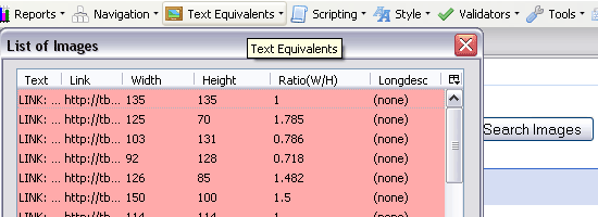
Firefox Accessibility Extension - screen shot.

The Firefox Accessibility Extension is a Firefox toolbar that allows you to inspect every aspect of a web page to determine its accessibility. A helpful toolbar feature is the Text Equivalents menu which allows you to generate lists of elements such as images and links to see whether each are standards-compliant. You can also launch 3rd party applications such as the WC3 HTML Validator and Link Checker services directly from the toolbar.

2. aDesigner

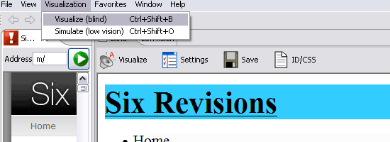
aDesigner - screen shot.

aDesigner, developed by IBM, simulates the experience of visually-impaired individuals so that designers can better understand how a web page is interpreted by screen readers. It has a plenty of features including a summary and detailed report of compliancy to web accessibility guidelines and simulations for blind or low-vision impairment.

3. EvalAccess

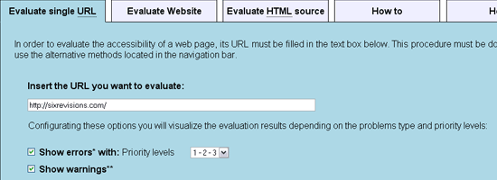
EvalAccess - screen shot.

EvalAccess is a web-based service for testing your website’s accessibility. You can either point to a web page, an entire website, or directly enter your HTML source code. It checks your mark-up against the WC3’s Web Content Accessibility Guidelines (WCAG 1.0) and provides a summary of the number of errors and warnings and a breakdown of each error.

4. WebAnywhere

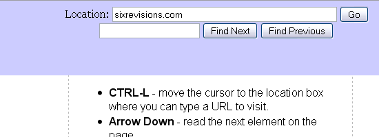
WebAnywhere - screen shot.

WebAnywhere is a browser-based web application that works similarly to screen readers such as JAWS. It’s an excellent way to see how a web page is read and navigated by assistive technologies.

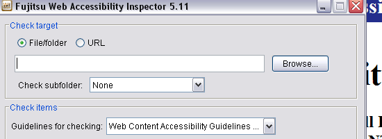
5. Web Accessibility Inspector

Web Accessibility Inspector - screen shot.

The Web Accessibility Inspector, developed by Fujitsu, is a desktop application that indicates web accessibility issues. You can specify a file, folder, or URL to run the inspection on. It has the “View on the screen” option which opens the web page in a browser window with markers that point out elements that have issues.

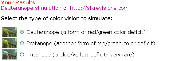
6. Vischeck

Vischeck - screen shot.

Vischeck simulates how a web page or image will look if viewed by people affected with color-blindness. It simulates three types of color-blindness. You can conduct the test by entering a URL or uploading images.

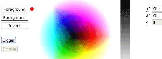
7. Accessibility Color Wheel

Accessibility Color Wheel - screen shot.

The Accessibility Color Wheel is a web-based tool to help you select the background color and font color. You can enter the hexadecimal values of the colors you want to test, or you can hover over the color wheel to select colors.

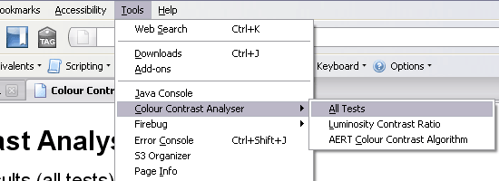
8. Colour Contrast Analyser

Colour Contrast Analyser - screen shot.

The Colour Contrast Analyser, developed by Juicy Studio, is a Firefox extension (currently in alpha) that checks all the elements in the Document Object Model for color contrast to insure that content is accessible by people who are color-blind or affected by other visual-impairments. It uses the color and brightness differences algorithm suggested by the WC3 “Techniques For Accessibility Evaluation And Repair Tools” (AERT).

Juicy Studio also has other web accessibility evaluation tools such as the Readability Test, CSS Analyser, and Image Analyser.

9. TAW Web Accessibility Test

TAW Web Accessibility Test - screen shot.

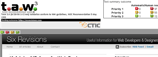
The TAW Web Accessibility Test evaluates your website’s accessibility based on the WCAG 1.0. It marks trouble spots directly on the web page, allowing you to quickly see where the errors are. Clicking on the error/warning indicator will bump you down to a summary of the issue. It’s a great way to visualize the areas of a web page that needs work.

10. Web Accessibility Toolbar

Web Accessibility Toolbar - screen shot.

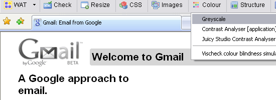
The Web Accessibility Toolbar (WAT) is an extension for Internet Explorer or Opera that offers designers a ton of useful tools and features to help in the analysis of a web page’s accessibility. One helpful feature is the Greyscale (Colour > Greyscale) feature which renders the web page in black in white to help you find low-contrast spots in the design.

Labels:


Monday, December 28, 2009

Web Accessibility Checklist


MARKUP


  • Separate structure from presentation and use proper markup for that structure. For example, mark up lists as lists (<ul>, <ol>, <dl>) rather than text with a <br> tag after each list item.
  • HTML headings (e.g. <h1>) are very helpful for blind users. Properly mark up the sections of a page and body copy with HTML headings rather than something such as a <p> tag with CSS styling that makes it look like a heading.
  • Give pages meaningful and accurate titles using the <title> tag.
  • Indicate the primary human language of the document using the lang attribute in the <html> tag, and indicate any passages in a secondary language using the lang attribute on other tags wrapping the relevant text (e.g. “<span lang="es">Hola</span> means Hello”).
  • Provide “Skip to content” links at the top of the markup order in pages with large numbers of navigational links before the main content.
  • Always indicate headers in data tables using <th> tags, and associate all data cells with their header.
  • Be sure tab order is logical using tabindex, if necessary. (If your HTML is in the proper order, then using tabindex isn't necessary.)


VISUAL APPEARANCE & CONTENT

  • Be sure your page is still usable when images are turned off. (This may include making sure that contrast is still sufficient if you happen to be using a background image and that image is removed.)
  • Be sure pages remain usable when users enlarge text up to twice its original size.
  • Be sure each element on a page is reachable and can be manipulated via the keyboard.
  • Whenever possible, write descriptive headings and link texts which can be understood when read out of context (e.g. no “click here” links).
  • For color-blind and low-vision users, be sure your content and background have sufficient contrast.
  • Do not use content that flashes or blinks more than three times a second.
  • Do not hide the focus indicator. When a user uses the keyboard to tab from element to element, it should always be apparent where they are.
  • Do not require users to perceive font, color, or other styling changes in order to understand meaning. For instance, don’t say, “ The highlighted word in the previous paragraph is the most important,” or “Items marked in red are errors and need to be corrected,” unless the word or items are indicated in some other way.


DYNAMIC CONTENT

  • Do not use JavaScript events that radically alter the page or load a new page when fired.


IMAGES & MULTIMEDIA
  • Be sure that all videos, if they don't autoplay, have, at the very least, an accessible Play control.
  • When text can be rendered just as well by the browser as it can in an image, avoid using images for text. (Image replacement techniques are often an acceptable alternate, but also consider translation requirements when using text in or as images.)
  • Avoid CAPTCHAs unless you have no other choice, and even then they should be avoided. However, if you must use them, provide an audio CAPTCHA alternative.


FORMS

  • Always label all form fields with the <label> tag. If a form field has no specific text label on the page, add one, and hide it with CSS or use the title attribute.
  • Use fieldsets (<fieldset>) with legends (<legend>) to associate prompts with radio buttons and check boxes. For instance, a form asks “Gender:” and offers radio buttons that say “Male” or “Female”. Then “Gender:” should be enclosed in a <legend> tag, and all three elements (<legend> and the two radio buttons with their label text) should be enclosed in a <fieldset> tag.
  • Identify all input errors in text (in addition to any images or icons), and place the error notification either next to the affected field or in a prominent location such as the top of the page with an anchor link to the affected field.
  • Provide help links or inline instructions for completing fields when necessary.
  • Do not permit users to complete important actions without a confirmation or a way to undo.
  • Avoid using HTML elements in nonstandard ways (e.g. form elements for navigation, links for form submission, etc.).


TESTING

  • Test all pages for markup validation (http://validator.w3.org). If your page does not pass validation, there should be a good reason for it.
  • Test all pages for color blindness using simulators or browser plug-ins. (Recommended: http://colororacle.cartography.ch or http://www.vischeck.com)
  • Test all pages for accessibility using an evaluation tool (http://wave.webaim.org), but only after you have done all you can to ensure it is accessible using the recommendations here.
  • Have your pages reviewed by an accessibility expert.

Labels:


Friday, July 17, 2009

Ten quick tests to check your website for accessibility

The DDA (Disability Discrimination Act) says that websites must be made accessible to blind and disabled people. So how can you check that your website actually has good accessibility? There are a number of basic tests you can make to address some of the main accessibility issues. The following list includes guidelines that provide a good start in increasing accessibility to disabled people:

1. Check informational images for alternative text

In Internet Explorer place the cursor over an informational image, for example, the organisation logo. Does a yellow box appear with a brief, accurate description of the image? For users whose browsers don't support images, this alternative text is what they'll see (or hear) in place of the image.

2. Check decorative images for alternative text

Place the cursor over a decorative image that doesn't have any function other than to look nice. Does a yellow box appear with a description of the image? It shouldn't. This image serves no purpose so there's no reason for users whose browsers don't support images to know that it's here.

Be careful though as this isn't a foolproof accessibility test. If a yellow box doesn't appear, this could mean one of two things:

  • The alternative text of the image is assigned a null value (alt=""), which means that it will be ignored by browsers that don't support images. This is the ideal scenario.
  • The alternative text of the image is simply not set at all, which means that users whose browsers do not support images will be alerted to its existence but will be unable to find out what purpose it carries - something which is very frustrating! This is certainly not the desired outcome.

3. ‘Listen’ to video or audio content with the volume turned off

If you turn your speakers off, you're clearly unable to listen to, or follow, any audio content. This situation is faced by a deaf person on a daily basis. Ensure your website supplies subtitles or written transcripts so that this type of content is accessible to hearing impaired users.

4. Check that forms are accessible

Usually there's prompt text next to each item in a form. For example, a contact form might have the prompt text ‘name’, ‘e-mail’ and ‘comments’, each one next to a box where site users will enter their details. When you click on the prompt text, does a flashing cursor appear in the box next to that text? If not, your forms may not be accessible.

5. Ensure that text can be resized

Can the text size on your website be adjusted? If not, then your website may not be accessible to web users with poor visibility. To check in Internet Explorer go to ‘View > Text size > Largest’. Alternatively, scroll with the wheel of your mouse whilst holding down the control key.

6. Check your website in the Lynx browser

The Lynx browser is a text-only browser and doesn't support many of the features that other browsers such as Internet Explorer have. You can check how your site looks in this browser with the Lynx Viewer3. If your website makes sense and can be navigated through the Lynx browser, then it'll be fulfilling many of the web accessibility guidelines.

7. Check you can access all areas of your website without the use of a mouse

Can you navigate through your website using just tab, shift-tab and return in Internet Explorer? If not, then neither can keyboard- and voice-only users.

8. Check there's a site map

Can you find a site map? If not, then neither can people who are lost on your website.

9. Ensure link text makes sense out of context

Visually impaired Internet users can browse web pages by tabbing from one link to the next. Does all the link text on your website make sense out of context? ‘Click here’ and ‘more’ are two common examples of non-descriptive link text that can cause a website to suffer poor accessibility.

10. Check your web pages with an automated program

Two accessibility programs available for free on the Internet are WebXACT4 and Wave5. They're unable to provide you with all the information that you need, as most accessibility checks must be done by humans, but they can tell you some of the areas where your site might be going wrong.

Labels:


Sunday, May 31, 2009

How to Improve the Accessibility of Your Website

When webmasters talk about a website's accessibility, they are referring to whether your website can be used by people with disabilities. For example, can a blind person use your website and access its content? While I am certainly no expert where accessibility is concerned, this tutorial discusses some of the commonly used techniques that can make your website more usable by such people.

Please note that I'm not going to be using politically correct euphemisms here. I want to avoid misunderstanding, and be clear so that webmasters know exactly what I'm talking about and can improve their websites. For example, if I start using terms like "visually impaired" (which can mean a whole range of things) and other such circumlocutions, instead of simply "blind", this article may end up being too obscure to be useful. The aim is to help both webmasters as well as the people who really need sites to be accessible. Euphemisms that cloud the issue will help no one here.

Some Types of Disabilities to Adjust For

There are undoubtedly many types of disabilities around. For this article, I will only discuss four types of disabilities. You should not take this list as exhaustive. For each type of disability, I will mention the adjustments that webmasters need to make to their sites so that people with these handicaps can use your site.

Colour blindness

  1. Types of colour blindness

    There are different types of colour blindness (or "color blindness" if you use US English).

    There are those that cause the person to see everything in monochrome colours (like black and white), the very common red-green colour blindness where the person can't (or finds it hard to) distinguish red and green hues, and the blue-yellow colour blindness where the problem lies with discriminating between blue and yellow hues. Even within each of these broad categories, there are differences in the way they perceive colours.

    Do not be deceived and think that your site is immune because it doesn't use (say) red or green. The different types of colour blindness can cause the colours of your site to appear completely different from what you intend. The end result is that your text may be indistinguishable from your background or that different elements of your page may appear merged with the rest of your page. For example, the "buttons" on your side panel may appear to have the same colour as the rest of your page, so that the colour-blind person reading may not realise that those are buttons.

  2. Practical suggestions

    Here are some practical suggestions for designing your website so that people with colour blindness can still use the site:

    • As far as possible, do not make your site dependent on colours. For example, if the only way to distinguish a link from normal text on your site is by its colour, and you're not careful when choosing your colours, it's entirely possible that a colour-blind person will not be able to see any links on your site. For your main content, it's generally best not to remove the underlining from your links.

    • Where you have important information, try to use black text on a white background, like what you see on the main article portion of thesitewizard.com and thefreecountry.com. Such a colour scheme is readable by anyone, colour-blind or not.

Poor Eyesight

When I say "poor eyesight" here, I'm referring to people who have difficulty reading or seeing things clearly, even with the aid of glasses. This not only includes people who may have inherited such poor eyesight, or have them through accidents, but also for the large number of elderly people. As a person grows older, one of the ailments he/she faces is failing vision.

As webmasters, we can improve the chances that people with poor eyesight will be able to read and use our sites by doing the following.

  1. Don't make the text on your site too small.

    Some sites have incredibly small print. Their web designers are probably highly focused on aesthetics and see the text as merely part of the sites' overall visual appearance rather than the most important part of the page. It's also possible that these webmasters have designed the page on a large monitor. The problem with this is that such sites are unreadable even for people with normal eyesight when they use a notebook/laptop with a high resolution but small monitor. Since laptops/notebooks are now the rage, with sales even exceeding those of desktops in some (many?) quarters, if your site uses small print, many of your audience will have difficulty reading what you write.

    In the end, as you design, you have to remember that aesthetics is not everything. If your visitors cannot see what you say, or find great difficulty reading, your site is not going to be as successful as it can be.

    Verdict: don't make your font size too small.

  2. Use highly contrasting colours for your text and background.

    Another thing that will help people with poor eyesight read your site is to make sure that the colours of your text and the background have a high contrast. Don't put white words on a grey background or grey words on a white or black background. These combinations are extremely difficult to distinguish for people with poor eyesight. (In fact, they are not easy to read even for people with normal eyesight.)

    Although white text on a black background may seem to fulfill this suggestion of contrasting colours, in general, for things that are read on a computer monitor, black text on a white background is vastly better. (This is probably the reason why all wordprocessing software nowadays use such a default colour scheme.)

Blindness

If you have never had a blind friend, you may not realise that blind people can and do surf the web as well. They do so with the help of software known as screen readers. These programs read aloud everything that appears on the screen or their browsers to their users.

Surfing the web with a screen reader is a tedious business. As a sighted person, you may not be able to fully appreciate the chore it is until you've tried using a screen reader yourself (blindfolded, of course, so that you don't cheat). When you look at a web page, say this page on thesitewizard.com, in spite of what you may think, you don't actually read every single line on the page. You'll probably have instinctively ignored my logo on the top left hand corner of the page as well as the entire column of navigation buttons. Instead, you'll have zoomed straight into the article itself. Chances are that you've scanned the title, and immediately started reading (or scanning) the article contents.

Someone dependent on a screen reader can do no such thing. The screen reader goes through your entire web page and reads it aloud, line by line, in the exact order in which the words appear in the HTML code (which may not correspond to the visual order). If it encounters a picture with no description tag, it will just say something like "image", and move on. Otherwise it reads everything. Everything.

Commercial screen readers have some convenience features, of course. They allow you to skip paragraphs, move from section to section, and so on. But no matter how you look at it, reading a site with the help of a screen reader is nothing like reading it visually.

As a webmaster, there are a few things that you can do to make life easier for the blind person.

  1. Make sure all your images have ALT tags.

    Screen readers cannot "read" images. They cannot see, for example, a photo of your children playing in the park and immediately tell the blind person, "picture of 4 children playing in the park". In order for your images to be meaningful to a blind person, you need to add description tags to those images. Such description tags are called "ALT" tags in HTML parlance. I've mentioned how you can do this in my article How to Create a Search Engine Friendly Website, so you should read that article if you're not familiar with the concept.

    (Note: If you use one of my web design tutorial series, like How to Create a Website with Dreamweaver CS4 or How to Design and Publish Your Website with KompoZer, and followed my suggestions, your images will probably be already tagged.)

    As a side effect, putting ALT tags on your images will benefit your site not just with blind visitors, but also with the search engines, which for all practical intents and purposes, are also "blind".

  2. Do not make your pages dependent on images.

    There are a few ways in which you can inadvertently make your web page dependent on images.

    • Navigation

      Some people like to create web pages that are so rich in pictures that even the navigation elements, like links, are represented by images. They probably think "a picture is worth a thousand words" or the like. It's possible for such sites to be a usability nightmare for blind people if you're not careful. They can also hurt the site's search engine performance, as I have written previously in "Why Is My Site Not Ranking in the Search Engines?".

      Obviously, just having images that link to other pages on your site does not necessarily mean that your site is inaccessible, since separate images, each with descriptive ALT tags, linking out can still result in an accessible site. What I mean is when the navigation elements on your page require a person to be able to actually see the image, and move the mouse to click at specific spots in the image or object. An example of this is when a site uses an image map or a Flash object where clicking different parts of the image or Flash object will take the visitor to different parts of the website.

      If your site does such things, try to replace your navigation system with one that either uses separate images (properly tagged) for each link, or one that uses text links. It's okay to use things like a CSS-driven menu button system, the way thesitewizard.com does, since, despite its graphical appearance, it is actually entirely text-driven. (It's just a visual trick done using CSS).

    • The Whole Web Page as an Image

      There are also websites where the webmasters have obviously used an image editor to create the design and write the text content. They then dumped the entire picture as their website. The links are image maps. Even the text you see is just part of the image. Needless to say, such a site is very difficult, if not impossible, for the blind to use. To fix such a site, use a web editor to craft your site, and only use images for design elements and other things that really need pictures.

    • CAPTCHA Images to Filter Spam

      On some sites, before you can fill an online form, be it a contact form or even a search form (for certain forum scripts), you are required to enter a series of letters and numbers shown in a picture. This is known as a CAPTCHA test, designed to make sure that the one filling in the form is a human being and not a spam "bot" (computer program). The webmasters implement this to weed out the spam sent by such bots, since they only want feedback from real human visitors (obviously).

      While the reasons for implementing a sort of CAPTCHA test are understandable, the image also prevents blind users from using your web form. To work around this, some sites (as well as at least one free CAPTCHA script) provide a link to an audio file which the visitor can play to read the string of letters and numbers aloud. Unfortunately, this method is not without its flaws, accessibility-wise, as you shall see later in this article.

  3. Give your readers a link (short cut) to skip your navigation menu.

    One of the problems with using a screen reader to read a web page is that it sees the web page as a stream of words, appearing one at a time. If the HTML for your web page begins with (say) a left column with all the navigation buttons, a typical screen reader will proceed to read your navigation button one by one, through the whole list, before it reaches your content. This is of course not what you want, nor is it what your blind user wants. The navigation menu is meant for visitors to move away from the page to other pages on your site, after they're done with your existing page.

    There are a couple of ways to deal with this.

    • Put a "Skip to main content" link at the top of the page.

      If your site has multiple columns (which it probably does since it's the fad these days), and you know that your left column appears first in the HTML code, put a link pointing to the main content as one of the first things appearing in that left column. You can use the technique mentioned in my article How to Link to a Specific Line or Paragraph on a Web Page Using HTML to do this. Your link should use plain language, like "skip to main content", "skip directly to the article", "skip navigation links" or the like, so that the blind user encountering it will know what to do.

      This method is used by many accessibility-aware sites.

    • Put the main content first in the HTML code.

      Another way is to put the main content first in the HTML code, as thesitewizard.com does. For those who use tables for your layout, one way to do this is to use the technique described in How to Present Content First in a Multi-Column Table Layout.

      Note that you cannot tell just by looking at a web page with a browser or your visual web editor whether the content or the side column comes first. With CSS, it's possible to put the side panel or top panel visually first, and yet in the underlying HTML code, present the content first. To do this however, you will need to be familiar with both CSS and HTML. If this is not the case, it's much easier to simply put a "Skip to main content" link near the top of your code.

  4. Divide into sections with appropriate headings.

    Commercial screen readers usually have many features that attempt to make reading a web page more pleasant. For example, they may read out all the section headings on a particular page and allow their readers to skip to the appropriate section. This is perhaps an attempt to mimic the way sighted people scan a page visually.

    In order for the software to be able to do this for your web page, you will need to divide your page into various sections and give headers to each of those sections (where possible).

  5. Make Your JavaScripts Device-Independent.

    Some pages have JavaScript as part of its content. The JavaScript may either generate part of the information contained on the page, or it may be used to drive the navigation menu of the site, or some other purpose. If your JavaScript depends on mouse or keyboard input to work, and it hides certain information that is only revealed when (say) a particular link or button is pressed (or hovered over with the mouse), it is possible that it presents accessibility problems to blind users.

    Making your JavaScript accessible is a large topic, so I will leave the details for another tutorial.

  6. Code Flash Objects Specifically with Accessibility in Mind.

    In general, Flash objects present a lot of problems. Assess carefully whether your use of Flash on your site is necessary, and whether it can be replaced with simple text, images and normal links. If so, that is the best solution, accessibility-wise, search-engine-wise, as well as usability-wise. In cases where this is not possible, read up on Adobe's information on the accessibility features available in Flash, and code your object to take advantage of them.

Both Blind and Deaf

Although you may not realise this, there are people in the world who are both blind and deaf. These people "read" documents by using some sort of tactile display, for example, a Braille console that translates the text on your web page into Braille symbols which they can feel with their fingers.

I mentioned earlier that even CAPTCHA images that have accompanying playable audio files have accessibility issues. For people who are both blind and deaf, neither the image nor the audio file is accessible to them. If you use such a CAPTCHA method to protect yourself from spam, you are also inadvertently blocking out some people.

This Article is Not Exhaustive

This tutorial is obviously not exhaustive, in both the types of disabilities discussed as well as in the measures that webmasters can take to make browsing their site easier for people with disabilities. I will address other aspects of accessibility in separate articles on thesitewizard.com.

For now, if you are looking for ways to improve your website, the above is probably good as a starting point to make your site more accessible. Use it as a checklist for evaluating your existing sites as well as when designing a new one.

Labels:


Friday, April 3, 2009

21 Usability and Accessibility Ways to Focus on Users

Below are following points for Usability and Accessibility ways to focus :

  1. “Quick and dirty” prototyping: Roughly sketch design ideas in order to reveal and test the underlying concepts.
  2. Anthropometric analysis: Use information of a wide range of users in order to determine the general appropriateness of products.
  3. Behavioral mapping: Track positions and movements of people within a space over time in order to determine spatial behaviors.
  4. “Be your customer”: Ask clients to describe and outline user experiences in order to get to know and to contrast client perceptions.
  5. Character profiles: Observe people and create character profiles in order to develop “persona-like, typical customers”.
  6. Activity analysis: Observe an activity in a situation as natural as possible, and compile all tasks, actions, objects, performers, and interactions being part of that process in order to create activity models and to find key issues.
  7. Cognitive task analysis: List and describe all sensory inputs, decision points, and possible actions of users in order to understand perceptional, attentional, and informational needs, and to focus on system features that the user will find hard to learn.
  8. Empathy tools: Use tools like e.g. clouded glasses in order to experience products differently and to get a better understanding of users with special conditions.
  9. Error analysis: Document all things that might go wrong and determine the causes in order to develop an understanding of the interaction of design elements.
  10. Experience drawings: Ask users to draw experiences in order to determine how people conceive and perceive.
  11. Extreme user interviews: Ask absolute novice or expert users to examine their product use experiences in order to gain insight for improvements.
  12. Five Why’s: Ask five “Why?” questions in response to five successive questions in order to be forced to evaluate and articulate reasons for attitudes and requirements.
  13. “Fly on the wall”: Observe and protocol behavior within its context, staying on the sideline, in order to determine what users really do.
  14. Historical analysis: Determine industry, market, and product trends in order to understand and project the development.
  15. Long-range forecasts: Think about future scenarios and their technological and social implications in order to “forecast” and anticipate behavior changes.
  16. Personal inventory: Document things that are important to people in order to get to know their lifestyles and activities.
  17. Role playing: Play the roles of stakeholders involved in design problems in order to increase the understanding of users.
  18. Scale modeling: Use scaled models and prototypes in order to understand spatial interaction.
  19. Foreign correspondents: Ask for input from people in other countries in order to understand cross-cultural principles and issues.
  20. Scenario testing: Confront users with e.g. cards with probable future situations in order to determine the value of and reaction to design concepts.
  21. Social network mapping: Document and map the different ways of interaction between users in a group in order to understand relationships and their structures.

Labels: ,


Saturday, January 10, 2009

10 Reasons Clients Don't Care About Accessibility

Working as an accessibility consultant in an IT company is a very frustrating job right now. Highly publicized lawsuits and deep-rooted accessibility myths leave us with a lot to explain when the final product does not really help visitors. Our clients simply don’t care about accessibility as much as we’d like them to, and there are several reasons for that.

Reason 1: It’s the Law But There’s None to Follow

Clients want to hear success stories from market leaders before they spend money. Unfortunately, pointing out that Amazon.com does not have a 450KB rotating logo splash page will not convince inexperienced clients that it’s a bad idea.

Since February 2002, it has been a legal requirement for organizations to make reasonable adjustments to ensure their sites are accessible. The Disability Rights Commission of Great Britain (DRC) issued a revised code of practice for Part 3 of the Disability Discrimination Act (DDA) of 1995, which covers goods, facilities and services. The code of practice explicitly included Web sites under Part 3 of the DDA and includes both those that provide services and goods for free and for payment.

Our clients heard that and wondered how to make “reasonable adjustments.” They turned to us for guidance, asking about standards and certifications.

But it’s hard to find standards for accessibility. Guidelines are easy to come by, but they’re outdated, not always logical or practical and are written for a world in which user agents (such as browsers) behave perfectly.

They are also a lot more demanding than they look, and encompass a whole methodology including testing with disabled users—something that is conveniently forgotten by a lot of agencies promising “100% accessible, verified Web sites.”

When we do follow the guidelines, we still don’t get a certification. A “WAI-AAA” button on our page carries the same legal punch as “Bill’s world of wicked Web sites gives your Web site five beer cans.”

Accessibility is about communication and compromise. Nobody expects you to cater for every disabled group because you simply cannot predict all scenarios. You need to go as far as you can but keep an open ear for concerns that are raised before legal action is taken.

Our rap now is “Yes, you can be sued for being inaccessible, but we cannot offer you a protection against that as there are no standards to follow.” Tough to put a price on that one.

Reason 2: There Is No Immediate Benefit

There is no immediate, measurable benefit from making a Web site accessible. Web accessibility enthusiasts might point out that that is not true as accessible Web sites are automatically more usable, and search engines can index them a lot easier. That is true but the benefits of that do not show up immediately—if ever. A fancy microsite or a video ad for a product, however, can trigger an immediate, measurable response in the form of traffic or revenue.

Good usability is a very important element in customer satisfaction, but you will rarely find it on the agenda of a project in the scoping phase (unless of course the project is usability consulting).

The argument that search engines are “blind billionaires”—that they “see” the Web like a blind visitor—is also a weak one. Search engine optimization (SEO) is a vast field and a lot of competitors fight dirty (e.g., link farms, bridge pages). Large corporations would rather plan for sponsored links and cross marketing than concern themselves with markup techniques to boost their search engine rankings.

Reason 3: Accessibility Is Sold As a Technical Problem

A lot of tutorials and introductory accessibility articles are written by Web developers for Web developers. They explain all the ins and outs of the HTML/CSS/scripting we have to worry about, and claim that it is not hard to do. It is true that when it comes to HTML, 90% of the accessibility changes happen “under the hood” and are not that hard to implement. This is also the biggest problem. It’s hard to explain to non-technical client why you have two development hours on your plan that didn’t result in any visible change.

Accessibility is perceived and sold as a technical issue, and there is little documentation out there for project managers on how to plan and budget an accessible Web site. They think it can be done later or that the developers will automatically take care of it.

If we want to develop a usable, accessible Web site, the development phase is far too late to think about accessibility. Designing for accessibility means ensuring that:

  • Text is easy to understand
  • All image material and colors are unambiguous to various groups of visually impaired users
  • There are meaningful text alternatives for all content images and multimedia
  • There is a glossary explaining all acronyms and abbreviations
  • The navigation and the flow of the site is logical and easy to follow
  • The maintenance staff of the product knows about these issues or gets trained accordingly

Reason 4: Disability Is Not Something Clients Want to Think About

A big problem with accessibility is that we just don’t want to think about why it is needed. For a visual person there is nothing scarier than the loss of sight. To address accessibility, the client and the designer has to think about what that experience would be like. The Web is still perceived as a medium for the able, the young and the wealthy. If your client sells games online and says its customers are in their twenties and have fast computers with broadband connections, it might be a tough sell to ditch the plan to build 150 links in a four-level drop-down navigation. Some clients can’t imagine that anyone in their audience would need to use the tab key to move through menus.

In Greek drama, the choir acted as the perfect audience, asking questions and commenting on the happenings. A lot of clients have something like that in their head when they talk about their users. The target audience is not necessarily the real audience, though. Grandmothers might be buying games online for their grandkids’ birthdays.

Reason 5: We’re Past Inventing, We’re Maintaining

As Joe Clark pointed out in his excellent book Building Accessible Web sites, it is a lot harder to retrofit an existing Web site than to start from scratch.

The Web is no longer new. Many companies spent a lot of money on their site, and it’s not always an option to start from scratch. Building an accessible blog or a 10-page brochure site is a lot easier than cleaning out a 200,000-page monster maintained in an eight-year-old content management system.

It’s even harder if you built the client’s site in the first place.

For years, badly planned and executed Web sites were sold at high prices. Now we have to tell businesses they’ve been had. Nobody likes to hear that they need to replace an expensive, functional product with a new one.

Reason 6: It Is Not Part of the Testing Methodology

The way we test Web sites is still rooted in the days of the browser wars. The important questions are:

  • Does the page work on browsers X, Y and Z on operating system 1 and 2?
  • Does it work on monitors with 800 by 600 resolution and is everything important visible without scrolling?
  • Are all images loading and positioned correctly?

We also need a methodology and test plan to address non-visual accessibility issues:

  • Does the alternative text make sense?
  • Is the language easy to understand?
  • Do links on the page make sense outside their context?
  • Does the page have a logical header order?
  • Does the page make sense without the style sheet?

Accessibility issues that require human verification are harder to quantify. Some automated verification tools flag these issues as “user checks” rather than “possible fatal errors that need user testing.” To clients, a bug that can’t be seen is not worth extra money spent on intensive testing.

Reason 7: Accessibility Seems Like a Party Pooper

Although the Web has been around for quite a while now, technology is still being toyed with. You don’t see newspapers printing at a 45-degree angle or TV news anchors talking “street,” but on the Web, anything goes.

Clients want their Web sites to be interactive—often, this means an interaction-required navigation that creates hardship for some disabled users. Unfortunately, it’s a lot easier to get a budget approved for a project with lots of flashy visuals than for a plan scoping out a very usable and accessible Web site. After all, the latter requires more client interaction and—gasp—maintenance.

Reason 8: Nobody Complains

It is hard for a client to see accessibility as a need when nobody complains. Many elderly and disabled people don’t claim their government benefits, so it’s safe to say that thwarted Web site users don’t necessarily complain. “No feedback is good feedback” seems to be the credo for a lot of site owners unaware of how badly their site is performing.

Reason 9: It Requires Involvement

One reason our clients don’t care about accessibility is that it means that they will have to deal with their Web site. In the low-budget market, clients think that you pay a Web designer to do your Web site and that’s that. A company brochure is not enough to base a fully accessible Web site on, and “build it and they will come” does not hold true anymore.

Aside from competitive pricing and a superior product or service, the only way to have success with your Web site is to give visitors what they want, regardless of their ability and technical environment. Many clients don’t want to be so involved. They can simply give their ideas to the print shop for their brochure, so why should they have to help a designer create and maintain a Web site?

Reason 10: There Is No Leader to Follow

The saddest reason for client indifference toward accessibility is that there is no leader to follow. Except in the case of Maguire vs. Sydney Organising Committee for the Olympic Games (SOCOG), no one has successfully sued a company for discrimination because of an inaccessible Web site. This makes it hard to spark a feeling of urgency in our clients.

Clients want to hear success stories from market leaders before they spend money. Unfortunately, pointing out that Amazon.com does not have a 450KB rotating logo splash page will not convince inexperienced clients that it’s a bad idea.

Few big corporations follow Web standards, mostly because of legacy systems and methodologies lingering from the days of browser wars.

As the DRC pointed out in its April 2004 report The Web - Access and Inclusion for Disabled People 81% of 1,000 Web sites failed to achieve a minimum level of compliance.

Another problem is the products that drive the Web. There are few content management systems that enforce accessibility testing in their workflow or create proper markup.

The same applies to frameworks like Microsoft’s .NET. Most “accessibility enhancements” mean graceful degradation for browsers like Netscape Communicator or “adding an alt attribute.” WYSIWYG editing is a very big selling point for a content management system, but it will inevitably result in malformed markup and bad document structure. Clients don’t care—all they want to do is easily maintain copy.

So what can we do?

Gently prod clients in the right direction. Here are some ideas:

  • Stop selling accessibility as a technical issue. Address it in the scoping and design phase rather than at delivery
  • Make sure you’ve got your facts straight before releasing another “accessibility” article or blog entry (rounded corners in CSS do not increase accessibility, really, they don’t!)
  • Make product presentations and assessments more fun by taking away the client’s mouse and changing monitor settings
  • If you want to support disabled users, don’t stop at one group. “Skip links” helps blind users and keyboard/switch access users alike, don’t hide them!
  • Send emails to companies every time it is hard for you to use their site. Point out that you will buy the product on their competitor’s site and why.
  • Step away from the visuals. Embrace Web design as a mixture of good content, proper structure and nice visuals. Start developing sites in the text editor, not in Illustrator.

Labels:


Saturday, December 6, 2008

Web Accessibility

ADA Guidelines for the Web cover aspects of Web accessibility including the look and feel of your page, the alternate text of your images, and more. Usable Web sites are sites that work for your readers. Make sure that your pages are accessible and usable and meet ADA and other Guidelines and your site will only be improved.

Does the Accesskey Attribute Improve Accessibility?
The accesskey is an attribute that provides keyboard shortcuts to Web pages. It has long been touted as a way to make Web pages more accessible, but is it really? There are some problems associated with the accesskey that you should be aware of before you start using it. What do the Accessibility Guidelines Mean to Me?
The W3C has released accessibility guidelines for the Web, how will they impact your site

Writing Great Alt Text
Alternative text is an important (and required) attribute on all your images. But it can be tempting to just write simple text or leave the attribute blank. Alt text is used for more than just accessibility, and if you get good at writing alt text, your pages will be more usable.

Accessible HTML
Learn how to make your Web pages more usable for people with disabilities.

Accessibility Definition
Creating Color Blind Friendly Web Pages
Creating a Web page that is accessible to color blind people can make a big difference in how your pages are perceived. As much as 12% of men in the US are color blind, and if your pages don't reflect that, they might not be seeing your pages at all.

Low Vision Web Page Layouts
Because the Web is primarily text, people with low vision often only need to expand the size of your text to be able to read it. However, even with the most flexible layouts, there can be problems when the reader zooms in using the Web browser. So some designers developed the idea of creating alternate style sheets that were written specifically for low vision readers.

Make Your Alternative Text Actually Readable
When including alt text in your images, you should make sure that it actually makes sense in the context of the page, and is not only a description of the image.

How do I set up an access key on my links and form fields?
An FAQ about setting up access keys to various form fields and links on a Web page using the accesskey attribute.

Validating for Accessibility
There is a great HTML validator available for checking your site to see if it is accessible. Learn when and why to use it. An article by your HTML Guide, Jennifer Kyrnin.

What do the Accessibility Guidelines Mean to Me?
The new W3C Guidelines can be tricky and hard to understand. This article will help explain the guidelines so you can apply them to your site.

Accessibility and JavaScript - JavaScript @ About.com
Accessibility on Web pages should encompass more than just the HTML and images. The About.com Guide to JavaScript, Stephen Chapman, has an informative 3-page article on how to make your JavaScript as accessible as your HTML.

What Javascript Cannot Do -JavaScript @ About.com
While JavaScript is a powerful language, there are things that it can't do.

Making Websites 508 Accessible for the Deaf - Deafness @ About.com
Captioning is an easy way to make video accessible to deaf people. And the About Deafness Guide has a great article on how to do it quickly and easily with several different tools.

Writing Good Alt Text - 456 Berea Street
When you're working on accessibility, alt text is something you should be aware of. But as Roger Johansson points out on 456 Berea St it's one of the most commonly misused attribute.

Evaluating Web Sites for Accessibility with Firefox
Using a Firefox extension you can validate pages for accessibility right within your Web browser.

Building a Website for Analytics
Understanding your Web site analytics can be critical to business success. If you don't know what they're clicking on or when, you can't maximize your site effectiveness.

How do things look to colorblind people?
An interesting look at how a color blind person sees two different images.

Seven Screen Reader Usability Tips
While it's important to be accessible, that's not all there is to making a site useful for people using screen readers. These tips will help you ensure that your accessible page is also usable.
via :webdesign.about.com

Labels: ,


Tuesday, November 25, 2008

CSS2 - Cascading Style Sheets Level 2

Introduction to CSS2

This article is not meant to teach you Cascading Style Sheets. If you are looking for a CSS tutorial, you should start with the previous link or try the Free CSS Class. In this article you will learn the basics of CSS2 and how it differs from Cascading Style Sheets, level 1.

Cascading Style Sheets, level 2, supports all of the functionality of CSS1. This means that if you create a CSS1 style sheet, it will work in a user agent that understands CSS2. Plus, the way that CSS1 is written, if you write a CSS2 style sheet, and load it in a CSS1-only user agent, that agent will simply ignore the elements and properties that it doesn't recognize.

Differences Between CSS1 and CSS2

There are some really interesting differences between Cascading Style Sheets level 1 and level 2. CSS2 offers many new options for accessibility and use across various user agents. Positioning in CSS2 is more flexible and offers more options to the designer. Automated content allows developers to force the user agent to display specific content elements as well as the layout, look, and feel. Also there is support for special cursors in CSS2 as well as dynamic outlining.

Accessibility and CSS2

  • Aural style sheets
    With CSS2, there are now style properties to define an aural style sheet for your documents. This means, that if a customer comes to your Web page with a screen reader that is CSS2 enabled, you can define how your page will sound. And this isn't just useful for blind customers, with aural CSS your documents can be listened to in automobiles, as auditory documentation for training, entertainment, and even for people who simply can't read.
  • Paging
    CSS1 dealt almost solely with "continuous media" - that is, media like Web pages that would run continuously until the end. Paged media, such as paper, slide shows, or transparencies were not handled. But with CSS2, it is possible to define how pages should be displayed or printed. This means that you can specify the size of the page to be printed, add things like crop marks and register marks, or how the page should layout on double- and single-sided printings.
  • Media Types
    CSS2 media types allow you to specify different style rules depending upon how your document is going to be displayed. There are many different types you can specify, including: aural, braille, handheld, screen, print, and tv (plus others).
  • International Accessibility Features
    CSS2 now offers features such as more list styles for international documents, support for bidirectional text, and language-sensitive quotation marks.

Improved Features over CSS1

  • Font selection
    When choosing which font to use, CSS2 offers both the standard "name matching" system that CSS1 uses, plus three other methods for defining fonts. These are: intelligent font matching, where the user agent uses a font that is the closest match to the requested font. Font synthesis, where the user agent creates a font that matches the metrics of the requested font. And font download, where the user agent retrieves a font over the Web.
  • Tables
    CSS2 recognizes that there might not be a table element (and related elements) in an XML document - but to display tabular data, it is important to have this as a style. So CSS2 allows you to define any element as a table element (and all the related table elements).
  • Positioning
    While CSS1 had some aspects of positioning, CSS2 takes it to the next level. Relative and absolute positioning determine their location based on their placement within the document or based on the user agent. But along with absolute positioning is the concept of fixed positioning. This acts as a sort of "watermark" in continuous media. In paged media, an element with fixed position is repeated on every page. This allows you to create frame-like documents or place a signature on every page of a document.
  • Cursors
    Now you can define how you want your cursor to respond to various actions. For example, you might want the default behavior over a link to be changed over some of the links in your document. With CSS2 you can define how the cursor should look over any element.

There are many other features that are new with CSS2, but these are some of the most exciting ones. There are also elements like text-shadows, new pseudo-classes, the use of system colors, and dynamic outlines. You can find out more about the differences between CSS1 and CSS2 on the W3C Web site.

Labels: ,


Tuesday, September 23, 2008

Accessibility In Suit And Tie

The life of the corporate web worker who cares about standards and accessibility can be a frustrating one; hampered by office politics and archaic content management systems. In this article, Bruce looks at what you can do to make sure your projects are as accessible for your users as possible.

The gap between the high-end standards-aware freelance developer with the freedom to choose and the corporate web worker is a wide one, and it doesn’t look as if it’s likely to narrow any time soon. But, just as not every start-up employee skateboards from meeting to meeting coding Django on her iPhone, not every business suit uses FrontPage to juggle his marquee tags. There are many corporate developers who do care about cross-browser compatibility, semantic code and accessibility.

So this article is for the suits who care: if you can’t use cutting-edge tools, technologies or techniques, what can you do to ensure that you’re doing all you can for all of your users? My tried-and-tested method is:

  1. Get buy-in from the top
  2. Some accessibility is better than none
  3. Educate your content providers

Get Buy-In From the Top

The last major redesign project I was involved with was successful from an accessibility point-of-view because we had buy-in from the board. Having convinced the top brass of the need for accessibility we wrote a “constitution” for the new site that says all content must be accessible to people with disabilities, and where this clashes with aesthetics or organizational convenience, it trumps them. If you read it, you’ll see that I’ve sneaked in some accessibility-related rules under a different guise.

The CEO then sent this to all the directors. The advantage of this is clear: when a content owner is exasperated at the time you spend marking up a long important document rather than simply linking to a PDF of the Word document they gave you, you can just point out that you’re just doing what you’re told and invite them to complain to the CEO.

Achieving Buy-In

One problem with corporate accessibility is that while corporations generally care about accessibility in the abstract (because they don’t want to get sued, and they don’t want negative publicity), they don’t actually understand how to show that they care. In my own experience, working for a UK legal regulator, accessibility is seen as a legal compliance issue (”does this comply with the DDA?”) which can lead to a grudging attempt to be accessible, because a corporate lawyer will naturally try to do the minimum required to stay in compliance; minimizing risk while minimizing costs.

The way to overcome this is to focus on the customer. I find the following arguments successful in getting accessibility discussed in a positive, “good-to-have” way rather than in a legal compliance “oh-well-if-we-must” way:

Some Accessibility is Better Than None

I often see standardistas boast "I don’t care about accessibility" because it’s assumed to be inherent in standards-based development. (I doubt that’s true if you’re making Ajax pages, as you’ll need WAI-ARIA attributes to be added to HTML elements in order to ensure accessibility).

But that is based upon the premise that your web infrastructure and office politics mean that you’re able to do standards-based development. Assuming you have a website that deals with the storing, manipulation and display of company data, you’ll need a CMS of some kind. The best code is produced by the best CMSes, and many of those are unavailable to corporate developers because:

  • they’re open source and most corporate IT departments don’t like open source, due to perceived "risk" and lack of someone else to shout at if there’s a problem
  • they are free or very cheap (this is why start-ups often have better tools than big corporates with deep pockets: they use the free ones like WordPress, PHP, Rails, Drupal, etc. because they have to)
  • they are very new and don’t have a pedigree that reassures those whose job depends upon procuring the right CMS
  • there’s a feeling that they can’t possibly compete with costly behemoths like Sharepoint, Teamsite, Vignette (AKA "no-one ever got sacked for buying Microsoft")

We could talk all day about why terrible tools are so prevalent. (In my experience, the reason why a terrible tool isn’t replaced is because someone senior paid $500,000 for it and sure as hell isn’t going to admit a mistake and scrap it.)

Working Around Bad Tools

The terrible tools can hamper your efforts to be accessible in several ways. One of the worst ways it can do this is by having some archaic WYSIWYG editor that allows authors to cheat and make “headings” by choosing size and colors which are translated into font tags on the front end, and therefore there is no structure for an assistive technology user to navigate by.

You can cure this by with a CSS rule that naughtily over-writes the tag: font {color:red; font-size:xx-large; text-decoration:blink; background-color:yellow;} which means content authors see hideous flashing text. It will, I guarantee, encourage them to write proper headings.

Sometimes, terrible tools have to be worked round. You might never be able to get 100% valid code, or remove all the nested tables that you’ve added into pages just to stop them looking atrocious.

But that doesn’t mean that you won’t make a difference if you do what you can. While I was working on The Law Society website we had thousands of pages in the CMS that were full of tags, double-
s to separate paragraphs and some table layout. Even if we could have run a script over the proprietary database to change those, it wouldn’t have been good use of our time, as every page would still need to be manually verified.

However, the site-wide header and navigation was controlled by a single include file, so we amended that to change the navigation from elaborate tables with bullet to be a CSS-styled unordered list. It would be easy, with such an architecture, to add some WAI-ARIA document landmark roles to help screenreader users. These changes were comparatively simple and made screenreader users’ lives much easier. The site will never validate, or win a clean code award, but it’s more accessible than it was.

Incrementally Improve the Code

So you know you have loads of bad markup and “imitation” headings lurking around, but fixing them all will take too much time and effort. Sort out the biggie pages, such as the home page, “contact us” page, “about us” page and the other top 10 high-traffic pages (check your server logs) straight away.

Whenever any other page needs any kind of editorial amend, take a few minutes when the page is open for the editorial change to correct the markup, too. You’ll find that the most commonly updated pages will be corrected first, and they’re very likely to be most-important or most-visited so a sort of "accessibility through natural selection" process takes over.

Educate Your Content Providers

Most big corporates have multiple people throughout the business submitting content for publication. Generally, they aren’t web specialists and submit their content in Microsoft Word format. It’s vital to give them a Word template that defines the styles they can use for bullets and numbering, etc., so they don’t get a nasty surprise when they see that their lovingly-created purple lightning-strike bullets haven’t made it onto the website.

Consider organizing half-day training sessions on how to use Word styles so that headings are methodically created rather than imitated with font size and bold. This pays off as there is no ambiguity if you’re having to mark up their content by hand. (I would have killed for a Word macro that converted documents into HTML with no style information, only the structural information. If you know of one, please tell the world!)

If you have to publish in PDF format, it will be more accessible if it’s made with a proper Word structure. (Adobe has published a useful cheat sheet on how to author Word files for conversion to more accessible PDF.)

Get Your Content Providers Writing HTML

Go mad! Dream big! Turn off the WYSIWYG, throw away Word and train your content providers to deliver you HTML. Most web content (as opposed to headers, navigation, forms, etc.) consists of a few conceptually simple elements:

  • headings
  • paragraphs (including abbreviations)
  • links
  • bulleted/ numbered lists

So train people to send you the content ready-marked up. It won’t be perfect, but it’s simple to run it through HTML Tidy to make it validate. It will be shorter and better-structured if they have to consider the heading hierarchy. Of course, you will still need to add the more complex elements like images and data tables yourself, but they are rarer, so your workload will diminish, their control over the content will increase and your users will get a more accessible website.

Accept the Compromises

It’s hard, when you’re a professional, to accept that something you produce is less than perfect. But all web design is a compromise: liquid layouts versus line length, design versus page weight, and so on. Complete accessibility is never completely achievable as there is such a vast range of needs. So, be a zen master and accept the compromises: simply by caring and trying to do what you can, you’ll make your company’s website more accessible and lives of your disabled visitors easier.

via :thinkvitamin

Labels: