Sunday, May 31, 2009

30 Ways To Keep Visitors On Site

Search engine optimization, links, directories — all of these are well-known means to drive visitors to your site. But, what can you do to keep them there? The number of visitors who land on your site and quickly move on is called your bounce rate — the rate at which visitors bounce to another site.

So, here are 30 sure-fire tips to keep visitors on site longer — and maybe even bookmark your site for future visits.

1. Teach them something. You can't swing a dead copywriter without hitting a Glazer-Kennedy "Who else wants to make a million dollars?" long-form sales letter on the web. It's page after page of hype, with a PS and a PPS just to make things urgent and "interesting."

Interesting? That's not what visitors want – steaming piles of hype. Provide informational content – no sales – about your product or services. Teach visitors and they'll look favorably upon your site.

2. Keep it fresh. Related to #1, if they've read it once they won't wont to read it again so keep adding new articles of interest to your primary demographic – your ideal buyer.

3. Add a blog. Blogs can be added to a site with a click if you go with a web host with a big tool kit. Blogs are an easy means of adding new content. It's a great way to add user-generated content (free stuff) and it's a terrific way to build a site community – a dedicated group of visitors who visit your blog everyday.

4. Keep the navigation really, really simple. First, navigation links should be large and clearly labeled. One boating supply site uses "Gulls" and "Buoys" as labels for their women's and men's clothing line. May be cute but it's also confusing.

Also, keep navigation consistent throughout the site. If you use a navigation bar at the top of the home page, keep it there on all landing pages so visitors don't have to look for it.

5. Provide a site map. It's easy to get lost on a site that has a couple of hundred pages. A link to a site map helps visitors (and search engine spiders), and an omni-present link to the homepage keeps visitors from bailing on your site simply because they took a wrong turn.

6. Provide product pictures. Indeed, product pictures sell products….something about a picture being worth a 1,000 words.

7. Provide complete product descriptions. Skip the sales yak. Keep your product descriptions 100% informational. Be sure to list all product features. Then move on to #8.

8. Describe product benefits. Most site owners (and copywriters) describe a product's features, i.e. 300 watts of raw power, a low-cut vamp, etc., but buyers don't purchase features; they purchase benefits. Be sure to describe how the product will make the reader's life easier, simpler, more productive, more fun or just better.

9. Provide numerous marketing channels. Some visitors will be comfortable ordering online; others want to order by telephone. Give visitors a choice and post that telephone number on every page of the site.

10. Keep it fun. Write in a chatty tone. Even serious subjects become more readable – accessible – when written in normal-speak not web-speak.

11. Ask for site feedback. Provide the visitor with a means of leaving feedback for you and other readers.

12. Encourage product reviews. Amazon does it and look what it's done for them. Good product reviews from visitors (1) shows you care about their needs and (2) provides solid gold marketing input. If the item is routinely slammed, dump it. If it gets good buyer reviews move it to the home page.

13. Separate informational content from sales content. The easiest way to do this is to create an archive of informational content separate and distinct from product pages.

14. Don't assume all visitors will land on the home page. Search engines index every page of a site so a category landing page may have more relevance to the user's query than the home page. So, consider every page a landing page and every product page a landing page, i.e. tell the visitor where s/he is.

15. Keep site pages light. Even 30 seconds is an eternity when waiting for a page download. In fact, you'll lose 90% of potential visitors who have to wait for a 30-second download. Now that's a short attention span!

16. Create visitor trust. From home page to landing page to checkout sequence, create trust in the minds of visitors. Not only does it keep visitors on-site longer, it generates more sales.

17. Add RSS feeds. This simplifies the visitor's day by providing in one place all pertinent information relevant to the topicality of your site. So, instead of having to visit 10 sites for the latest in gold investing news, visitors can access your site for the latest via RSS feed.

18. Please the eye. It's a subliminal thing. Pastels are appropriate for sites selling makeup or clothing. Fluorescent green works well for that high-protein energy boosting shake. Two completely different buyers, two different products, two different looks.

19. Give them something to watch. A how-to video or PowerPoint deck will keep visitors watching, especially if it provides useful information. There's just something hypnotic about moving pictures!

20. Allow visitors to bookmark pages. This is so simple to do yet few site owners do it. It's the best way for visitors to compare product A to product B.

21. Don't be afraid of syndicated content. Some webmasters shy away from syndicated content because it's duplicate content and, therefore, doesn't help in SERPs placement. Okay, but it does provide informational content relevant to the interests of your visitor. And it's free. Remember, the objective is to keep them on site for as long as possible to make that sale.

22. Personalize the homepage. Welcome repeat visitors by name. Make recommendations based on previous purchases. Create a "Your Shopping Cart" feature. In other words, make the visitor feel welcomed and valued. They are.

23. Plant Easter Eggs. You don't see this much but it's a great idea. Easter eggs are little surprises. The term comes from computer gaming in which programmers plant little surprises to be discovered by the player.

In the case of your site, tell readers about the Easter eggs on the home page. Tell them what they can "win" by discovering an Easter Egg – a small give-away that you can buy in quantity. Visitors will be looking at every page trying to find those fun surprises – and FREE stuff.

24. Make sure your informational content is accurate. There is so much mis-and dis-information on the web. However, your visitors will stick around to read what you say – especially when you back it up with references – even links to references!

25. Yes, grammar counts. Spelling and punctuation, too. Sure, most people won't care if you use except instead of accept. But some will. And they'll draw the rightful conclusion that if your site text isn't dead-on, maybe other aspects of your business are off target.

26. Provide shopping carts. Again, obvious, but you'd be surprised how many sites don't offer shopping carts – even though the software is OSS!. Without a shopping cart, the user has to write down all product info – way too much trouble.

A good shopping cart program will enable visitors to view cart contents, change quantities and delete items at any time.

27. Slap security all over your site. Still more than one-half of all buyers won't buy online because they're afraid of getting ripped off. There are plenty of trust building tools like Verisign and BBBonline. Make sure your visitors and buyers know your site is secure – or they're gone.

28. Offer a "Track Your Order" feature. Just another reason to get the visitor back on site. "Hey, as long as you're here, we have these on sale for the next two hours."

29. Expand the viewers scope. You sell canoes online and you're doing okay. Well, put up a couple of informational articles on the joys of sea kayaking just before bringing out a new kayak product line. You can't always be sure what the visitor wants. Sometimes the visitor doesn't even know. But you can tell him or her, provide some interesting reading, some food for thought and, if all falls into place, generate a kayak sale.

30. Tweak. Not every bird flies. Use site metrics analysis software to determine which features readers find appealing and which are ignored. Then, it's just a matter of building on the good stuff and dropping the unseen.

It's rare to get it right the first time, but tweaking will improve site performance and links popularity over time. And, the more visitor traffic and page views, the more successful the site.

So, once you've got them on site, keep them there with interesting, easy-to-find information that's relevant to the visitor's needs and wants. That's what makes conversion ratios skyrocket.

Labels:


How to Improve the Accessibility of Your Website

When webmasters talk about a website's accessibility, they are referring to whether your website can be used by people with disabilities. For example, can a blind person use your website and access its content? While I am certainly no expert where accessibility is concerned, this tutorial discusses some of the commonly used techniques that can make your website more usable by such people.

Please note that I'm not going to be using politically correct euphemisms here. I want to avoid misunderstanding, and be clear so that webmasters know exactly what I'm talking about and can improve their websites. For example, if I start using terms like "visually impaired" (which can mean a whole range of things) and other such circumlocutions, instead of simply "blind", this article may end up being too obscure to be useful. The aim is to help both webmasters as well as the people who really need sites to be accessible. Euphemisms that cloud the issue will help no one here.

Some Types of Disabilities to Adjust For

There are undoubtedly many types of disabilities around. For this article, I will only discuss four types of disabilities. You should not take this list as exhaustive. For each type of disability, I will mention the adjustments that webmasters need to make to their sites so that people with these handicaps can use your site.

Colour blindness

  1. Types of colour blindness

    There are different types of colour blindness (or "color blindness" if you use US English).

    There are those that cause the person to see everything in monochrome colours (like black and white), the very common red-green colour blindness where the person can't (or finds it hard to) distinguish red and green hues, and the blue-yellow colour blindness where the problem lies with discriminating between blue and yellow hues. Even within each of these broad categories, there are differences in the way they perceive colours.

    Do not be deceived and think that your site is immune because it doesn't use (say) red or green. The different types of colour blindness can cause the colours of your site to appear completely different from what you intend. The end result is that your text may be indistinguishable from your background or that different elements of your page may appear merged with the rest of your page. For example, the "buttons" on your side panel may appear to have the same colour as the rest of your page, so that the colour-blind person reading may not realise that those are buttons.

  2. Practical suggestions

    Here are some practical suggestions for designing your website so that people with colour blindness can still use the site:

    • As far as possible, do not make your site dependent on colours. For example, if the only way to distinguish a link from normal text on your site is by its colour, and you're not careful when choosing your colours, it's entirely possible that a colour-blind person will not be able to see any links on your site. For your main content, it's generally best not to remove the underlining from your links.

    • Where you have important information, try to use black text on a white background, like what you see on the main article portion of thesitewizard.com and thefreecountry.com. Such a colour scheme is readable by anyone, colour-blind or not.

Poor Eyesight

When I say "poor eyesight" here, I'm referring to people who have difficulty reading or seeing things clearly, even with the aid of glasses. This not only includes people who may have inherited such poor eyesight, or have them through accidents, but also for the large number of elderly people. As a person grows older, one of the ailments he/she faces is failing vision.

As webmasters, we can improve the chances that people with poor eyesight will be able to read and use our sites by doing the following.

  1. Don't make the text on your site too small.

    Some sites have incredibly small print. Their web designers are probably highly focused on aesthetics and see the text as merely part of the sites' overall visual appearance rather than the most important part of the page. It's also possible that these webmasters have designed the page on a large monitor. The problem with this is that such sites are unreadable even for people with normal eyesight when they use a notebook/laptop with a high resolution but small monitor. Since laptops/notebooks are now the rage, with sales even exceeding those of desktops in some (many?) quarters, if your site uses small print, many of your audience will have difficulty reading what you write.

    In the end, as you design, you have to remember that aesthetics is not everything. If your visitors cannot see what you say, or find great difficulty reading, your site is not going to be as successful as it can be.

    Verdict: don't make your font size too small.

  2. Use highly contrasting colours for your text and background.

    Another thing that will help people with poor eyesight read your site is to make sure that the colours of your text and the background have a high contrast. Don't put white words on a grey background or grey words on a white or black background. These combinations are extremely difficult to distinguish for people with poor eyesight. (In fact, they are not easy to read even for people with normal eyesight.)

    Although white text on a black background may seem to fulfill this suggestion of contrasting colours, in general, for things that are read on a computer monitor, black text on a white background is vastly better. (This is probably the reason why all wordprocessing software nowadays use such a default colour scheme.)

Blindness

If you have never had a blind friend, you may not realise that blind people can and do surf the web as well. They do so with the help of software known as screen readers. These programs read aloud everything that appears on the screen or their browsers to their users.

Surfing the web with a screen reader is a tedious business. As a sighted person, you may not be able to fully appreciate the chore it is until you've tried using a screen reader yourself (blindfolded, of course, so that you don't cheat). When you look at a web page, say this page on thesitewizard.com, in spite of what you may think, you don't actually read every single line on the page. You'll probably have instinctively ignored my logo on the top left hand corner of the page as well as the entire column of navigation buttons. Instead, you'll have zoomed straight into the article itself. Chances are that you've scanned the title, and immediately started reading (or scanning) the article contents.

Someone dependent on a screen reader can do no such thing. The screen reader goes through your entire web page and reads it aloud, line by line, in the exact order in which the words appear in the HTML code (which may not correspond to the visual order). If it encounters a picture with no description tag, it will just say something like "image", and move on. Otherwise it reads everything. Everything.

Commercial screen readers have some convenience features, of course. They allow you to skip paragraphs, move from section to section, and so on. But no matter how you look at it, reading a site with the help of a screen reader is nothing like reading it visually.

As a webmaster, there are a few things that you can do to make life easier for the blind person.

  1. Make sure all your images have ALT tags.

    Screen readers cannot "read" images. They cannot see, for example, a photo of your children playing in the park and immediately tell the blind person, "picture of 4 children playing in the park". In order for your images to be meaningful to a blind person, you need to add description tags to those images. Such description tags are called "ALT" tags in HTML parlance. I've mentioned how you can do this in my article How to Create a Search Engine Friendly Website, so you should read that article if you're not familiar with the concept.

    (Note: If you use one of my web design tutorial series, like How to Create a Website with Dreamweaver CS4 or How to Design and Publish Your Website with KompoZer, and followed my suggestions, your images will probably be already tagged.)

    As a side effect, putting ALT tags on your images will benefit your site not just with blind visitors, but also with the search engines, which for all practical intents and purposes, are also "blind".

  2. Do not make your pages dependent on images.

    There are a few ways in which you can inadvertently make your web page dependent on images.

    • Navigation

      Some people like to create web pages that are so rich in pictures that even the navigation elements, like links, are represented by images. They probably think "a picture is worth a thousand words" or the like. It's possible for such sites to be a usability nightmare for blind people if you're not careful. They can also hurt the site's search engine performance, as I have written previously in "Why Is My Site Not Ranking in the Search Engines?".

      Obviously, just having images that link to other pages on your site does not necessarily mean that your site is inaccessible, since separate images, each with descriptive ALT tags, linking out can still result in an accessible site. What I mean is when the navigation elements on your page require a person to be able to actually see the image, and move the mouse to click at specific spots in the image or object. An example of this is when a site uses an image map or a Flash object where clicking different parts of the image or Flash object will take the visitor to different parts of the website.

      If your site does such things, try to replace your navigation system with one that either uses separate images (properly tagged) for each link, or one that uses text links. It's okay to use things like a CSS-driven menu button system, the way thesitewizard.com does, since, despite its graphical appearance, it is actually entirely text-driven. (It's just a visual trick done using CSS).

    • The Whole Web Page as an Image

      There are also websites where the webmasters have obviously used an image editor to create the design and write the text content. They then dumped the entire picture as their website. The links are image maps. Even the text you see is just part of the image. Needless to say, such a site is very difficult, if not impossible, for the blind to use. To fix such a site, use a web editor to craft your site, and only use images for design elements and other things that really need pictures.

    • CAPTCHA Images to Filter Spam

      On some sites, before you can fill an online form, be it a contact form or even a search form (for certain forum scripts), you are required to enter a series of letters and numbers shown in a picture. This is known as a CAPTCHA test, designed to make sure that the one filling in the form is a human being and not a spam "bot" (computer program). The webmasters implement this to weed out the spam sent by such bots, since they only want feedback from real human visitors (obviously).

      While the reasons for implementing a sort of CAPTCHA test are understandable, the image also prevents blind users from using your web form. To work around this, some sites (as well as at least one free CAPTCHA script) provide a link to an audio file which the visitor can play to read the string of letters and numbers aloud. Unfortunately, this method is not without its flaws, accessibility-wise, as you shall see later in this article.

  3. Give your readers a link (short cut) to skip your navigation menu.

    One of the problems with using a screen reader to read a web page is that it sees the web page as a stream of words, appearing one at a time. If the HTML for your web page begins with (say) a left column with all the navigation buttons, a typical screen reader will proceed to read your navigation button one by one, through the whole list, before it reaches your content. This is of course not what you want, nor is it what your blind user wants. The navigation menu is meant for visitors to move away from the page to other pages on your site, after they're done with your existing page.

    There are a couple of ways to deal with this.

    • Put a "Skip to main content" link at the top of the page.

      If your site has multiple columns (which it probably does since it's the fad these days), and you know that your left column appears first in the HTML code, put a link pointing to the main content as one of the first things appearing in that left column. You can use the technique mentioned in my article How to Link to a Specific Line or Paragraph on a Web Page Using HTML to do this. Your link should use plain language, like "skip to main content", "skip directly to the article", "skip navigation links" or the like, so that the blind user encountering it will know what to do.

      This method is used by many accessibility-aware sites.

    • Put the main content first in the HTML code.

      Another way is to put the main content first in the HTML code, as thesitewizard.com does. For those who use tables for your layout, one way to do this is to use the technique described in How to Present Content First in a Multi-Column Table Layout.

      Note that you cannot tell just by looking at a web page with a browser or your visual web editor whether the content or the side column comes first. With CSS, it's possible to put the side panel or top panel visually first, and yet in the underlying HTML code, present the content first. To do this however, you will need to be familiar with both CSS and HTML. If this is not the case, it's much easier to simply put a "Skip to main content" link near the top of your code.

  4. Divide into sections with appropriate headings.

    Commercial screen readers usually have many features that attempt to make reading a web page more pleasant. For example, they may read out all the section headings on a particular page and allow their readers to skip to the appropriate section. This is perhaps an attempt to mimic the way sighted people scan a page visually.

    In order for the software to be able to do this for your web page, you will need to divide your page into various sections and give headers to each of those sections (where possible).

  5. Make Your JavaScripts Device-Independent.

    Some pages have JavaScript as part of its content. The JavaScript may either generate part of the information contained on the page, or it may be used to drive the navigation menu of the site, or some other purpose. If your JavaScript depends on mouse or keyboard input to work, and it hides certain information that is only revealed when (say) a particular link or button is pressed (or hovered over with the mouse), it is possible that it presents accessibility problems to blind users.

    Making your JavaScript accessible is a large topic, so I will leave the details for another tutorial.

  6. Code Flash Objects Specifically with Accessibility in Mind.

    In general, Flash objects present a lot of problems. Assess carefully whether your use of Flash on your site is necessary, and whether it can be replaced with simple text, images and normal links. If so, that is the best solution, accessibility-wise, search-engine-wise, as well as usability-wise. In cases where this is not possible, read up on Adobe's information on the accessibility features available in Flash, and code your object to take advantage of them.

Both Blind and Deaf

Although you may not realise this, there are people in the world who are both blind and deaf. These people "read" documents by using some sort of tactile display, for example, a Braille console that translates the text on your web page into Braille symbols which they can feel with their fingers.

I mentioned earlier that even CAPTCHA images that have accompanying playable audio files have accessibility issues. For people who are both blind and deaf, neither the image nor the audio file is accessible to them. If you use such a CAPTCHA method to protect yourself from spam, you are also inadvertently blocking out some people.

This Article is Not Exhaustive

This tutorial is obviously not exhaustive, in both the types of disabilities discussed as well as in the measures that webmasters can take to make browsing their site easier for people with disabilities. I will address other aspects of accessibility in separate articles on thesitewizard.com.

For now, if you are looking for ways to improve your website, the above is probably good as a starting point to make your site more accessible. Use it as a checklist for evaluating your existing sites as well as when designing a new one.

Labels:


Saturday, May 30, 2009

52 Excellent websites Inspiring For Designers

1. Delegu Studios

Delegu Studios


2. Giat Creative

Giat Creative


3. Marius Roosendaal

Marius Roosendaal


4. SOFA Designs

SOFA Designs


5. Daniel Stenberg

Daniel Stenberg


6. We Bleed Design

We Bleed Design


7. Fabiano Meneghetti

Fabiano Meneghetti


8. Designed by Dave

Designed by Dave


9. Jason Reed Web Design

Jason Reed Web Design


10. Yura Sklyar

Yura Sklyar


11. Basil Galoo

Basil Galoo


12. Ayush Sara

Ayush Sara


13. Deaxon

Deaxon


14. Alexandru Cohaniuc

Alexandru Cohaniuc


15. Edit Studios

Edit Studios


16. Alessandro Cavakllo

Alessandro Cavakllo


17. James Lai Creative

James Lai Creative


18. Red+White Sale

Red+White Sale


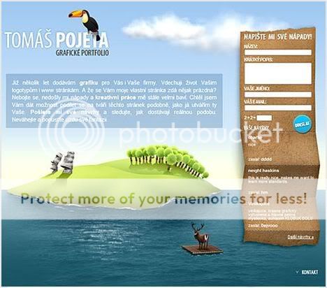
19. Tomas Pojeta

Tomas Pojeta


20. New Media Production

New Media Production


21. Brian Murchison

Brian Murchison


22. Stanislav Krofta

Stanislav Krofta


23. Tvrdek

Tvrdek


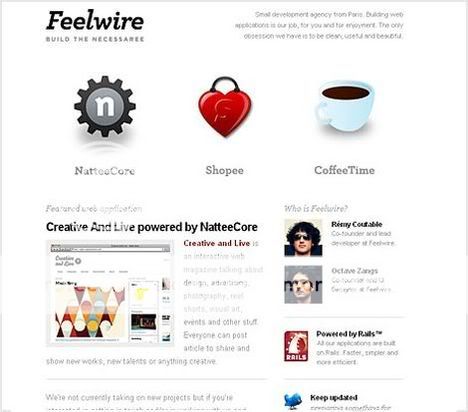
24. Feelwire

Feelwire


25. luke stevens

luke stevens


26. Cpeople

Cpeople


27. Gotta Get To FOWA

Gotta Get To FOWA


28. Pikaboo

Pikaboo


29. Rzmota

Rzmota


30. tomatic

tomatic


31. Lonely Tweet

Lonely Tweet


32. Maurivan Luiz

Maurivan Luiz


33. Just Dot

Just Dot


34. NerdoPlex

NerdoPlex


35. Sroown

Sroown


36. Stage 5 Studio

Stage 5 Studio


37. Veeboo Labs

Veeboo Labs


38. Alex Buga

Alex Buga


39. Colourpixel

Colourpixel


40. Edit Studios

Edit Studios


41. The Great Bearded Reef

The Great Bearded Reef


42. Jiri Tvrdek

Jiri Tvrdek


43. Legwork Studio

Legwork Studio


44. Magouya

Magouya


45. Nofrks Design Studios

Nofrks Design Studios


46. Omnitech Incorporated

Omnitech Incorporated


47. Jakub Antalik

Jakub Antalik


48. Tomáš Pojeta

Tomáš Pojeta


49. Tyler Finck

Tyler Finck


50. Visual Elixer

Visual Elixer


51. volll

volll


52. We Bleed Design

We Bleed Design

Labels: ,